
22 Neutral Bathroom Ideas
A neutral bathroom can look calm and expensive in your head, then turn flat and overly beige once every finish starts blending together.
The problem is rarely the neutral palette itself, it is usually the missing contrast, wrong undertones, or lack of texture that makes the room feel unfinished.
In this article, you’ll find neutral bathroom ideas that show how to add warmth, depth, and character without losing that clean, calming look.
Let’s jump in!
What Is The Best Neutral Bathroom Color?
Warm white is one of the safest neutral bathroom colors because it keeps the room bright without giving you that cold, clinical look.
If your tile or countertop has beige, cream, or sandy undertones, choose a warm white, soft beige, taupe, or light greige that works with them.
For a bathroom with plenty of natural light, you can go slightly deeper with mushroom, taupe, or warm greige without making the space feel heavy.
If the room is small or dark, keep the main color lighter and bring depth through wood, stone, hardware, and textured tile instead.
The best neutral is the one that matches your fixed finishes first, because even a beautiful beige can look wrong beside clashing undertones.
Soft Stone
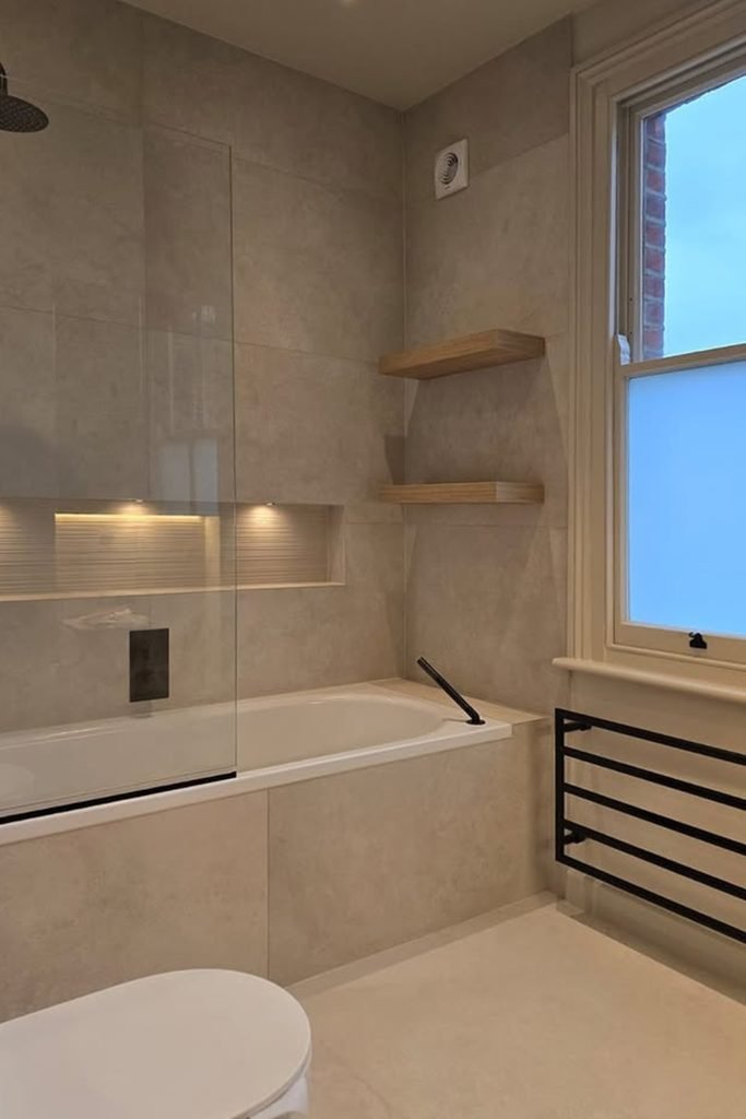
If your bathroom already gets plenty of daylight, warm stone-look tiles can cover larger surfaces without making the room feel heavy or closed.
Keep the tile tone consistent across the bath surround and walls, then use black fixtures to give the pale palette a sharper edge.
Small wood shelves and recessed lighting add warmth where you need it, without breaking the calm look with extra colors or bulky storage.
Warm Glow
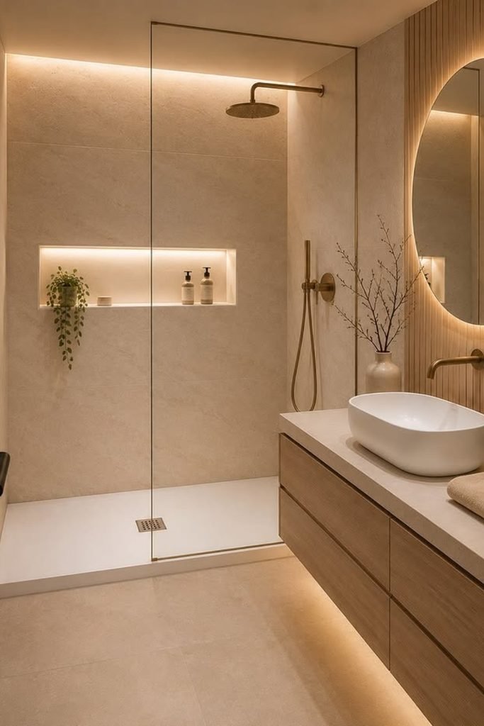
A neutral bathroom feels far richer when lighting becomes part of the design instead of relying only on one bright ceiling fixture.
Use hidden LED strips around the mirror, vanity, and shower niche to soften beige surfaces and bring out their natural texture.
Pair that glow with light wood and brushed brass, especially in windowless bathrooms where cool white lighting can make neutrals look flat.
Open Calm
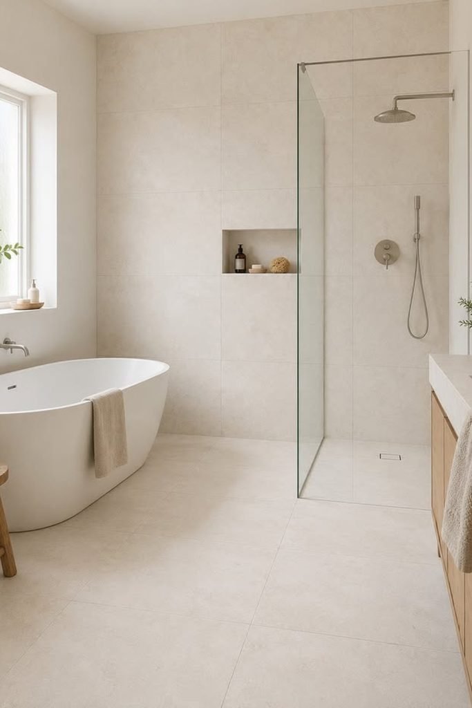
When you have enough floor space for a tub and shower, keep both zones visually connected with one pale stone palette.
A frameless screen helps the shower disappear into the room, while a freestanding tub gives the layout a softer focal point.
Bring in a little oak through the vanity or stool, so the large cream surfaces stay warm instead of reading cold or clinical.
Textured Layers
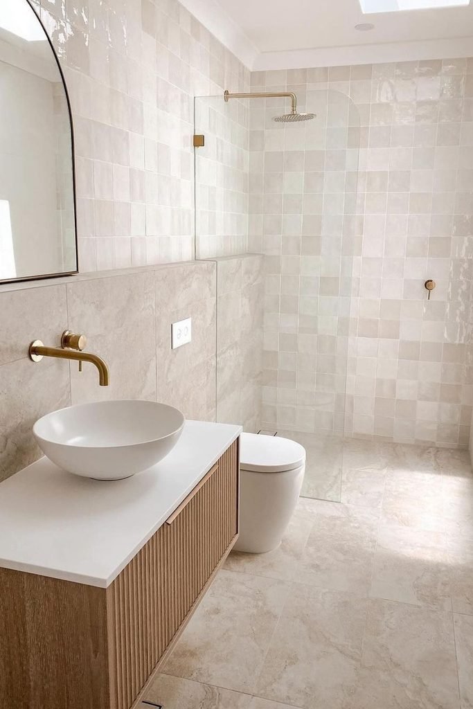
Glossy handmade-style tiles are a smart way to stop a pale bathroom from feeling plain when you want to keep color minimal.
Let their uneven surface catch natural light, then balance that shine with matte stone flooring and a simple fluted wood vanity.
Warm brass fixtures work especially well here because they echo the wood tone and keep the white surfaces from feeling too stark.
Tailored Taupe
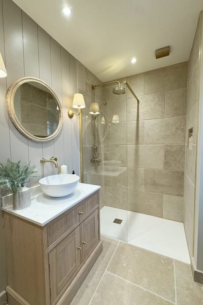
Taupe works beautifully in smaller bathrooms when you break up the stone with painted wall panels instead of covering every surface alike.
Use a wood vanity and warm wall sconces to stop the gray-beige palette from feeling dull, especially where daylight is limited.
Keep the shower glass clear and repeat the same floor tone inside, so the narrow layout reads as one continuous space.
Skylit Symmetry
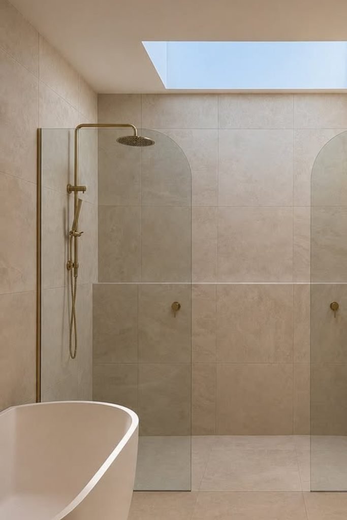
A skylight changes what you can do with beige, because natural overhead light reveals texture instead of washing the room flat.
If you have a wide shower wall, matching brass fixtures on both sides create balance without adding another competing material.
Run one soft stone tone across the floor and walls, then let the ribbed vanity bring in the stronger visual detail.
Luminous Stone
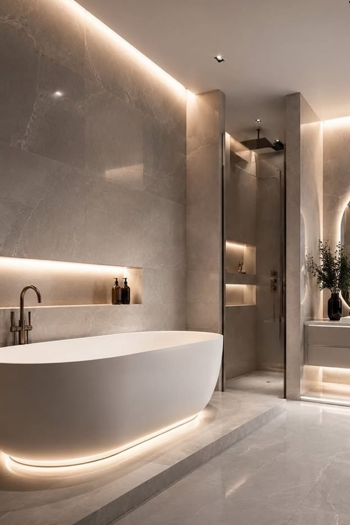
Neutral bathrooms can go darker without feeling gloomy when concealed lighting traces the stone and keeps the larger surfaces visually separated.
Use this approach in a larger bathroom where taupe marble, deep niches, and a white tub have enough room to breathe.
Keep the lighting warm rather than yellow, and repeat it under the vanity or bath platform so the glow feels intentional.
Earthy Layers
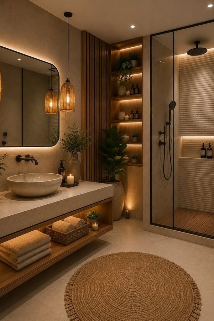
When beige starts feeling too safe, layer in timber, woven lighting, and greenery so the room gains character without chasing brighter colors.
This mix suits bathrooms with warm stone floors, because the wood and natural fibers reinforce those earthy undertones instead of fighting them.
Use black only on the shower frame and fixtures, then soften those hard lines with rounded mirrors, plants, and open shelving.
Quiet Contrast
When beige stone already covers the shower, let a floating oak vanity bring warmth without introducing another competing color into the room.
Use brushed brass for the faucet, shower, and mirror frame so the metal repeats cleanly instead of feeling randomly scattered.
Keep the glass frameless and the floor pale, especially in narrower bathrooms where heavy borders can make separate zones feel smaller.
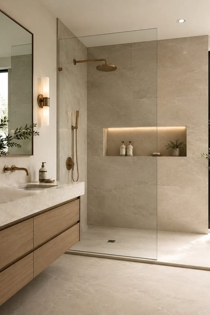
Soft Balance
Soft beige works best when you leave plenty of white around it, because that contrast stops the whole bathroom from turning muddy.
Choose pale oak for the vanity and a warm metal finish for fixtures, then avoid adding darker accessories that interrupt the calm palette.
If natural light is strong, matte surfaces will keep the room soft while still showing enough variation to prevent a flat finish.
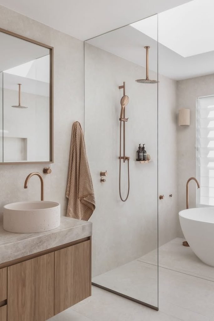
Woven Warmth
Natural fibers are useful when a beige bathroom feels too polished, because they add texture without forcing another permanent finish into the scheme.
Bring them in through a runner, baskets, or towels, then repeat warm wood on the vanity to make the styling feel connected.
This approach suits bright bathrooms especially well, since sunlight can wash out pale colors unless you give the room stronger tactile layers.
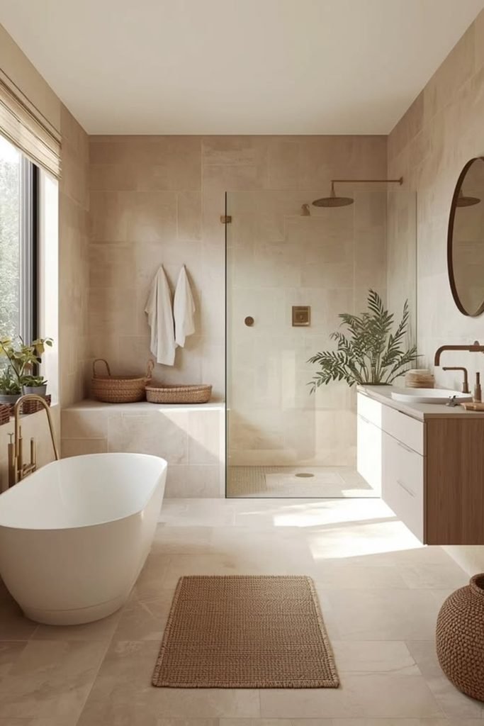
Sculpted Neutral
If you want a neutral bathroom to feel dressier, use shape and texture before adding more color or piling on decorative accessories.
An arched mirror, fluted vanity, and softly veined stone create enough visual movement, while warm brass keeps the palette from reading cold.
Use woven storage or a textured rug near the tub so the polished surfaces still feel comfortable rather than overly formal.
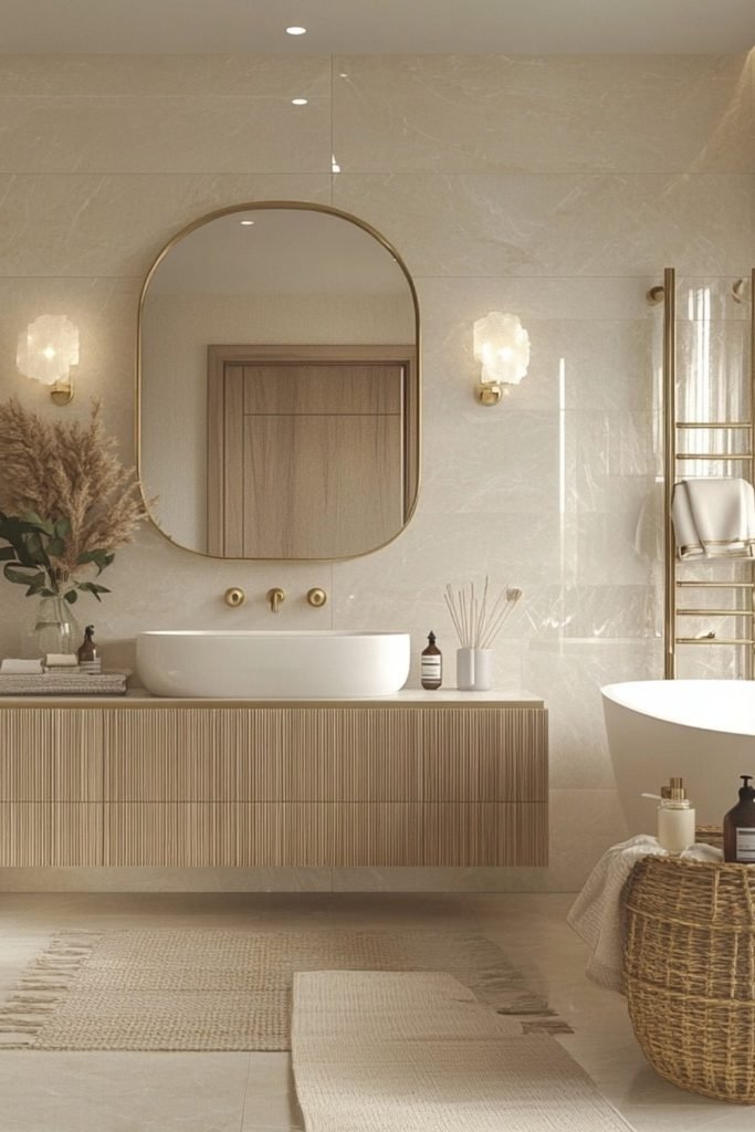
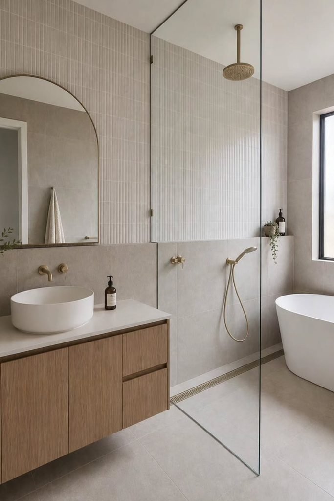
Linear Texture
Fine vertical tiles are useful when a neutral bathroom needs movement, because the narrow lines add detail without introducing a busy pattern.
Pair them with a plain stone floor and floating oak vanity so the texture stays noticeable instead of competing with other finishes.
Brushed brass works well here, while clear glass keeps the shower open and lets the tiled wall continue across the room.
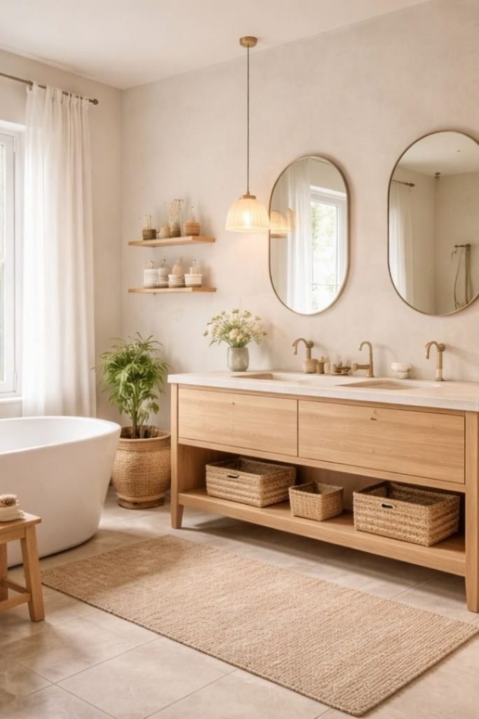
Open Storage
If a double vanity feels too bulky, choose an open lower shelf instead of solid cabinetry from floor to counter.
Use matching baskets for towels and daily extras, then repeat their woven texture in a rug or plant pot nearby.
Two rounded mirrors and pendant lights break up the long vanity wall, keeping a wide neutral bathroom from feeling flat.
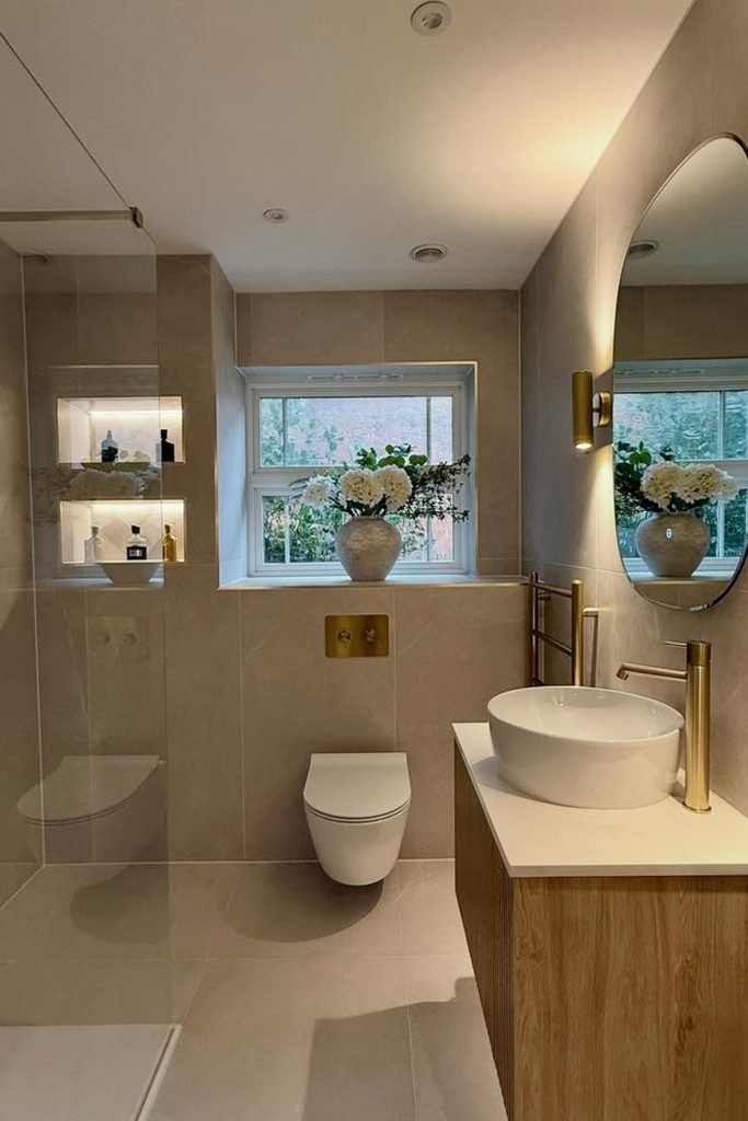
Compact Flow
In a narrow bathroom, wall-hung fixtures free up visible floor area and stop the layout from feeling packed with separate pieces.
Keep the shower screen frameless and use one tile tone across the walls, so your eye moves through the room without interruption.
Add warmth through a small oak vanity and brass fittings, then use recessed niches for storage instead of projecting shelves.
Built-In Warmth
Built-in shelving earns its place in a neutral bathroom when it replaces freestanding storage that would otherwise make the room feel crowded.
Line the recess with warm wood and keep displayed items sparse, so the storage adds depth without turning into visual clutter.
Finish with a textured runner and fluted vanity to echo that warmth, while pale walls keep the darker wood from dominating.

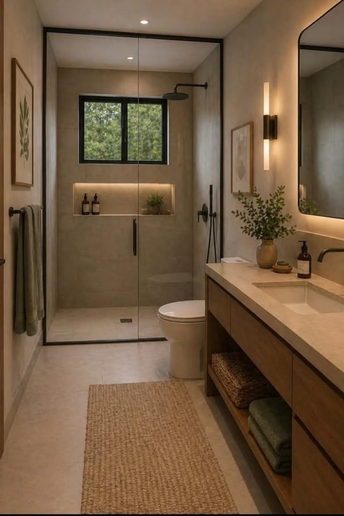
Dark Framing
A black shower frame can sharpen a narrow neutral bathroom, especially when beige walls and pale flooring need a stronger visual boundary.
Keep the vanity warm and simple, then repeat black only on the faucet, mirror edge, and hardware so the contrast stays controlled.
Use a woven runner and soft lighting to balance those dark lines, preventing the room from feeling too hard or overly modern.
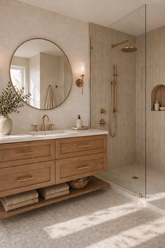
Vertical Rhythm
Vertical shower tiles are a smart choice when you want extra texture without introducing pattern or another color into a calm bathroom.
Pair them with a wide oak vanity and simple brass fixtures, so the room feels warmer while the tile remains the main detail.
An arched niche adds one soft shape inside the shower, which helps break up straight lines without making the wall feel busy.
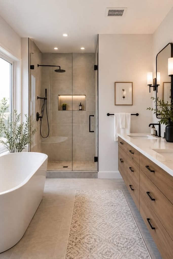
Balanced Contrast
If your neutral bathroom feels too light, matte black fixtures can add structure without forcing you to change the main color palette.
Use black on the shower set, handles, and sconces, then let the wood vanity soften the contrast and keep things welcoming.
A pale rug and white tub will stop the darker details from taking over, which works especially well in longer bathroom layouts.
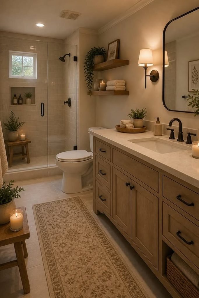
Cozy Neutral
A neutral bathroom does not need to feel minimal, especially if you prefer warmer details, softer lighting, and a more lived-in finish.
Choose a wood vanity with visible grain, then add shaded sconces and floating shelves to make the room feel relaxed rather than stark.
Keep baskets, towels, and greenery in the same earthy range, so practical storage still supports the neutral palette instead of cluttering it.
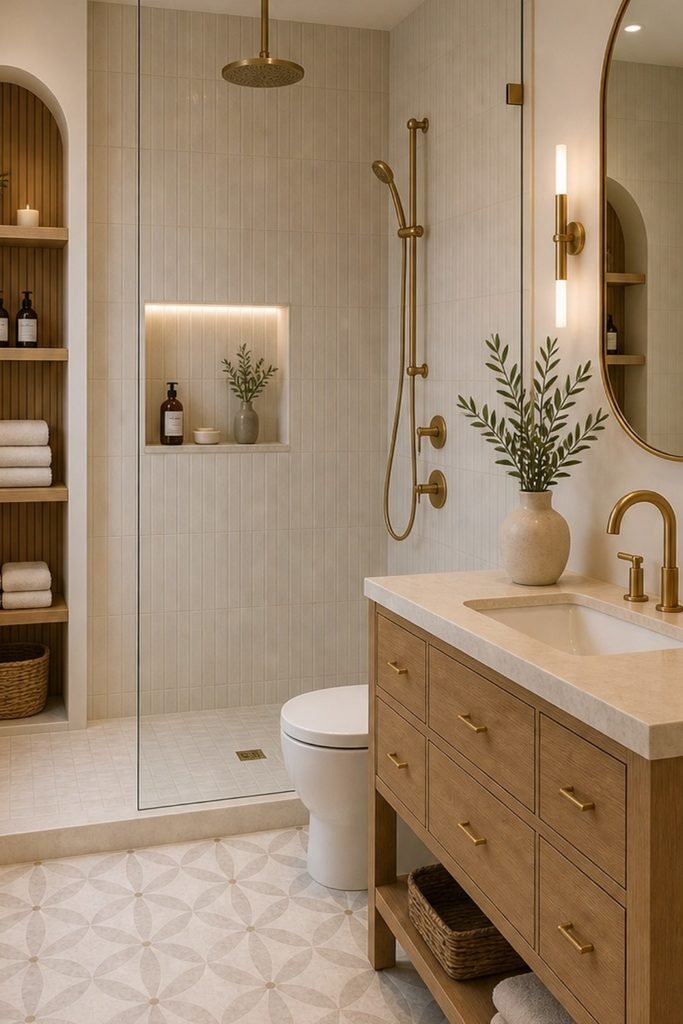
Patterned Ground
When a neutral bathroom starts feeling too uniform, a patterned floor can add character without pushing the room outside its calm palette.
Keep the wall tile simple and vertical, then repeat warm oak in the vanity and recessed shelving to connect everything visually.
Brass fixtures finish the scheme nicely, while the soft floor pattern gives smaller bathrooms a focal point without making them feel busy.
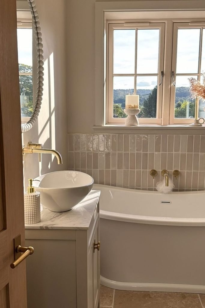
Window Warmth
If your bathroom has a large window, let natural light do the work and keep the main palette soft, creamy, and simple.
Glossy greige tiles around the tub catch that daylight beautifully, while brass fittings stop the pale surfaces from looking washed out.
For a more traditional finish, bring in a marble top, warm wood, and simple accessories instead of adding stronger colors.
FAQs
How do you stop a neutral bathroom from looking boring?
Mixing several textures is the easiest way to keep a neutral bathroom from feeling flat when the color palette stays simple.
Use wood, stone, textured tile, woven pieces, or brushed metal, then repeat those finishes so the room still feels connected.
If everything shares the same beige tone and smooth finish, add one darker detail or stronger texture to create some needed depth.
Can you mix warm and cool neutrals in a bathroom?
You can mix them, but one temperature should lead the room so the palette does not start looking mismatched or accidental.
If your tile leans warm, keep larger finishes creamy or beige, then use cooler gray or nickel only as smaller accents.
Before choosing paint or stone, compare samples beside your existing finishes under bathroom lighting because undertones can shift more than expected.
