
21 Orange Kitchen Ideas
Orange is one of those colors that can make a kitchen feel instantly warmer, brighter, and far more interesting.
From soft terracotta to deep burnt orange, even a small touch can completely change the mood of the space.
In this article, you’ll find orange kitchen ideas that show just how many stylish ways there are to use this bold color.
Let’s jump in!
Is Orange Color Attractive For Kitchen?
Yes, orange can look very attractive in a kitchen when you choose the right shade and balance it with calmer finishes.
If you want a softer look, go with terracotta, rust, clay, or burnt orange instead of a very bright citrus tone.
Pair orange with cream, warm white, wood, black, sage, or muted blue so the color feels connected to the rest of the room.
For a bold kitchen, use orange on cabinets or an island, but keep the countertop and backsplash simple so everything does not compete.
If you prefer less commitment, bring orange through walls, stools, tiles, lighting, or smaller decor instead.
Warm Wood
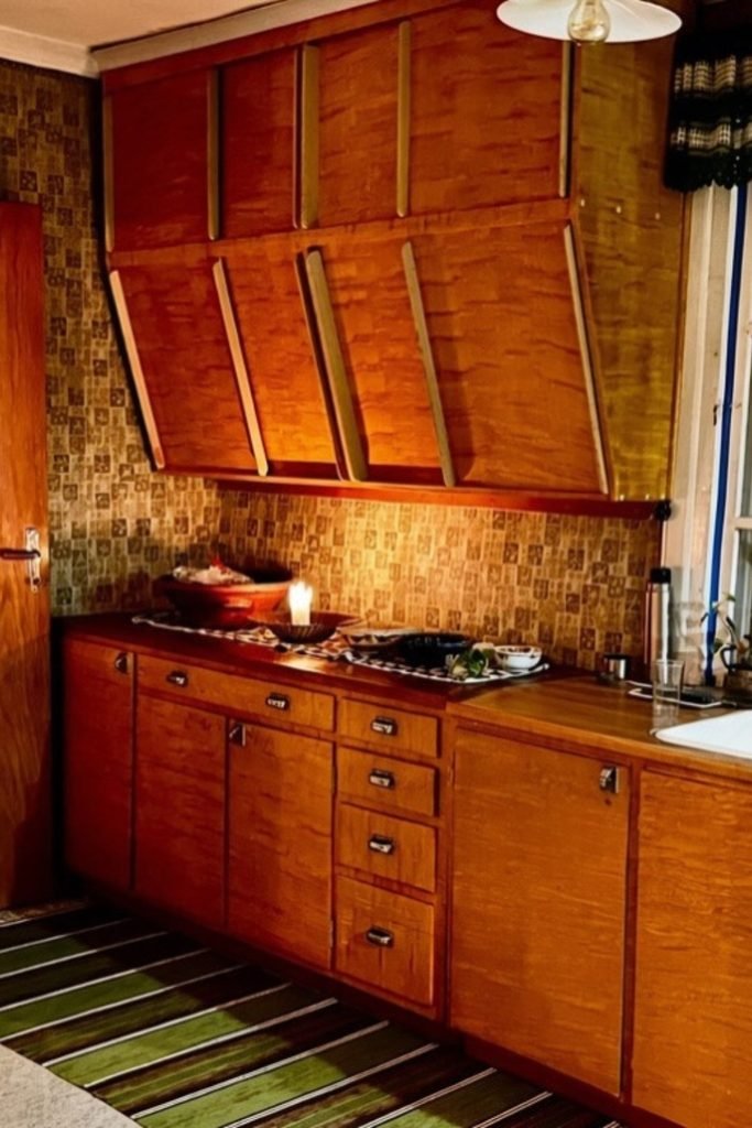
If your kitchen already has orange-toned wood cabinets, lean into that warmth instead of fighting it with stark, cool finishes.
A muted mosaic backsplash, dark worktop, and simple metal hardware can ground the wood while keeping its natural character visible.
This approach works especially well in older kitchens where replacing solid cabinetry would cost more than refreshing the surrounding surfaces.
Citrus Cabinets
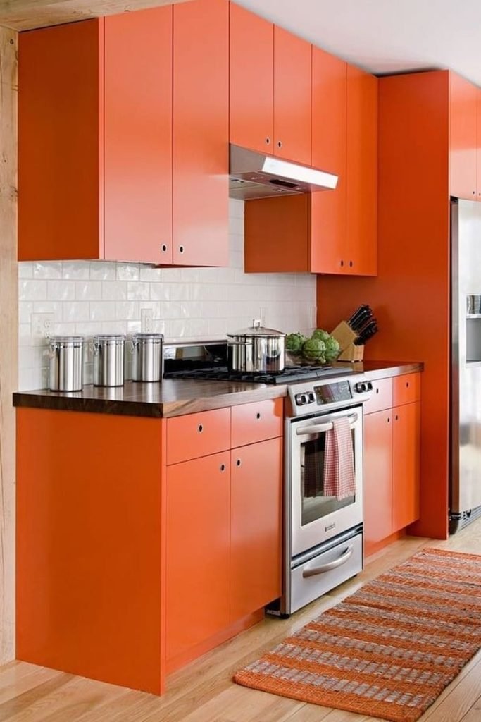
Bright orange cabinets look cleaner when the door style stays flat and simple, letting the color become the main design feature.
Balance that intensity with a white subway backsplash, stainless appliances, and pale flooring so the kitchen still feels open and practical.
This setup suits compact modern kitchens because the neutral surfaces create breathing room without taking away the personality of the orange.
Two-Tone Balance
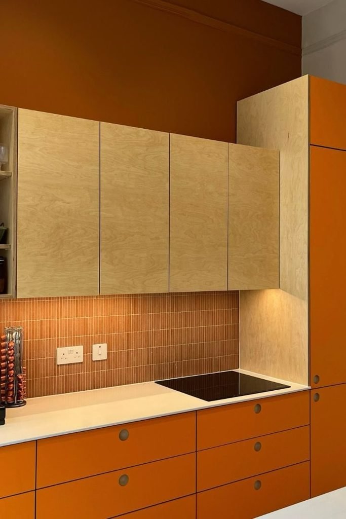
Using orange on the lower cabinets gives you strong color at eye level without making every storage wall feel equally heavy.
Keep upper cabinets in pale wood, then repeat orange through the backsplash or tall units to tie both halves together naturally.
This mix works well in smaller kitchens where you want warmth and personality, but still need lighter surfaces above the counter.
Navy Contrast
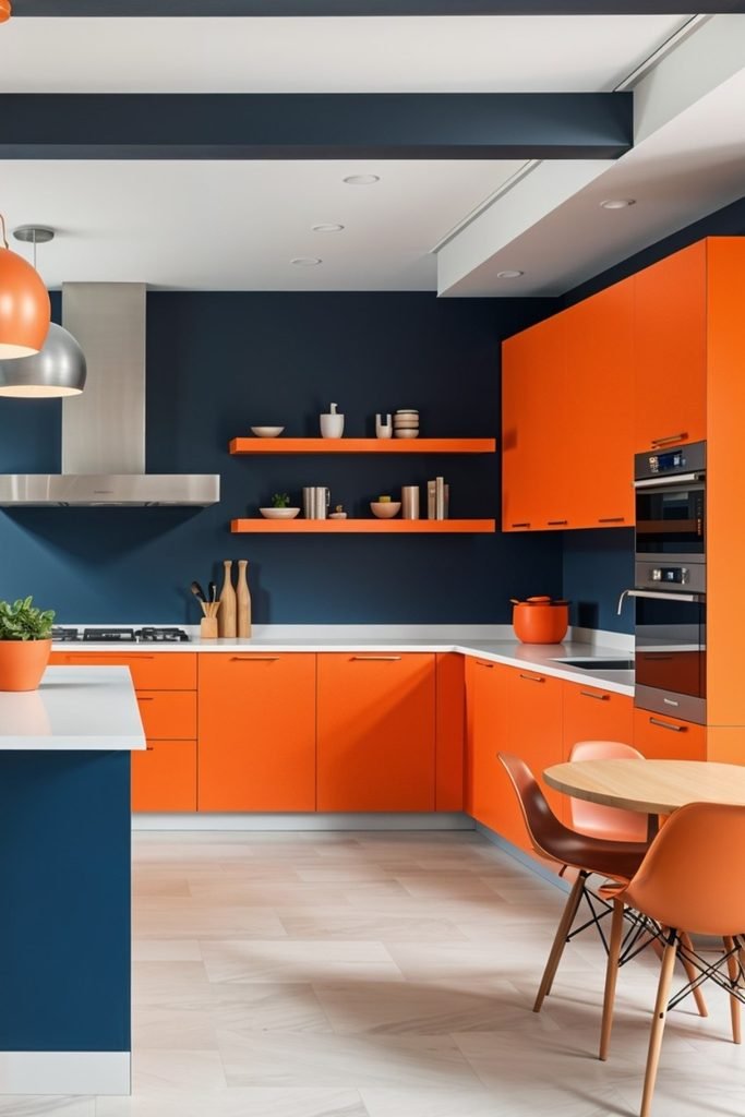
Pairing orange with deep navy gives the color a sharper, more modern edge and stops a large kitchen from feeling overly warm.
Use orange for cabinets, stools, lighting, or shelves, then let navy cover larger wall areas to create clear visual structure.
White countertops and pale flooring are useful here because they break up both saturated colors and keep the whole room from closing in.
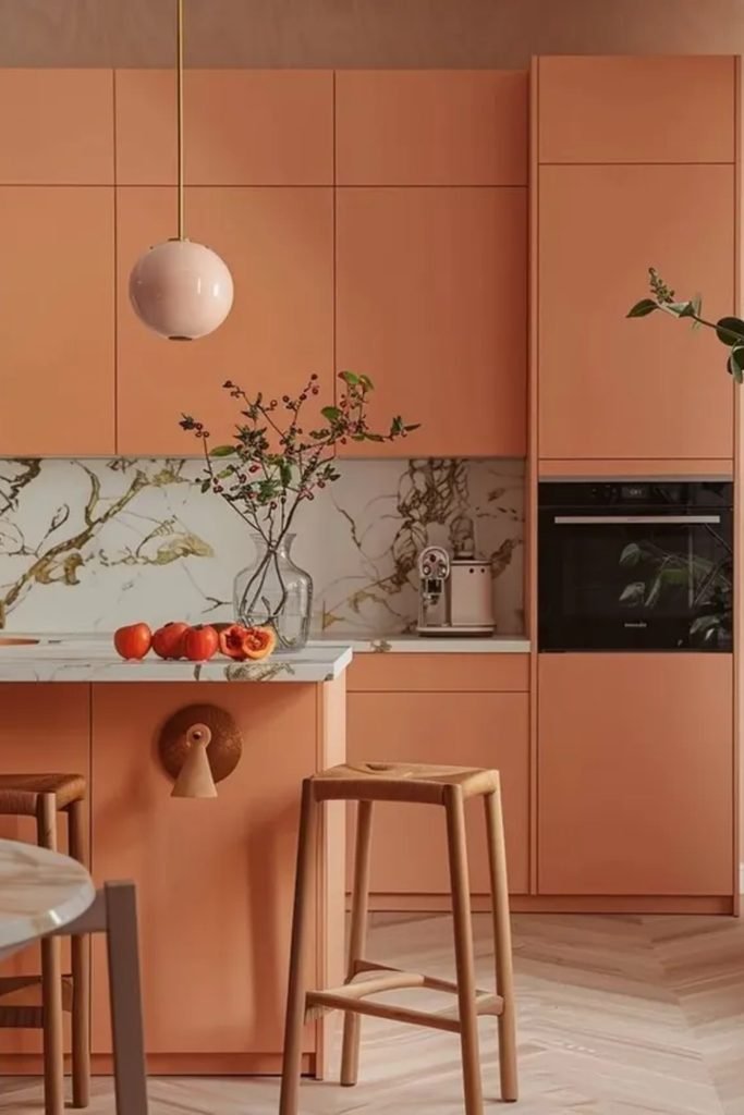
Soft Apricot
Soft apricot cabinets are a smart choice when you want orange warmth without making the kitchen feel loud or overly energetic.
Keep the surfaces pale with marble, light flooring, and simple wood stools so the color stays relaxed and easy to live with.
This softer palette works especially well in open kitchens where you want the cabinetry to blend gently into nearby dining spaces.
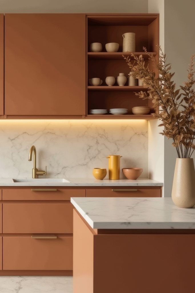
Terracotta Calm
Terracotta feels more grounded when you pair it with creamy stone and brushed brass instead of adding several other strong colors.
An open shelf breaks up a long cabinet run and gives you space to add pottery that repeats the warm earthy palette.
Use this look in kitchens with plenty of natural light, because muted orange becomes richer without turning heavy against pale counters.
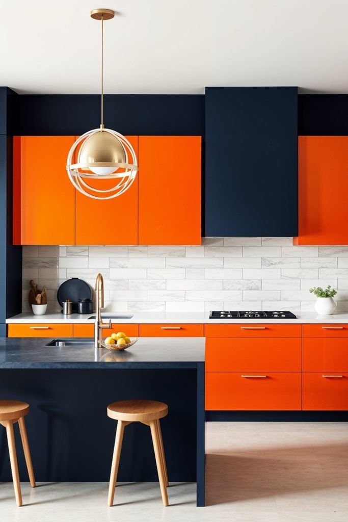
Bold Contrast
Bright orange looks far more controlled when deep navy frames the cabinets and creates a clear boundary around the strongest color.
Keep the backsplash light and the island dark, then use warm metal details to connect both sides without adding another competing shade.
This high-contrast scheme suits larger modern kitchens best, especially when you have enough daylight to stop the navy from feeling flat.
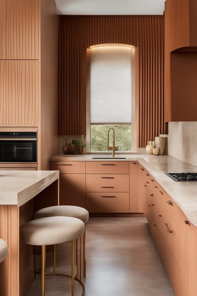
Tonal Layers
Using several close orange tones creates a calmer result than one bright shade, especially when cabinetry, walls, and woodwork share warmth.
Bring in pale stone counters and textured seating to give the room contrast without breaking the soft, almost monochromatic effect.
This approach works beautifully in narrow kitchens because repeating one warm family reduces visual clutter and makes every surface feel connected.
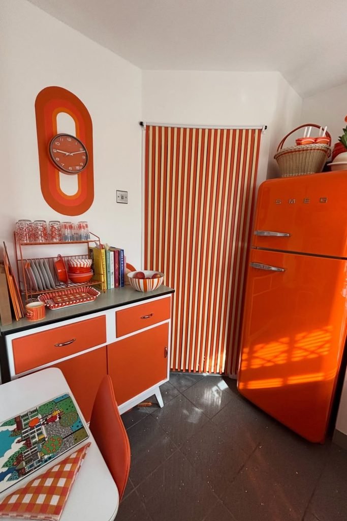
Retro Pop
Let one statement appliance carry the theme when you want a retro kitchen without covering every wall and cabinet in orange.
Repeat the color through smaller details like striped blinds, dishes, or artwork so the room feels playful instead of randomly mismatched.
This works best in compact kitchens where white walls and dark flooring give bright orange pieces enough contrast to stand out.
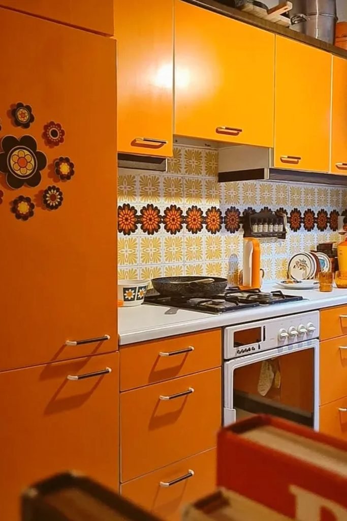
Floral Retro
Orange cabinets can handle a patterned backsplash when the print repeats the same warm tones instead of introducing too many unrelated colors.
Choose a simple worktop and slim metal handles to keep the busy pattern grounded and stop the kitchen from feeling overly themed.
This approach suits retro or eclectic homes, especially when you want vintage character without replacing practical modern appliances and fittings.
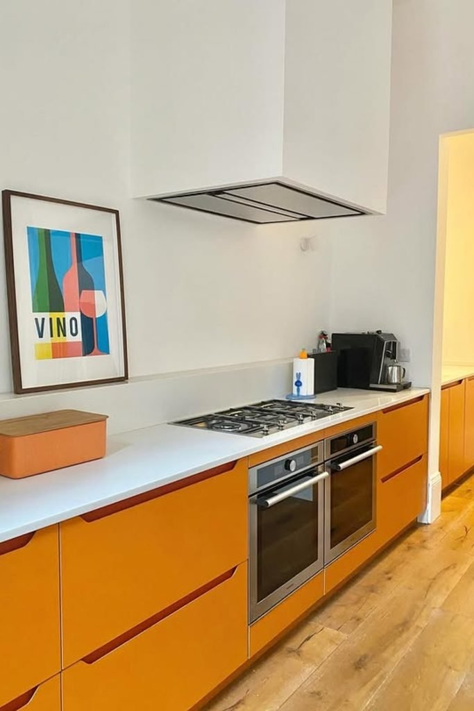
Minimal Orange
Keep orange only on the lower cabinets if you want strong color while the upper half of the kitchen stays light.
White walls, pale counters, and warm wood flooring soften the cabinetry, making this combination easy to use in long narrow layouts.
Add one or two simple accessories nearby, but leave plenty of blank wall space so the orange remains clean and intentional.
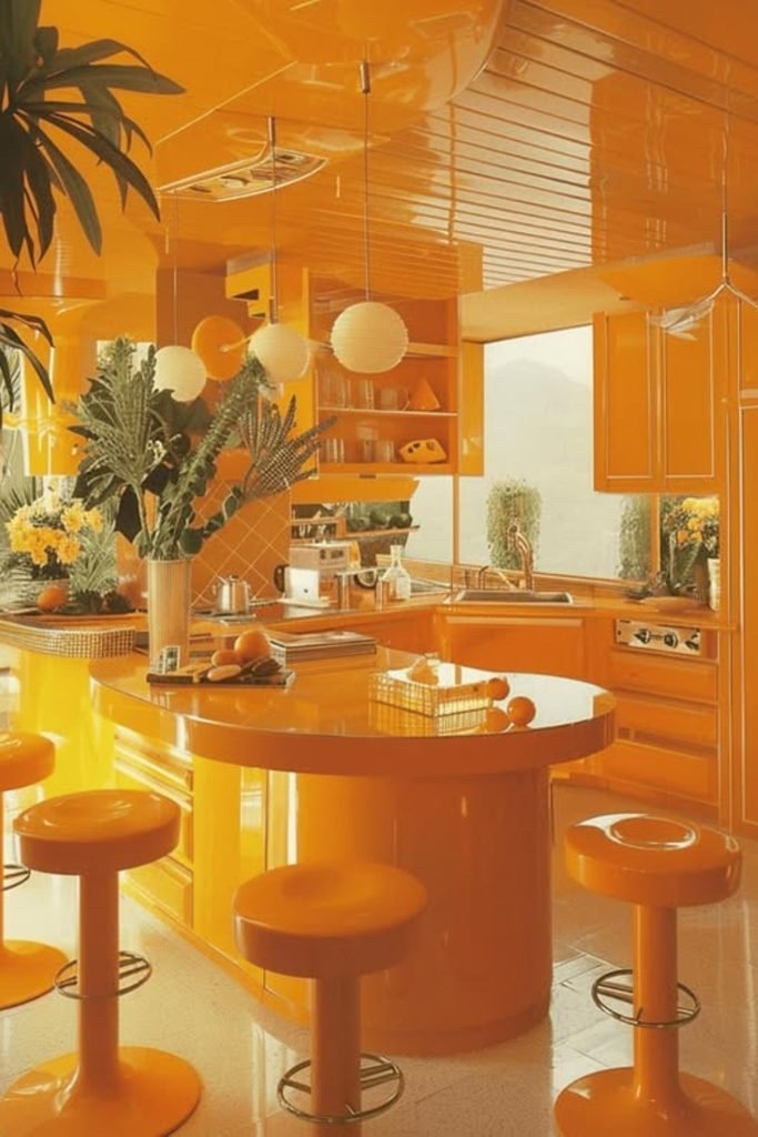
Orange Drench
Go fully orange when you want the kitchen to feel immersive, but vary the finish so every surface does not read flat.
Glossy cabinetry, reflective ceilings, and curved counters amplify light, while plants and pale accents stop the saturated palette feeling too enclosed.
This bold treatment works best in larger rooms with strong daylight, where orange can wrap the space without visually shrinking it.
Orange Heights
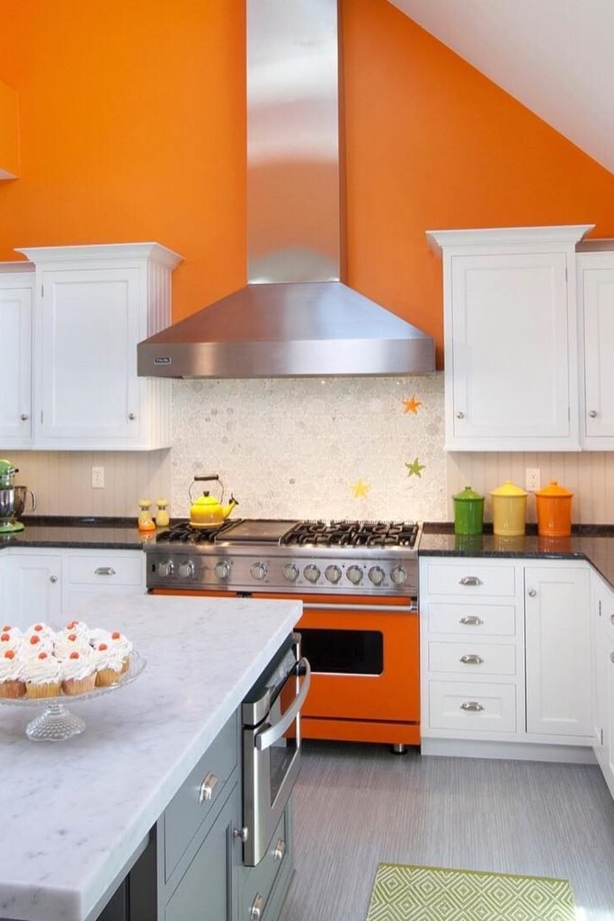
Paint the upper walls orange when you want strong color overhead while keeping white cabinetry bright, classic, and easy to live with.
Dark counters and stainless steel help anchor the vivid wall color, while small green accents keep the palette lively without looking chaotic.
This approach works especially well in kitchens with tall ceilings, where orange can add warmth without crowding the main work surfaces.
Boho Warmth
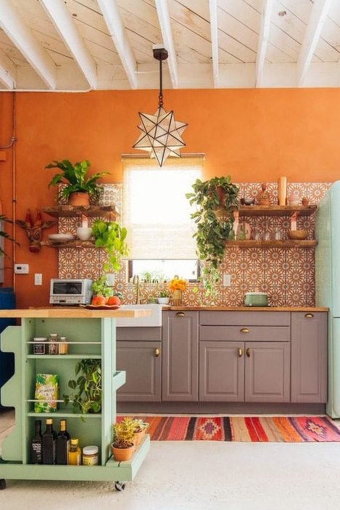
Muted orange walls feel more relaxed when you pair them with gray cabinets, patterned tile, natural wood, and plenty of greenery.
Bring in a pale green island or vintage-style appliance to cool the warmth and give the room a collected, bohemian character.
This mix suits casual kitchens best, especially when you prefer layered color, handmade details, and a space that feels lived in.
Clean Citrus
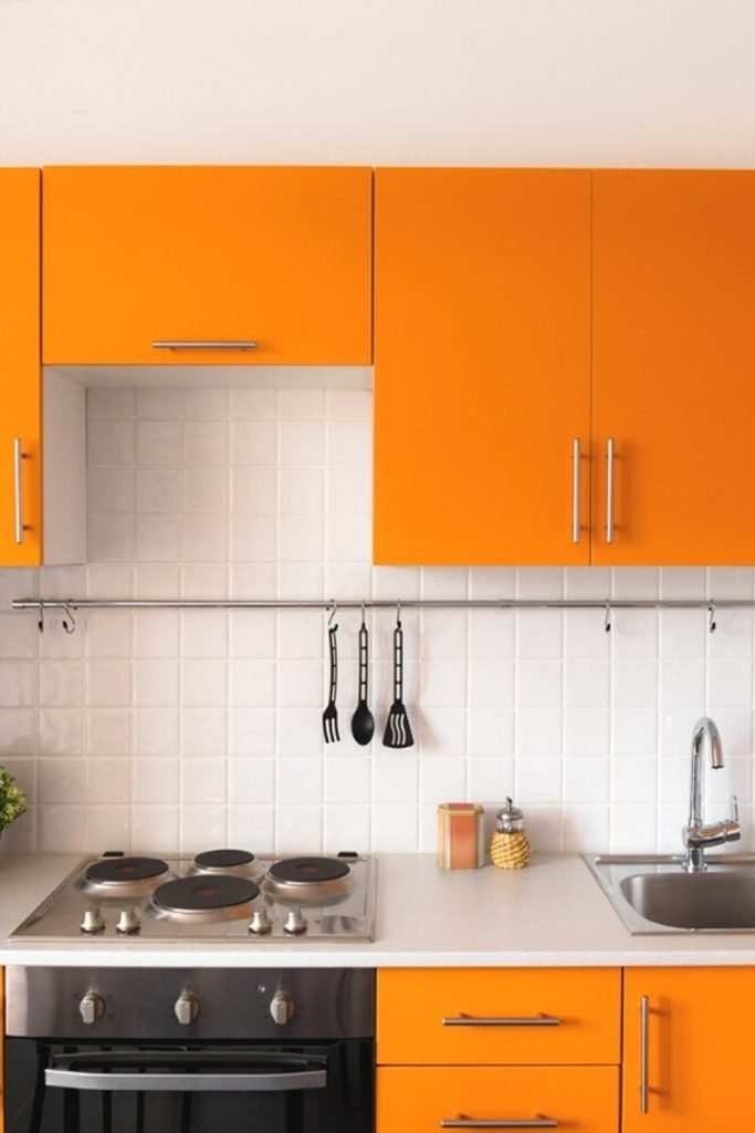
Flat orange cabinets can look crisp and modern when white tile, pale counters, and stainless hardware keep every surrounding surface simple.
Use the same orange on upper and lower cabinets to create continuity, then let the backsplash provide a clean visual break.
This is a strong choice for compact kitchens because the straightforward palette keeps bold cabinetry from making the layout feel cluttered.
Coral Centerpiece
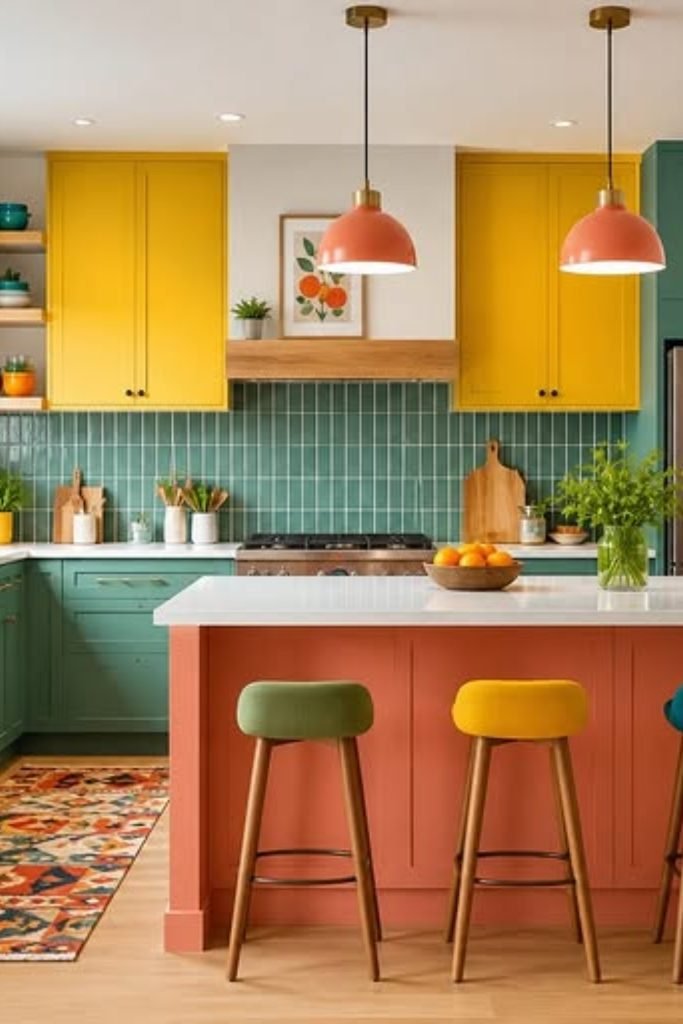
Use a coral-orange island as the warm center of a colorful kitchen instead of spreading orange across every cabinet and wall.
Green base cabinets and yellow uppers can still work together when the island repeats warm undertones and the counters stay light.
This idea suits bright family kitchens where several colors feel intentional, especially when stools, lighting, and artwork repeat those shades carefully.
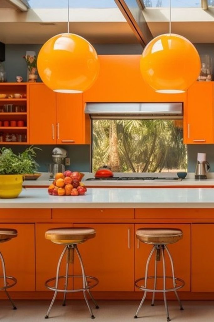
Sunlit Orange
Large skylights make saturated orange cabinets feel brighter and cleaner, especially when dark walls frame the color instead of competing.
Repeat orange through pendant lights and open shelving, then keep counters pale so the room still has visual breathing space.
This setup works best in sunny kitchens, where natural light can support strong cabinetry without making the palette feel heavy.
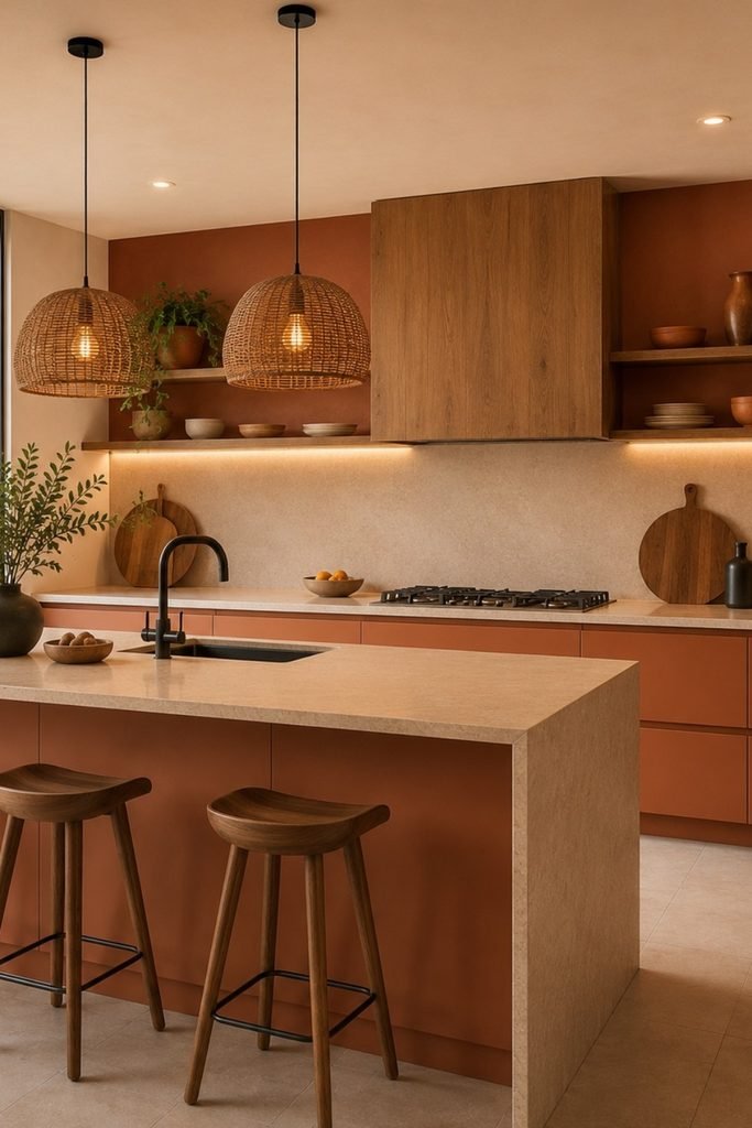
Earthy Terracotta
Terracotta becomes easier to live with when you pair it with warm wood, creamy stone, and woven lighting instead of crisp white.
Keep the island and backsplash quiet, then let open shelves, pottery, and plants build a softer natural layer around the color.
This scheme suits open-plan kitchens especially well because the muted orange reads warm and grounded rather than bright or attention-seeking overall.
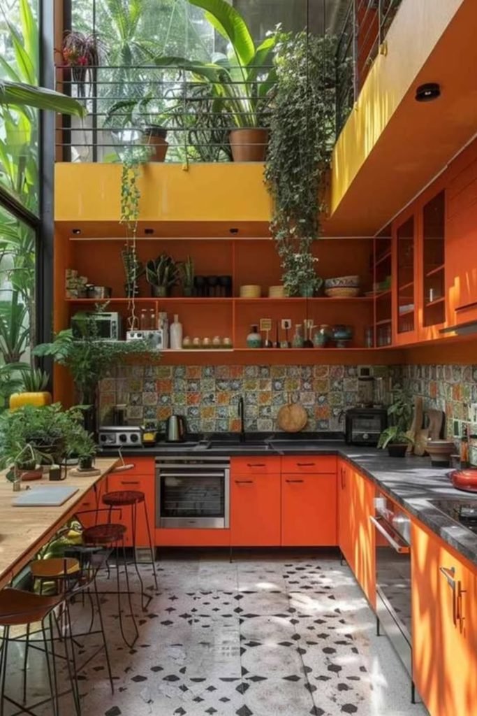
Tropical Orange
Orange feels especially lively beside lush greenery, so use plants generously when you want a bold kitchen to feel fresher and softer.
Patterned tile can handle the strong cabinetry here because black counters and simple flooring give the eye enough calmer surfaces.
Try this approach in bright, plant-filled spaces where sunlight, tall windows, and natural textures can balance several intense warm tones.
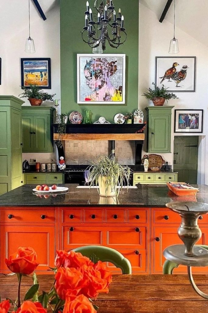
Orange Island
If full orange cabinetry feels too much, put the color on the island and let softer green cabinets carry the perimeter.
Black countertops help connect both colors, while warm wood and artwork stop the scheme from looking like a strict two-color formula.
This works beautifully in larger traditional kitchens where one bold center piece can add personality without changing every surrounding cabinet.
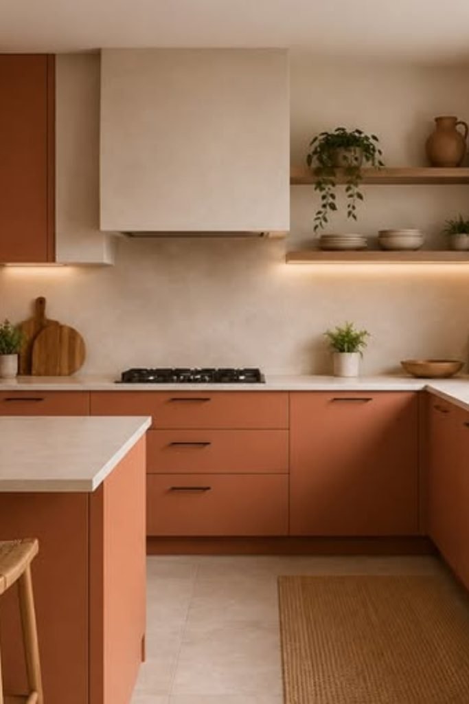
Muted Terracotta
Muted terracotta cabinets work beautifully when you want orange warmth without the sharp energy that brighter citrus shades can bring.
Keep the backsplash, counters, and walls creamy, then add black fixtures and natural wood to give the warm palette clear structure.
This combination suits calm modern kitchens, especially where open shelves and woven seating can soften the cabinetry with texture naturally.
FAQs
What countertop works best with orange kitchen cabinets?
Warm white, cream, or lightly veined stone usually works best because these surfaces calm orange without making the kitchen feel flat.
If your cabinets are burnt orange or terracotta, darker stone can add depth, but keep the backsplash simple to avoid competition.
Always compare samples beside your flooring and cabinet finish first, since undertones can shift dramatically under different natural and artificial lighting.
How can I make an orange kitchen feel less overwhelming?
Use orange on one main feature, then surround it with warm neutrals, natural wood, or soft stone to give your eyes rest.
You can also reduce visual weight by choosing matte finishes, simple cabinet fronts, and fewer decorative colors across the rest of room.
If the space still feels too intense, introduce cream, beige, sage, or pale wood before changing the orange itself completely.
