This article may contain affiliate links: read full affiliate disclosure.
Last year, you and I both know how it feels when you stand in the paint aisle, and you see 47 shades of warm gray, and you almost walk out.
Every sample looks perfect on Pinterest, but you notice it’s completely different on your wall. Too dark? Too cold? Too flat at night?
If you’re here, you’re probably worried that you might choose the wrong color and you’ll regret it every single day. You might think it’s impossible, but you can actually figure it out.
The best bedroom color isn’t about trends, it’s about the lighting you have, the mood you want, and how you want your room to feel.
In this article, you’ll see exactly how you can choose the right shade without making yourself second-guess every time with these 24 paint color ideas.
Let’s jump in!
What Is The Best Color To Paint A Bedroom?
The best color for your bedroom is the one that makes you feel calm the moment you walk in.
Not the trendiest shade. Not the boldest one you’ve seen on Instagram. The one that works with your lighting, your furniture, and the mood you want to create.
If your room gets a lot of natural light, you can go slightly darker or cooler without making it feel heavy.
But if your bedroom is small or doesn’t get much sunlight, you should stay away from icy grays or dark blues.
They can make your space feel flat and smaller than it really is.
In that case, you might find warm off-whites, soft greige, muted sage, or dusty blue work better because they reflect light and feel soft at night.
You also need to think about undertones. If your furniture has warm wood tones, you should choose a paint color with a warm base.
If you mix warm furniture with cool gray walls, the room can feel off without you knowing why.
You see your bedroom more at night than during the day. You should test your color under warm lighting before you commit.
If you want something safe and timeless, you can choose a warm neutral. If you want cozy and slightly dramatic, you might try a muted deep tone.
The best color is the one that supports your sleep, feels balanced, and makes your bedroom feel like it’s truly yours.
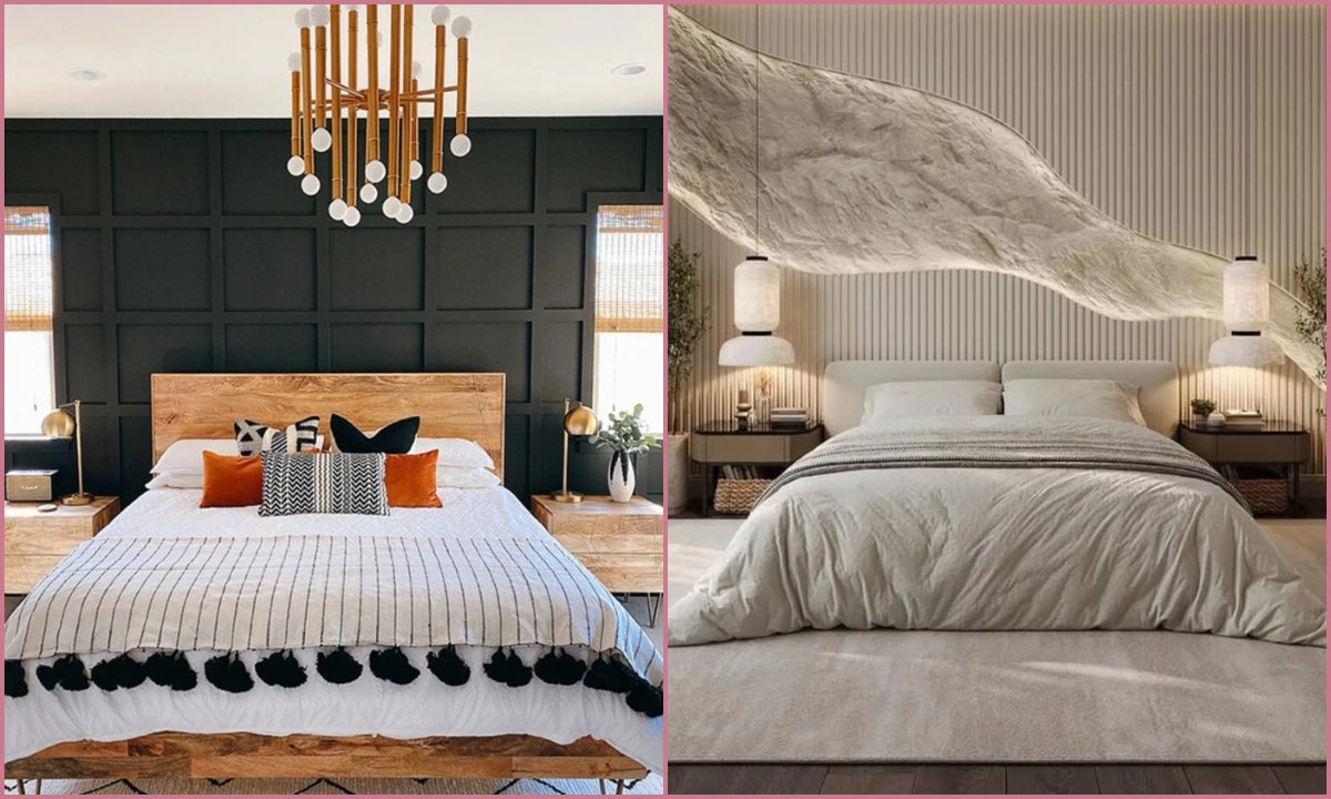
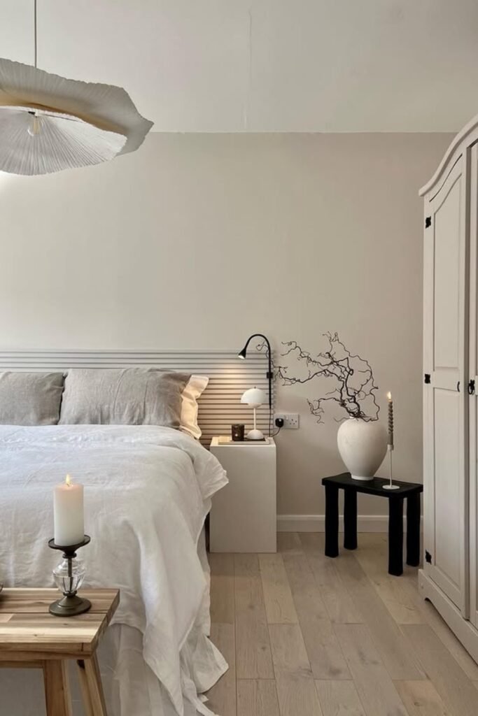
Soft Warm Minimalism
When you choose warm beige walls like this, you instantly notice how they quietly fix most bedroom problems.
You’ll see how they soften the light during the day and make the space feel cozy at night, which makes your room look expensive without you trying.
If your furniture is white, light wood, or even black accents like this side table, you can let a creamy neutral keep everything balanced.
You should pick a shade with a slight warm undertone, not stark white, and use layered textures like linen bedding so you don’t feel the room is flat.
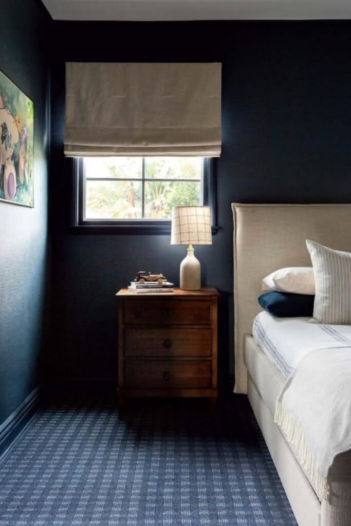
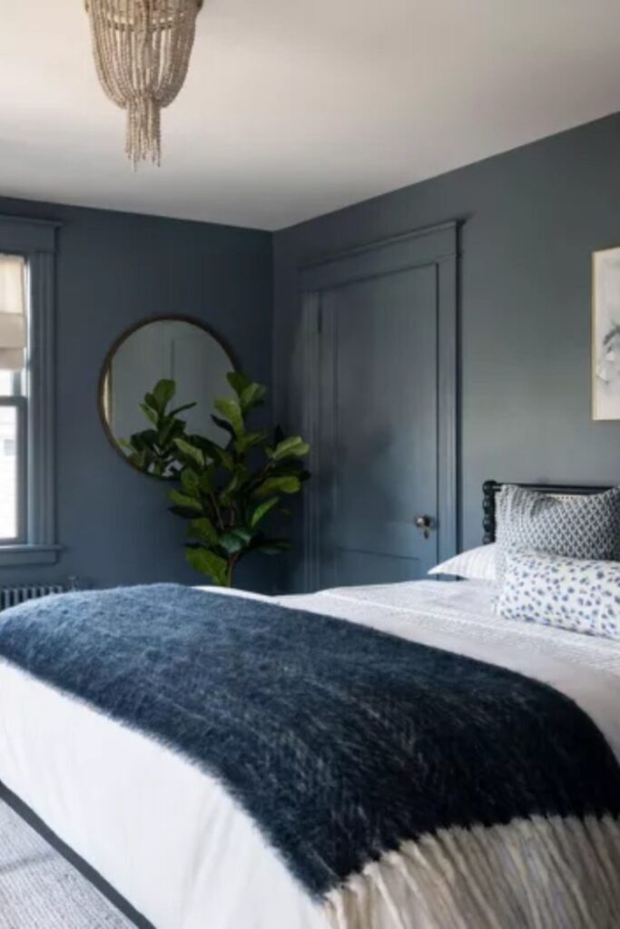
Deep Navy Retreat
When you paint with dark blue the right way, you’ll feel like your bedroom is a boutique hotel, not a cave.
You’ll notice this shade works best if your room has at least one decent window, so you don’t see the color turn flat during the day.
You can pair it with warm wood furniture and beige or cream upholstery to soften the depth. You should keep your bedding light to create contrast.
If you want drama without chaos, you can paint all walls the same navy and let texture, not more color, do the work.
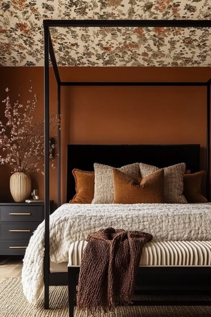
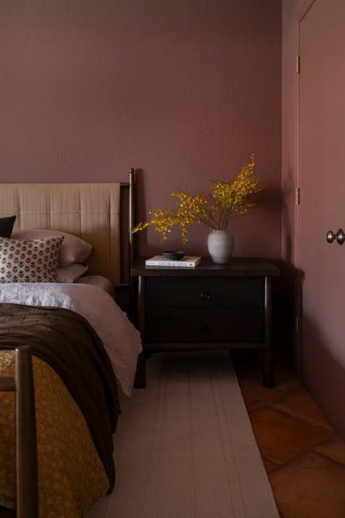
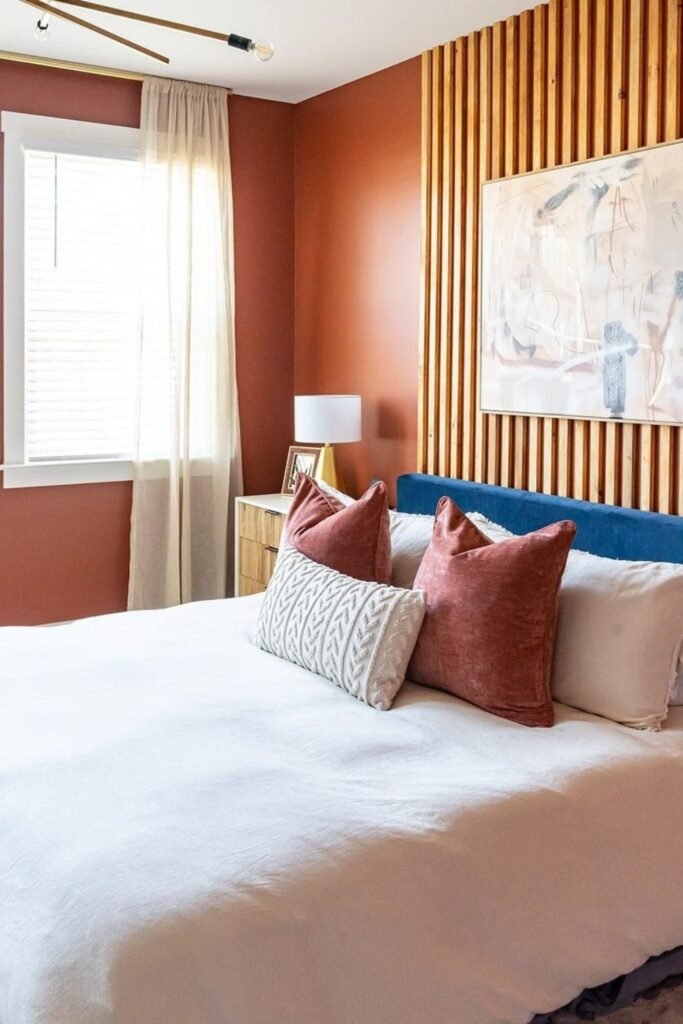
Rich Terracotta Comfort
This is how you make your bedroom feel warm the second you step inside.
You’ll see a deep terracotta like this wraps the space in comfort, especially if you have black accents or dark furniture.
You should use it where you get soft natural light so the color glows instead of feeling heavy.
You can balance it with creamy bedding and textured fabrics so you don’t feel overwhelmed.
If you want cozy without going dark brown, this shade might be just what you need.
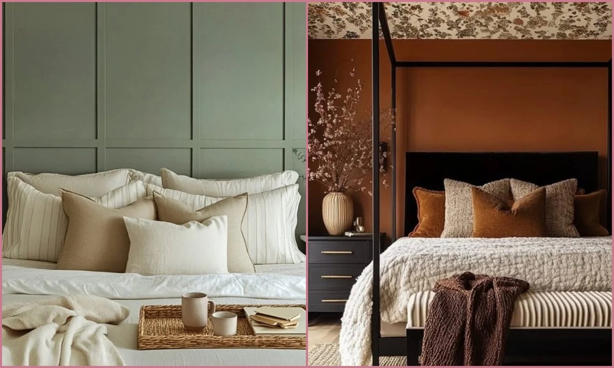
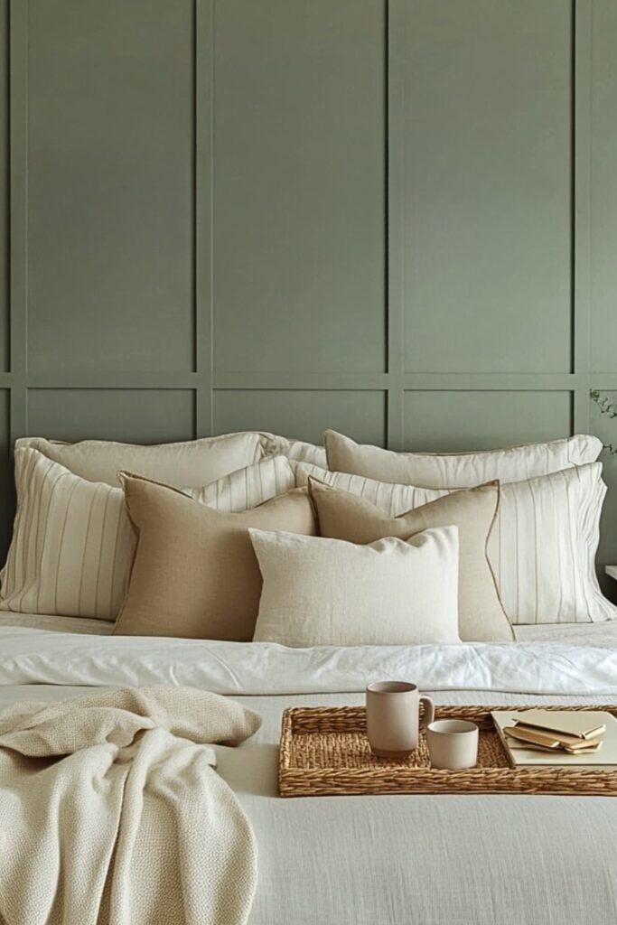
Muted Sage Calm
Nothing makes you feel more restful than a soft sage wall like this. You’ll notice it adds color without shouting, which makes it perfect if you want calm but not plain white.
You can pair this shade beautifully with cream bedding, woven textures, and light wood tones. You should keep the rest of your palette neutral so the green stays subtle.
If your room gets medium natural light, you’ll see a muted sage like this look fresh during the day and cozy at night.
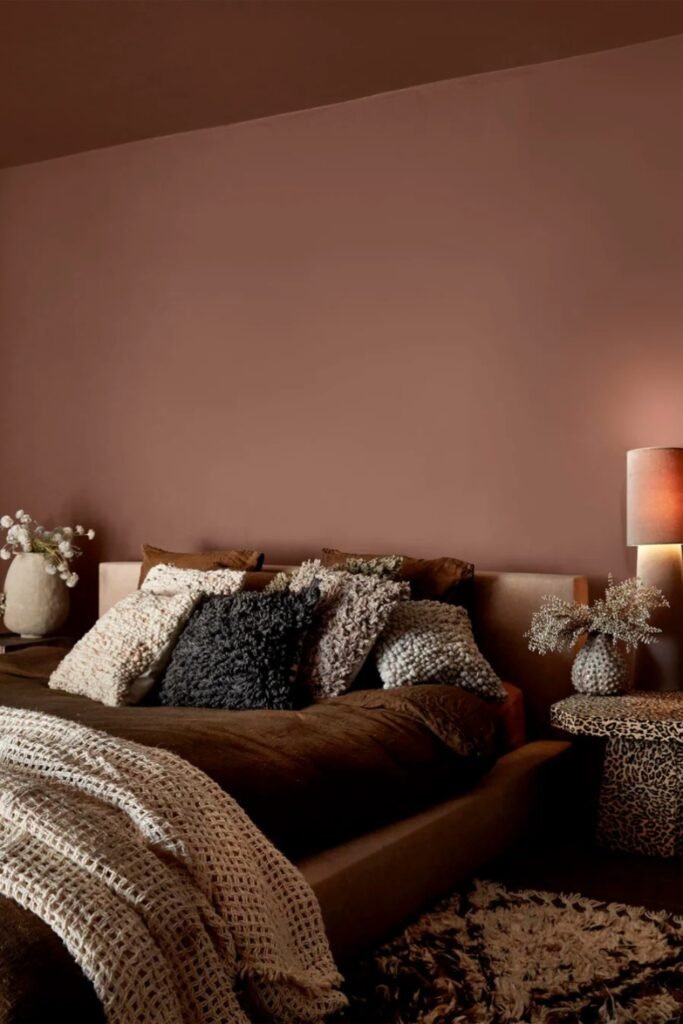
Earthy Mocha Walls
When you use warm brown walls like this, you instantly feel your bedroom is grounded and intimate.
You’ll see this shade works best if you lean into soft lighting, layered textures, and rich fabrics.
You can notice how creamy throws and neutral pillows break up the depth so it doesn’t feel too dark.
If your goal is a cozy, cocoon-like space for winding down at night, you should try a muted mocha tone paired with warm bulbs, you’ll love the calm, enveloping effect.
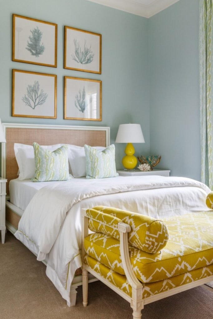
Fresh Aqua Light
A soft aqua like this can instantly brighten your bedroom without feeling loud.
You’ll notice it works especially well if your room has large windows, because you’ll see natural light keeps the color crisp and airy.
You can pair it with white furniture to keep things clean, then add small hits of a bold accent like yellow, so you don’t feel the room is too sweet.
You should choose a version with a slight green undertone so you feel relaxed, not icy.
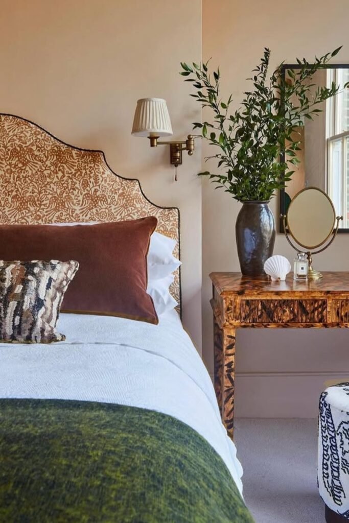
Warm Cream Backdrop
Sometimes, you need your wall color to support, not compete.
You’ll see a soft warm cream like this lets patterned headboards, rich wood furniture, and layered textiles stand out without you feeling the room is busy.
You can choose this if you love mixing prints or antique pieces. You should pick a cream with a beige undertone, not bright white, so your space feels inviting.
You’ll notice this shade works especially well if your room has natural light and you want warmth without it feeling dark.
Textured Greige Depth
You’ll see a soft greige with a subtle textured finish adds quiet depth without making your bedroom feel dark.
You can use it if you like earthy, modern spaces with wood beams and natural fabrics.
You should pick a warm greige, not a cool gray, so your room doesn’t feel cold in the evening.
You can keep your palette neutral, linen bedding, light oak, soft browns and let the wall texture create the interest instead of bold color.
Dusty Rose Warmth
This is how you use pink without making it feel childish. You’ll notice a muted dusty rose like this reads earthy and grown-up, especially next to dark wood furniture.
You can use it if you want warmth but something softer than brown.
You should keep your bedding neutral and layer in deeper accents, chocolate, mustard, or charcoal, so you don’t feel the color is too bright.
You should pick a shade with a brown undertone so your room feels cozy at night, not bubblegum bright.
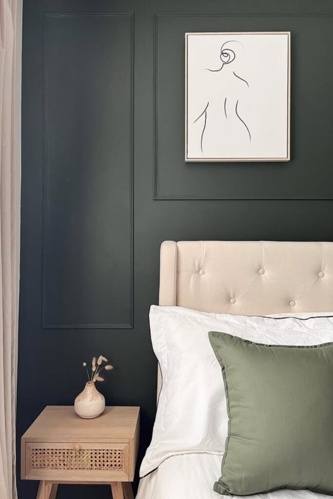
Forest Green Accent
A deep green wall like this instantly makes your wood furniture look richer. You might choose to keep it as a feature wall so the color feels bold but controlled.
You’ll notice this works especially well if your bedroom has sloped ceilings or unique architecture, the green adds depth without making your space feel closed in.
You should pair it with beige bedding and natural textures so you feel calm rather than overwhelmed.
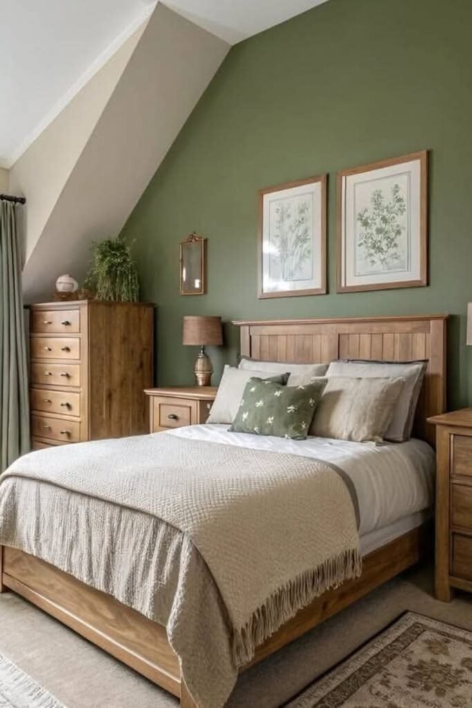
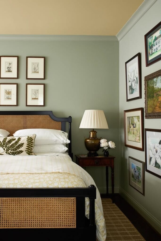
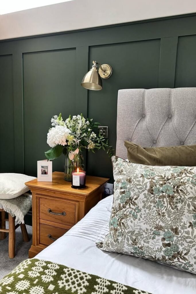
Classic Olive Elegance
When you choose olive green walls like this, you’ll notice your traditional bedroom instantly feels rich without going dark.
You can pair this shade beautifully with cane details, antique frames, and warm brass lighting.
If you love collected, layered spaces with character, you should see how this color elevates the room.
You can keep the ceiling light to avoid closing the room in, and you might repeat the green subtly in pillows or artwork so you feel the effect is intentional.
You should pick a muted olive, not bright green, for a timeless, grown-up look.
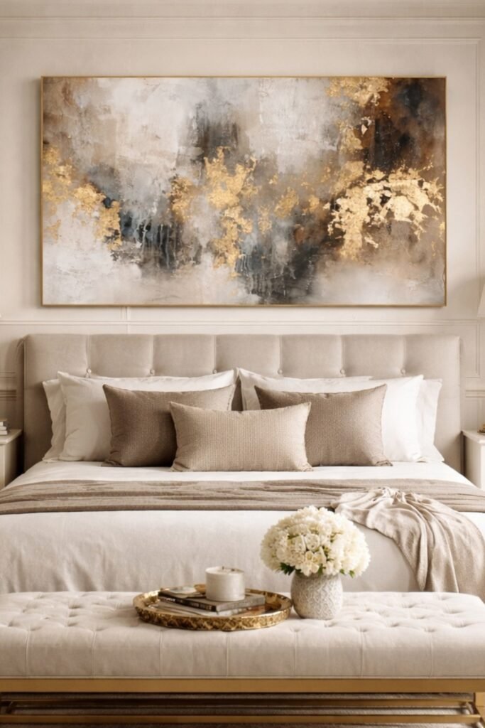
Elegant Beige Luxe
This proves that beige isn’t boring when you do it right. You’ll see how a soft warm beige wall creates a smooth backdrop for gold accents, layered neutrals, and tailored upholstery.
If you want a hotel-like feel without going gray, you can use it in master bedrooms.
You should stick to warm undertones and mix textures, velvet, linen, brushed brass, so you don’t feel the space is flat.
You can keep everything in the same color family to make your room feel polished and expensive.
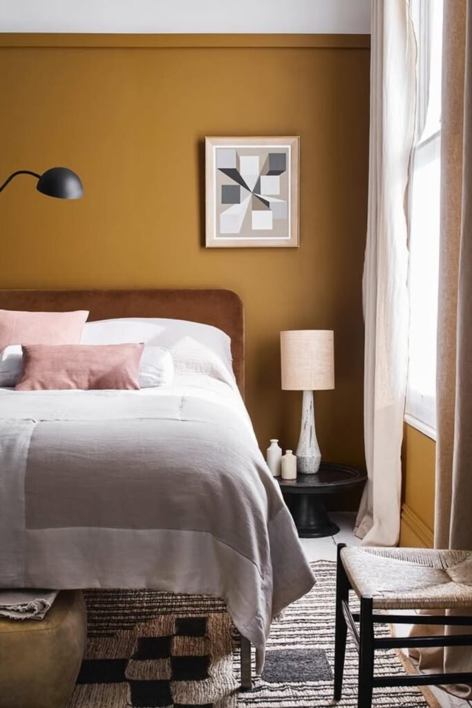
Mustard Accent Glow
When you paint a mustard wall, you’ll instantly notice your bedroom wakes up without feeling loud.
You should use this shade as a feature wall, especially behind your bed, so it feels bold but controlled.
You can pair it with soft beige bedding and warm neutrals to keep it balanced. You might add black accents for contrast so you don’t feel the color is too soft.
You should choose a muted mustard with brown undertones so your room looks rich in natural light and cozy at night.
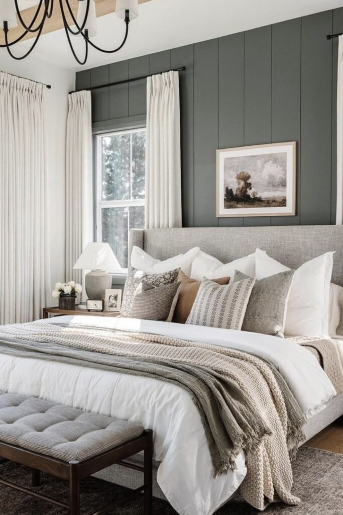
Moody Charcoal Green
This shade proves dark doesn’t have to mean gloomy. You’ll see a deep charcoal green instantly creates depth and makes light bedding pop.
You can use it in bedrooms where you want a modern, slightly dramatic feel without going black.
You should add panel molding before painting to give your wall structure and prevent it from feeling flat.
You can keep furniture light, beige, oak, or rattan, so you feel the room is balanced instead of heavy.
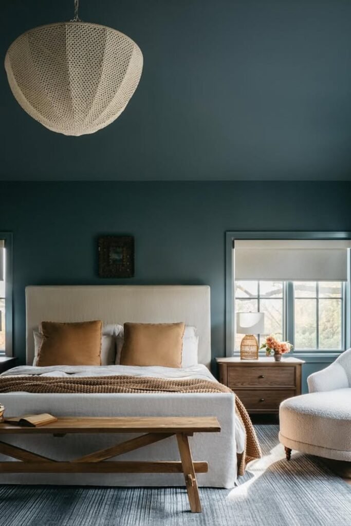
Teal Evening Mood
A rich teal like this shifts beautifully under warm lighting and makes your bedroom feel calm instead of cold.
You can use it in medium to large bedrooms where you can paint all walls for a cozy, cocoon effect.
You should balance the depth with cream upholstery and warm wood so you don’t feel the space is too intense.
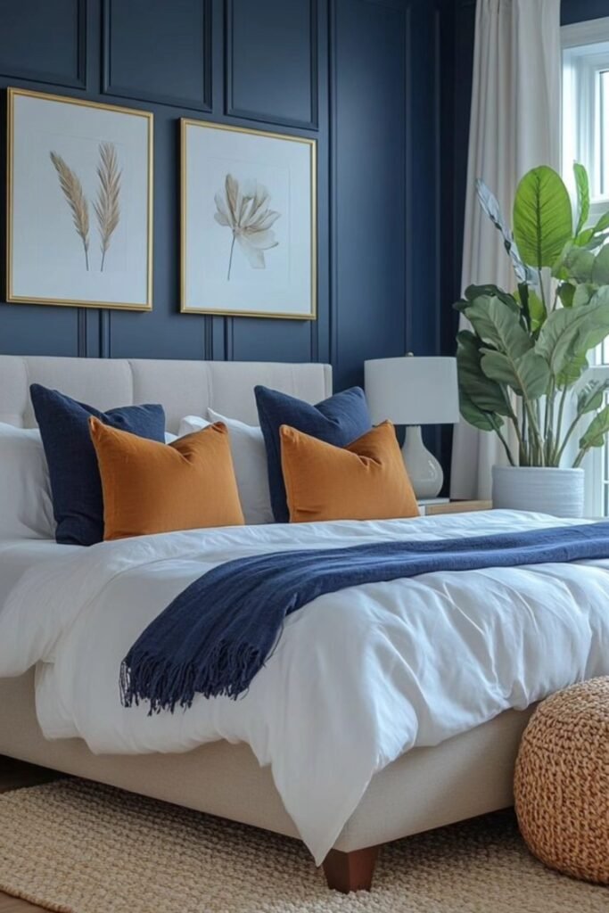
Navy Panel Drama
When you add panel molding and paint it navy, you’ll see everything changes. Instead of feeling flat, your wall gains structure and looks intentional.
This shade works especially well behind your bed, where you can frame the headboard and artwork.
You can pair it with crisp white bedding and warm accent pillows to keep your room balanced.
If you want bold but still classic, you should choose a navy with a slightly muted undertone so it doesn’t turn too bright in daylight.
Steel Blue Balance
You’ll see it’s a smart choice if you want color but still need the room to feel open.
You can paint the trim and door the same shade to make everything look seamless and intentional.
You should pair it with white bedding and soft gray patterns to keep your space fresh.
You might choose a muted blue with a hint of gray so you feel relaxed, not overwhelmed.
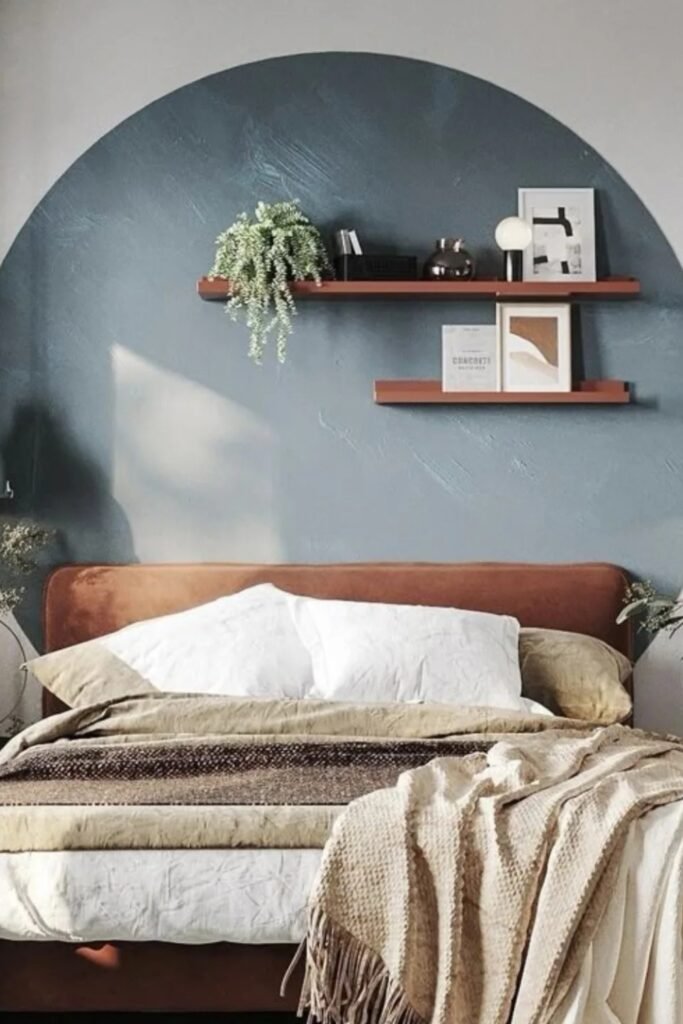
Statement Circle Accent
A full painted wall isn’t your only option and you’ll notice a circular blue-gray accent can define your bed area instantly.
You can use it in smaller bedrooms where you want impact without losing light. You should choose a muted, slightly dusty tone so it blends with your neutral bedding.
You can keep shelves simple and let the shape do the talking, you’ll see that’s what makes the idea feel intentional.
Terracotta Modern Mix
Terracotta doesn’t have to feel rustic, and you’ll see how warm clay walls look fresh when paired with clean white bedding and modern wood slats.
You can balance the color with contrast so it doesn’t feel heavy. You should use this shade in rooms with good daylight so it glows instead of darkening.
You can add one cool accent like a blue headboard, to balance the warmth and make your bedroom feel designed, not accidental.
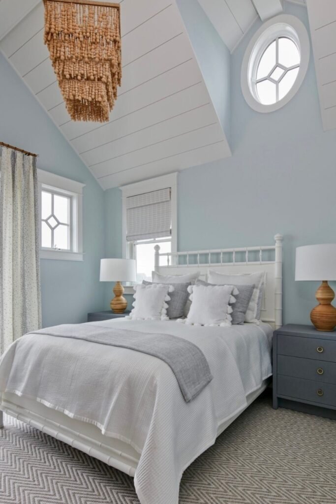
Airy Sky Blue
When you have high ceilings, light colors like this soft sky blue can keep your room feeling open while still adding personality.
You’ll notice it’s perfect if your bedroom has lots of windows or unique architectural details like angled ceilings.
You can pair it with crisp white trim to highlight the structure and add gray or natural wood for balance.
You should pick a pale blue with a touch of warmth so you feel calm instead of cold.
Deep Woodland Green
When you choose deep woodland green, you’ll notice your bedroom instantly feels grounded and secure.
You can pair the darker tone with warm wood nightstands and brass lighting to add depth. You might try using it as a half-wall panel so the color feels structured, not overwhelming.
You should keep your bedding light and your patterned cushions subtle so you don’t feel the richness is too heavy.
You should pick a green with a muted base so you feel it’s timeless instead of just trendy.
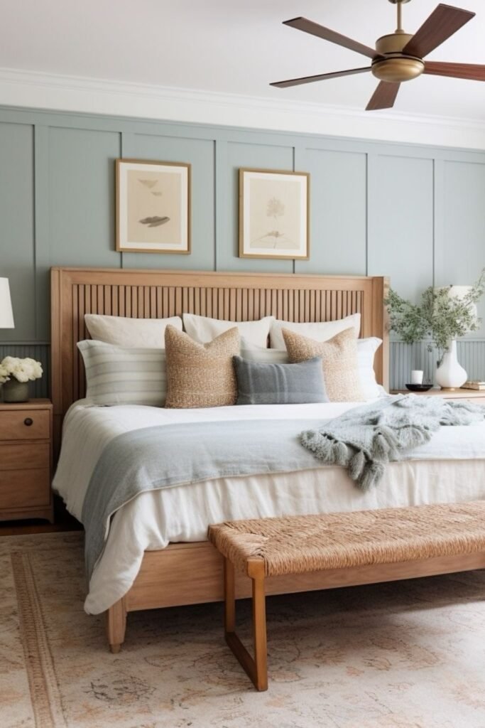
Soft Blue-Green Panels
This shade sits right between blue and green, and you’ll see how that makes it incredibly versatile. You can notice it feels fresh during the day but still calm at night.
You might paint the panel molding the same color to add depth without needing a darker tone. You can use it especially well with light oak furniture and layered neutral bedding.
You should pick a muted version, not a bright mint, so you feel the room is relaxed and grown-up instead of playful.
Slate Green Contrast
When you paint just the wall behind your bed in deep slate green, you’ll see your room gets instant focus.
You can keep the white side walls bright so the darker tone doesn’t shrink your space. You might use this approach in bedrooms with large windows where you still want depth.
You can pair it with layered neutral bedding and warm wood nightstands to soften the contrast. You should stick to a muted green so you feel the look is calm, not dramatic.
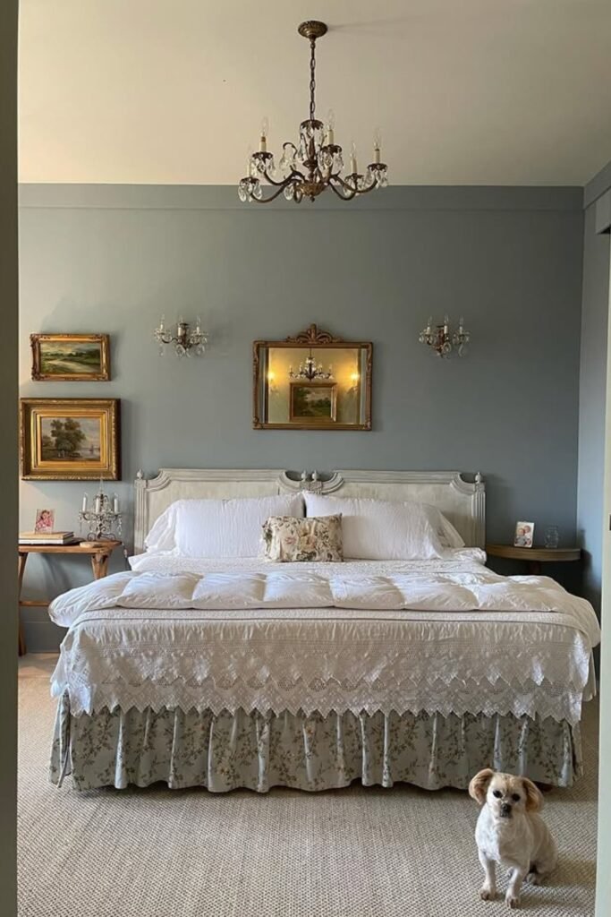
Vintage Blue Serenity
When you choose a soft dusty blue, you’ll notice your bedroom feels calm without looking modern or cold.
You can use it in traditional bedrooms with antique frames, chandeliers, and layered linens. You should pick a muted tone so your gold accents and cream fabrics shine without clashing.
If you love a collected, old-world feel, you can choose a blue with a gray undertone so you feel it looks gentle in daylight and warm under soft bulbs.
You should keep the ceiling light to maintain that airy balance.
FAQs
What bedroom paint colors make a small room look bigger?
When you’re working with a small bedroom, you’ll notice light colors with warm undertones usually work best.
You can use soft whites, creamy beige, pale greige, or muted blue-greens to reflect more light so you feel the walls are farther apart.
You should avoid very dark shades on all four walls unless you know your room gets strong natural light.
If you want depth without shrinking your space, you can try a darker accent wall behind your bed and keep the other walls light, you’ll see how it changes the whole feel of your room.
Should bedroom paint be warm or cool?
It really depends on the mood you want in your bedroom. You’ll notice warm tones like beige, terracotta, and soft olive make your space feel cozy and inviting, especially at night.
You can try cool tones like blue, sage, and gray if you want your room to feel fresh and calming during the day.
You should look at your lighting first, if your room faces north, you might need warmer shades, while bright sunny rooms can handle cooler colors without you feeling the space is cold.
You may like to read!
- 25 Taupe Bedroom Ideas
- 26 Yellow Bedroom Ideas
- 23 Eclectic Bedroom Ideas
- 24 No Headboard Ideas Bedroom
Ahtsham
Hi, my name is Ahtsham. I am a passionate writer and researcher. During my content writing journey, I worked with three different home decor content publishing websites. This topic caught my attention, prompting me to do in-depth research on interior decor. That’s why I started Styli Casa to share my insights and tips with my audience and inspire homeowners to make their home more special.