
70’s Kitchen Decor – 20 Ideas
A 70s kitchen can feel warm, bold, and full of personality, but one wrong mix of dark wood, orange, and busy pattern can make it feel dated fast.
Rich wood grains, earthy colors, geometric patterns, and playful vintage accents give this style its unmistakable warmth and energetic character.
In this article, you’ll learn how to bring that unmistakable 70s character into your kitchen in a way that still feels fresh, practical, and easy to live with.
Let’s jump in!
What Is The 70s Design Style Called?
The 70s design style is usually called retro, 1970s interior design, or mid-century modern with bohemian influences, depending on the look you want.
If you want the classic version, think warm wood, avocado green, mustard, burnt orange, bold patterns, chrome, and plenty of texture.
Some 70s kitchens lean more boho with plants and rattan, while others feel sleek with glossy surfaces, globe lights, and space-age shapes.
You don’t need every retro element in one room, because too many strong colors and patterns can make the kitchen feel heavy instead of intentional.
Start with one clear 70s feature, then build around it with warmer neutrals, natural materials, and simple finishes that keep the space easy to live with.
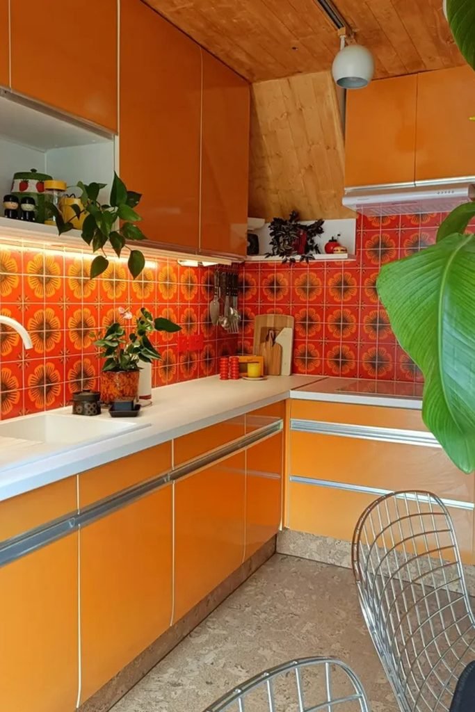
Orange Layers
If you want orange to lead the room, repeat it on cabinets and backsplash, then break the color with pale counters.
Keep the wood ceiling and wall panels warm rather than dark, because too much brown can make a compact kitchen feel closed.
Finish with leafy plants and simple white fixtures so the strong palette feels lived in, fresh, and easier to balance.
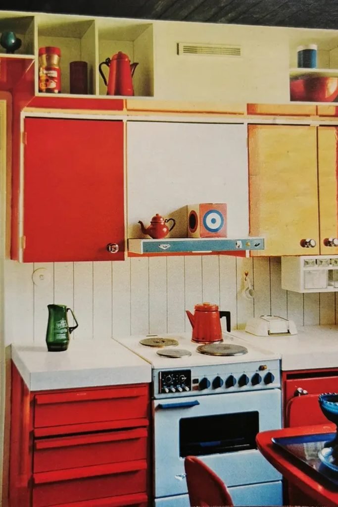
Primary Blocks
A red and cream scheme works best when you treat each cabinet block separately instead of flooding every surface with one color.
Use the stronger shade on lower drawers and selected uppers, then let pale doors and counters give your eyes somewhere to rest.
Open cubbies are useful here because small ceramics, kettles, or glassware can add period character without needing another permanent finish.
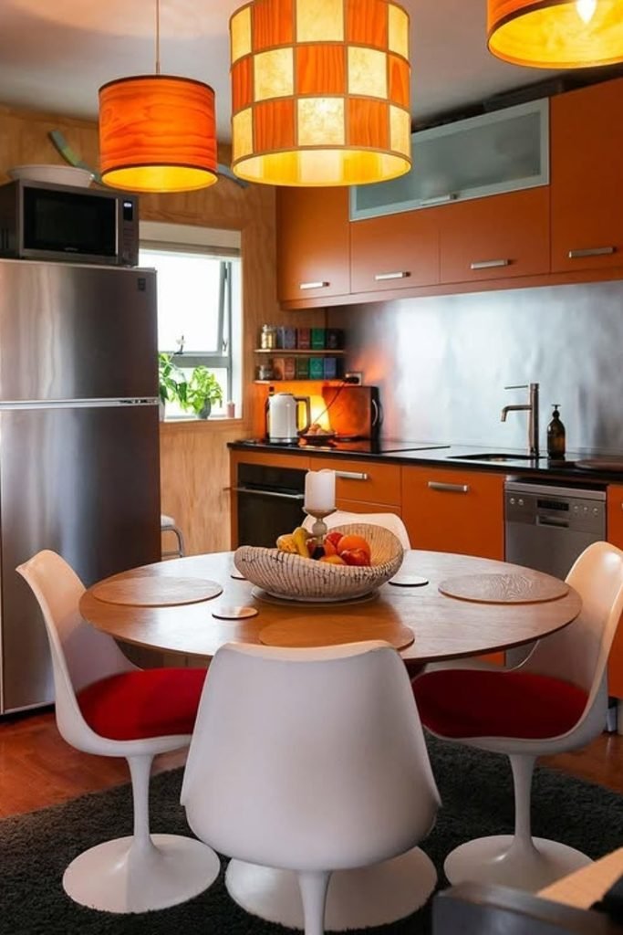
Retro Dining
For a cleaner 70s look, pair burnt orange cabinetry with stainless steel so the room feels retro without becoming overly nostalgic.
A round table and pedestal chairs soften all those straight cabinet lines, making this approach especially useful in open kitchen dining areas.
Repeat orange above the table through pendant lighting, but keep floors and appliances neutral so the color stays focused rather than busy.
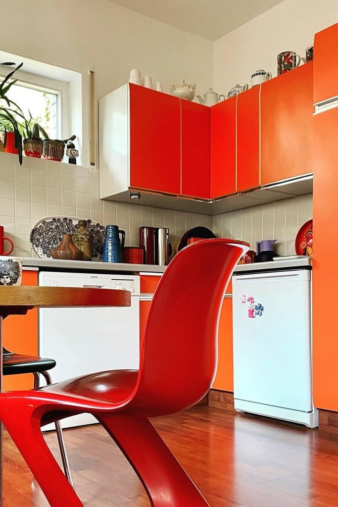
White Balance
If bright orange cabinets feel risky, use white tile and white appliances to cut the intensity before adding any other strong accents.
This works especially well in smaller kitchens because the pale background reflects light while orange still gives the room unmistakable seventies energy.
Bring in red through one chair, lamp, or countertop accessory, then stop there so the palette stays playful instead of chaotic.
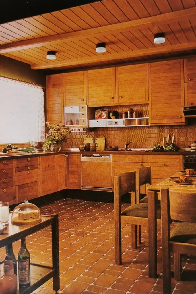
Wood Envelope
If your kitchen already has plenty of wood, keep the palette tight and let one warm finish carry walls, cabinets, and ceiling.
Break up all that brown with a lighter window area, simple hardware, and a darker counter that gives the cabinetry some edge.
Terracotta flooring works especially well here because it deepens the earthy mood without introducing another color that competes with the timber.
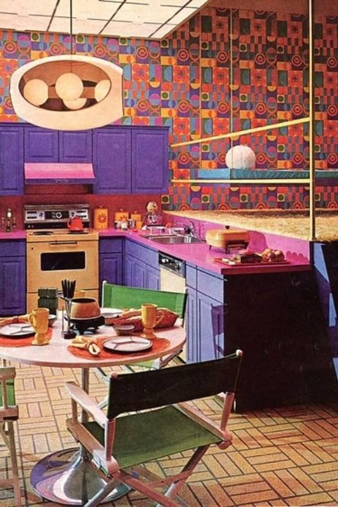
Psychedelic Contrast
Bold wallpaper needs a clear partner, so pull one strong color from the print and use it across the cabinetry.
Keep the countertop in a second related shade instead of adding another pattern, otherwise the room can tip from playful into visual noise.
This approach suits larger or well-lit kitchens best, where saturated purple, pink, and geometric walls have enough breathing room to feel intentional.
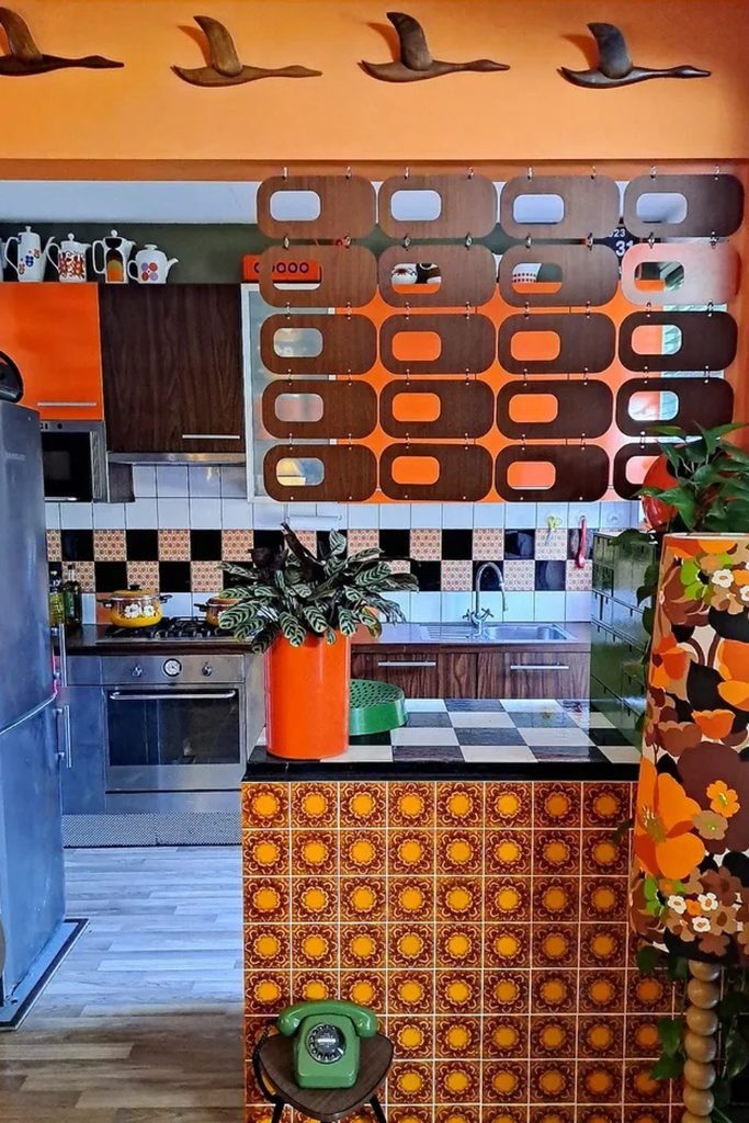
Pattern Zones
When several retro patterns are calling for attention, give each one a separate zone instead of scattering prints across every surface.
Use patterned tile on one island or backsplash, then let dark wood cabinets and plain flooring calm everything around it.
An orange wall can tie the mix together, while plants and simple stainless appliances stop the room from feeling like a themed set.
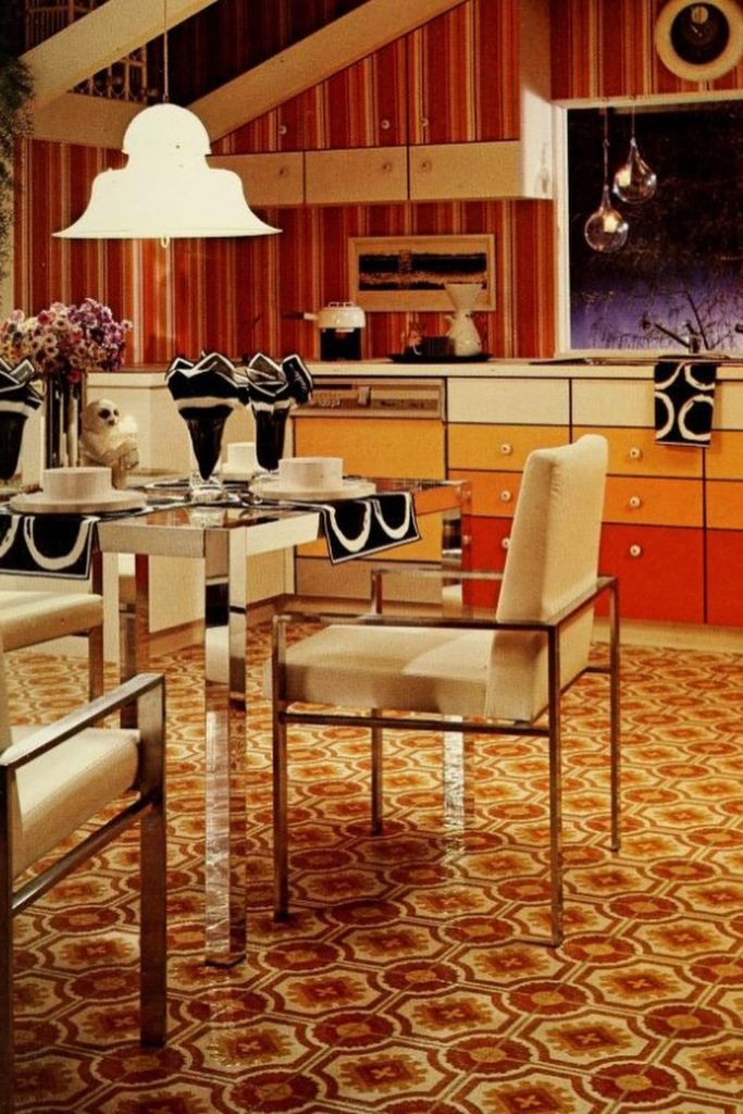
Graphic Layers
If you love full-on 70s color, repeat the same orange family in cabinets, wallpaper, and flooring instead of mixing unrelated brights.
Chrome furniture and cream upholstery give the eye a cooler break, which helps layered patterns feel designed rather than simply crowded.
Save this look for dining kitchens with good floor space, because bold carpet, striped walls, and graduated cabinet colors all need distance.
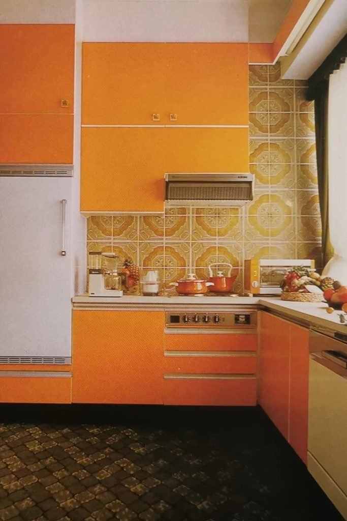
Orange Geometry
If your kitchen has strong orange cabinetry, let pale appliances and counters interrupt the color before the room starts feeling too heavy.
A patterned backsplash can stay warm and retro, but choose softer yellow tones so it supports the cabinets instead of competing.
Dark flooring anchors this palette well, especially when a large window brings enough daylight to keep all those warm shades balanced.
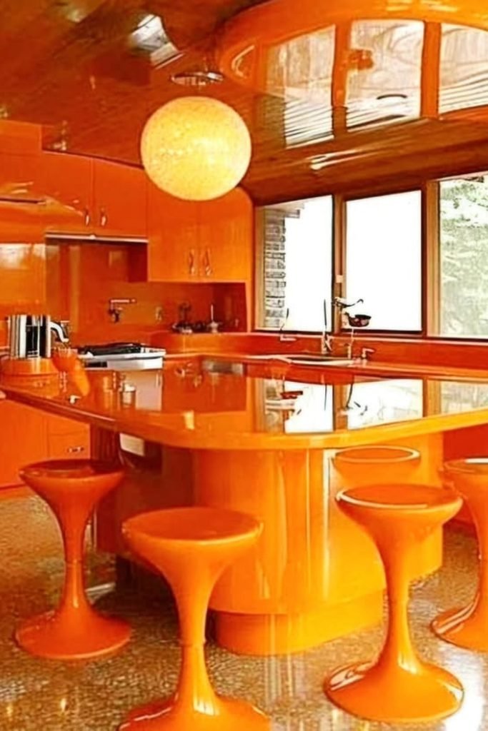
Glossy Orange
Going fully orange works best when the surfaces are glossy, because reflected light keeps a single bold color from looking flat.
Use the same shade on cabinets, island, and stools, then rely on big windows and warm wood to soften it.
A round island and tulip stools push the retro shape language further, making this approach ideal for open kitchens with generous floor space.
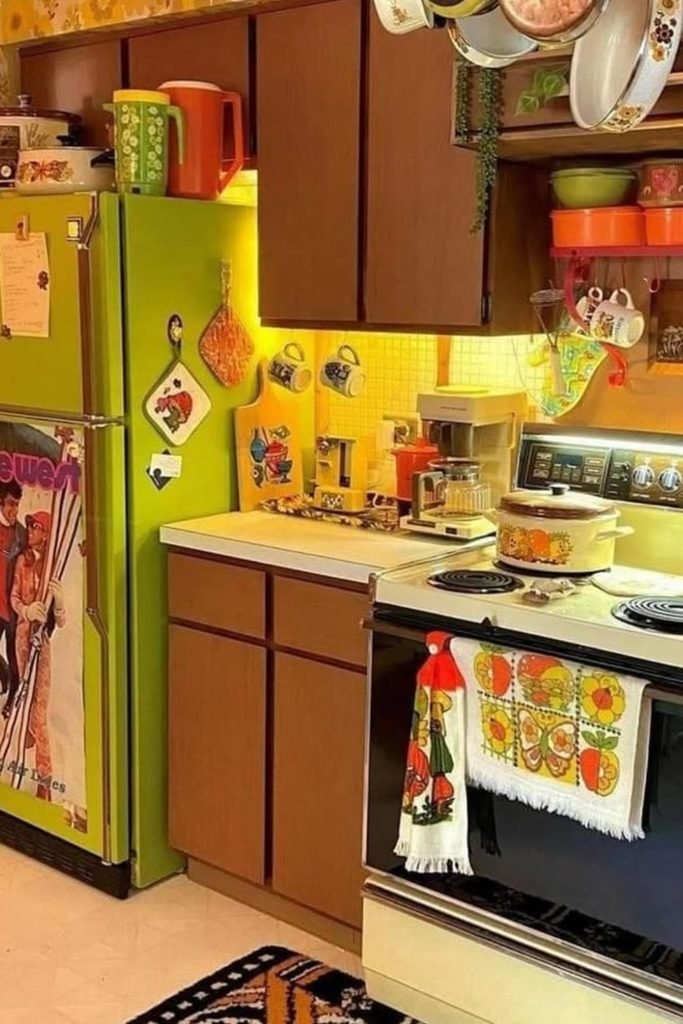
Avocado Pop
A bright avocado refrigerator can become the whole retro statement, which is useful when your existing brown cabinets are still worth keeping.
Warm yellow walls bridge the gap between green appliances and dark wood, so the color mix feels connected instead of random.
Keep smaller accessories in orange, olive, and cream, but repeat only a few shades so open shelves do not become cluttered.
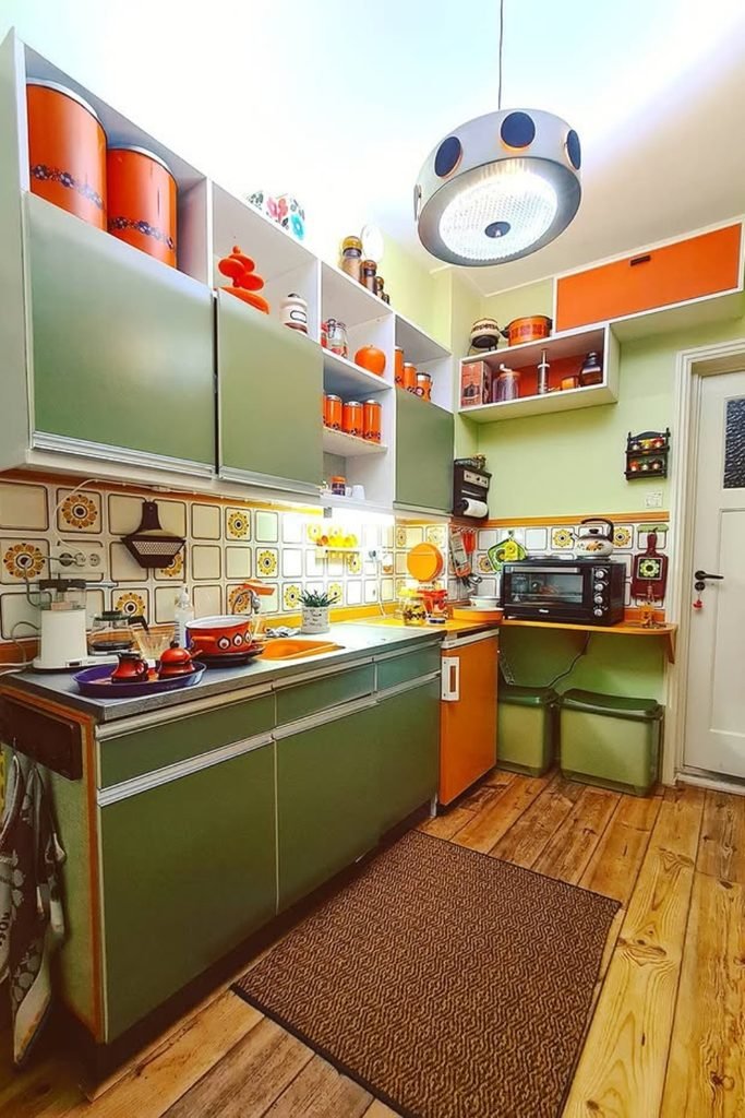
Olive Galley
Small kitchens handle 70s color better when one muted shade covers most cabinets and brighter orange appears only in smaller sections.
Use a patterned backsplash to connect those colors, then keep the floor natural so the narrow room still has visual breathing space.
A space-age pendant adds the period feel overhead without stealing counter room, which makes this setup especially practical for compact galley layouts.
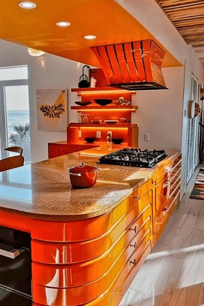
Curved Island
A curved orange island can carry most of the 70s mood, especially when the surrounding walls and flooring stay noticeably quieter.
Choose a glossy finish if natural light reaches the room, because reflections stop such a saturated color from feeling visually heavy.
Rounded stools and a sculptural hood continue the shape language, while a stone counter gives you one practical surface that feels calmer.
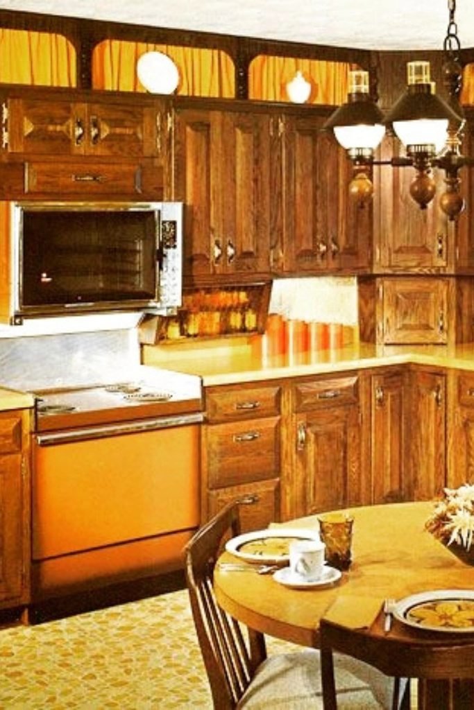
Warm Wood
Dark wood cabinets already give you strong 70s character, so you only need one orange appliance or panel to sharpen the look.
Keep countertops in a warm cream or muted yellow, which connects the timber and orange without adding another attention-grabbing finish.
This combination suits older kitchens especially well, because you can preserve solid cabinetry and update color through smaller, easier changes.
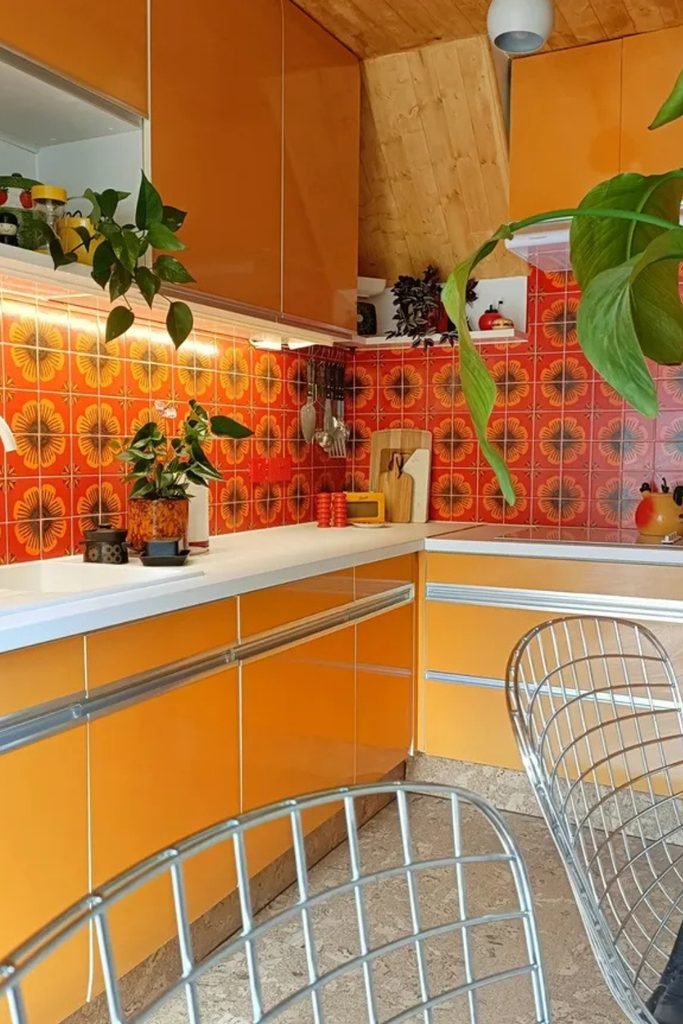
Floral Backsplash
When orange cabinets already dominate, a floral backsplash works best when its pattern repeats the same orange rather than introducing new colors.
Use white counters and a pale sink around that pattern, because the blank surfaces give your eyes a necessary place to rest.
Large green plants can soften the hard cabinetry lines and bring in another period detail without adding more permanent color.
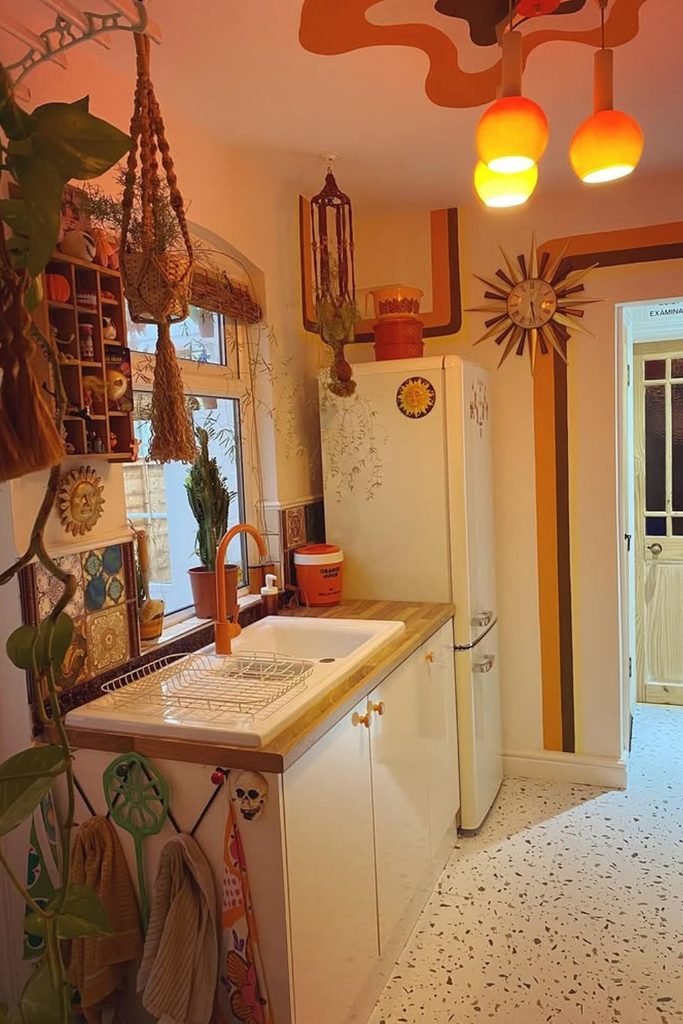
Retro Stripes
If you want 70s character without replacing cabinets, painted wall stripes can create the look while leaving the working surfaces simple.
Pick two warm shades such as rust and brown, then repeat one of them in pendant lights or small accessories nearby.
Cream cabinetry, terrazzo flooring, and hanging plants keep the room light, making this approach especially useful in narrow or rental kitchens.
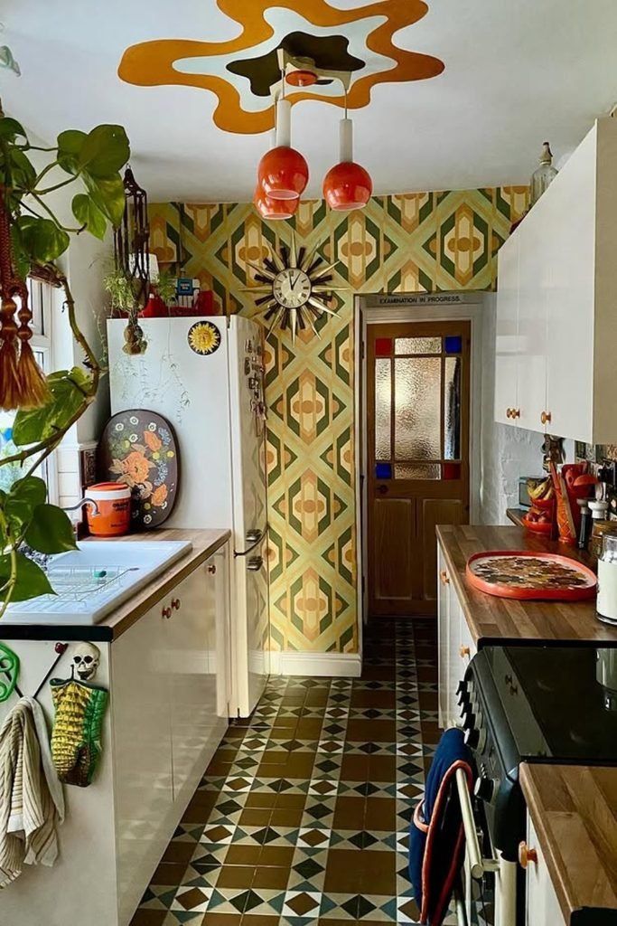
Patterned Galley
In a narrow galley, let pattern travel vertically on one wall while keeping the long cabinet runs light and simple.
Choose a floor pattern that repeats the same olive and cream tones, so the room feels connected instead of visually chopped.
Finish with orange lighting and trailing plants near the window, which add 70s character without taking precious counter space away.
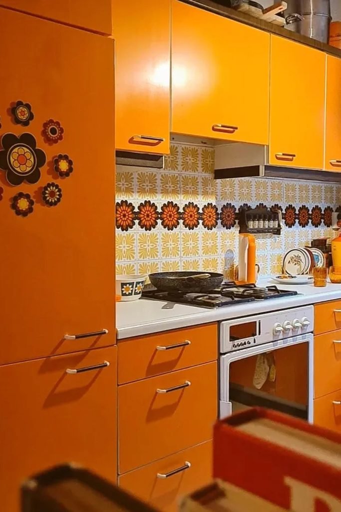
Floral Band
When orange cabinetry already fills most of the room, use a floral backsplash band to add detail without adding another dominant color.
Keep the worktop pale and the hardware slim, because both details give saturated cabinet fronts enough breathing room to stay readable.
Repeat the backsplash flowers through one or two small accessories, then stop before the kitchen starts feeling more themed than lived in.
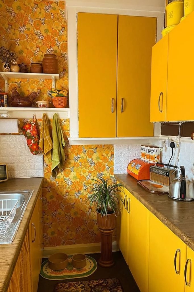
Mustard Florals
Mustard cabinets can handle busy floral wallpaper when the countertop stays brown and grounded, giving both strong finishes a shared warm base.
Use the wallpaper on selected wall sections rather than everywhere, especially in a small kitchen where every surface already sits close together.
Add cream tile around the sink and stove, which gives practical splash protection while breaking up the yellow before it becomes overwhelming.
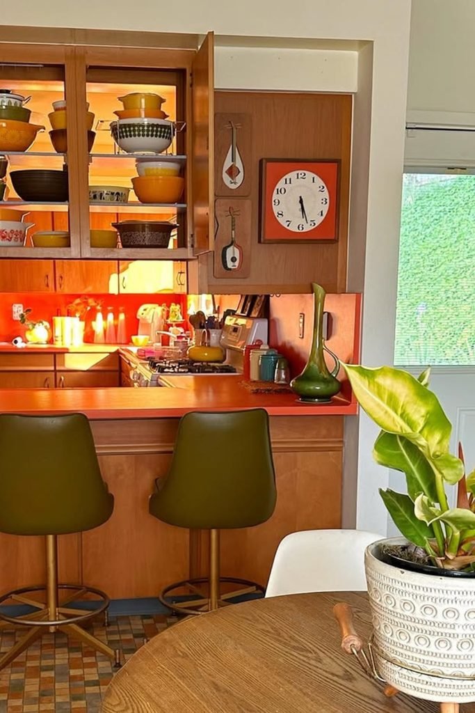
Breakfast Bar
If your wood kitchen feels too flat, an orange breakfast bar can add a clear focal point without touching the original cabinetry.
Choose olive stools beside it instead of matching orange seats, because the contrast keeps the dining area from becoming one solid block.
A lit display cabinet above the bar is useful for vintage bowls and cookware, turning everyday storage into part of the 70s scheme.
FAQs
How do you modernize a 70s kitchen without losing its character?
Keep one or two original features, such as wood cabinets or Formica, then update lighting, hardware, and surrounding finishes first.
If the room feels dark, add warmer white walls, brighter task lighting, or a lighter backsplash before replacing everything at once.
That approach keeps the 70s personality visible while making the kitchen easier to use, brighter, and less visually heavy overall.
What colors make a 70s kitchen feel modern?
Start with one earthy shade like olive, mustard, rust, or burnt orange, then pair it with cream or warm wood.
Avoid using every classic 70s color together, because too many saturated tones can quickly make a small kitchen feel crowded and dated.
For a softer look, let neutral counters and floors carry more space, then bring stronger color through cabinets, lighting, or accessories.
