
22 Two Tone Kitchen Cabinet Ideas for 2026
This article may contain affiliate links: read full affiliate disclosure.
You’re probably drawn to two-tone cabinets because you want your kitchen to look more interesting, but you also worry about getting it wrong.
You keep thinking about whether the colors might clash with your floors, whether the darker shade might make your kitchen feel tight.
You are not wrong to question these things. And that’s exactly why you need clear guidance.
In this article, you will learn how you can avoid those mistakes and follow the simple rules that help you create a two-tone kitchen that looks balanced, intentional, and truly high-end.
Are Two-Tone Kitchen Cabinets A Good Idea?
Yes, two-tone cabinets can work beautifully if you use them the right way.
When you want more depth without changing your layout, two-tone cabinets give you exactly that.
You can make your small kitchen feel taller, you can break up those heavy walls of one color, and you can add personality without committing everywhere.
But they turn into a bad idea when you pick colors that clash with your floors, when you have very low light, or when you choose shades just because they’re trending.
If you choose colors that actually suit your space, your two-tone cabinets will look intentional, modern, and surprisingly high-end.
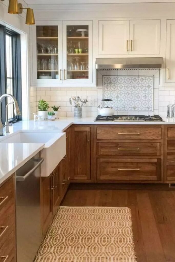
Warm Wood Balance
You can use this pairing in any kitchen where you want warmth without heaviness.
You can keep your upper cabinets in a warm wood tone, then paint your base units in a soft cream so both shades blend with your backsplash.
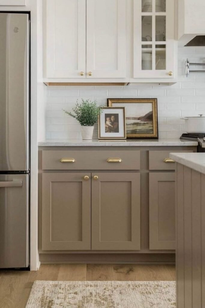
Soft Taupe Base
You can use this setup in small or tight layouts where you want color without weighing down the room.
It adds soft under-cabinet lighting, and you will see how instantly warm the mix becomes.
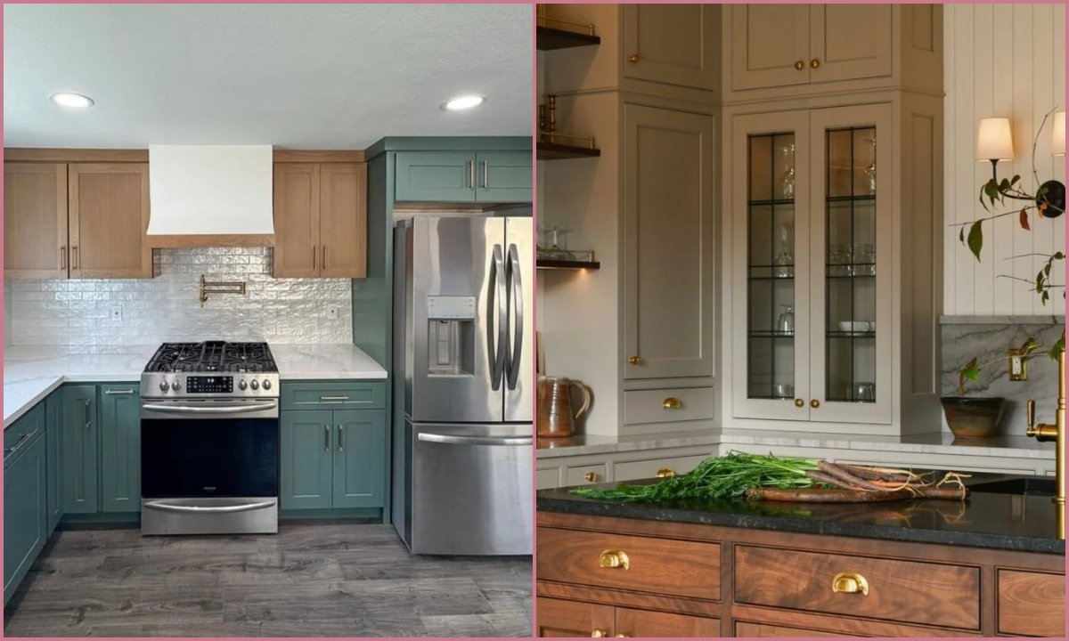
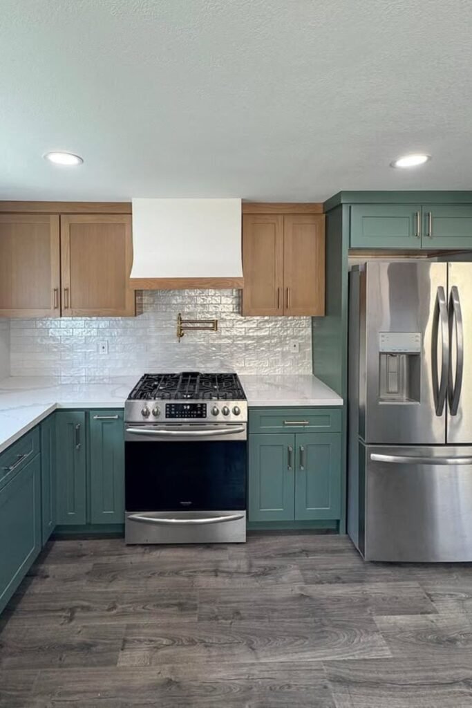
Teal Lowers Contrast
This combo works well in rooms with darker floors because your teal adds energy while your wood keeps everything grounded.
You can choose a muted, earthy teal, pair it with simple brushed hardware, and keep your counters light so your color has room to breathe.
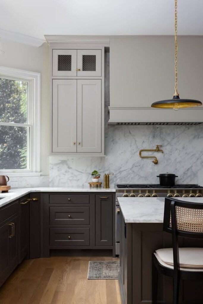
Charcoal Base Depth
The light uppers keep your room open while the darker base cabinets frame your marble beautifully.
You can recreate this look by choosing a soft greige or warm white for your uppers, then anchoring your lowers in a deep charcoal.
Charcoal Island Focus
A strong charcoal island works well when the rest of your kitchen stays bright and light.
This setup is perfect when you want contrast without darkening the whole room.
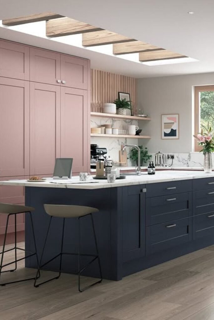
Blush Wall Accent
The blush pantry cabinets bring a soft, unexpected twist, and they work because you keep your island grounded in a deep navy.
This mix is great for open kitchens where you want personality without overwhelming the space.
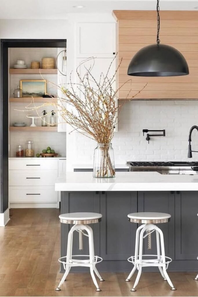
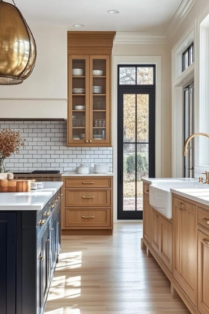
Wood Island Anchor
When you want warmth without repainting everything, a wood island becomes your best move.
You keep your perimeter cabinets crisp white, and you let the island carry that natural wood tone.
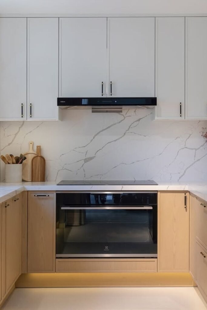
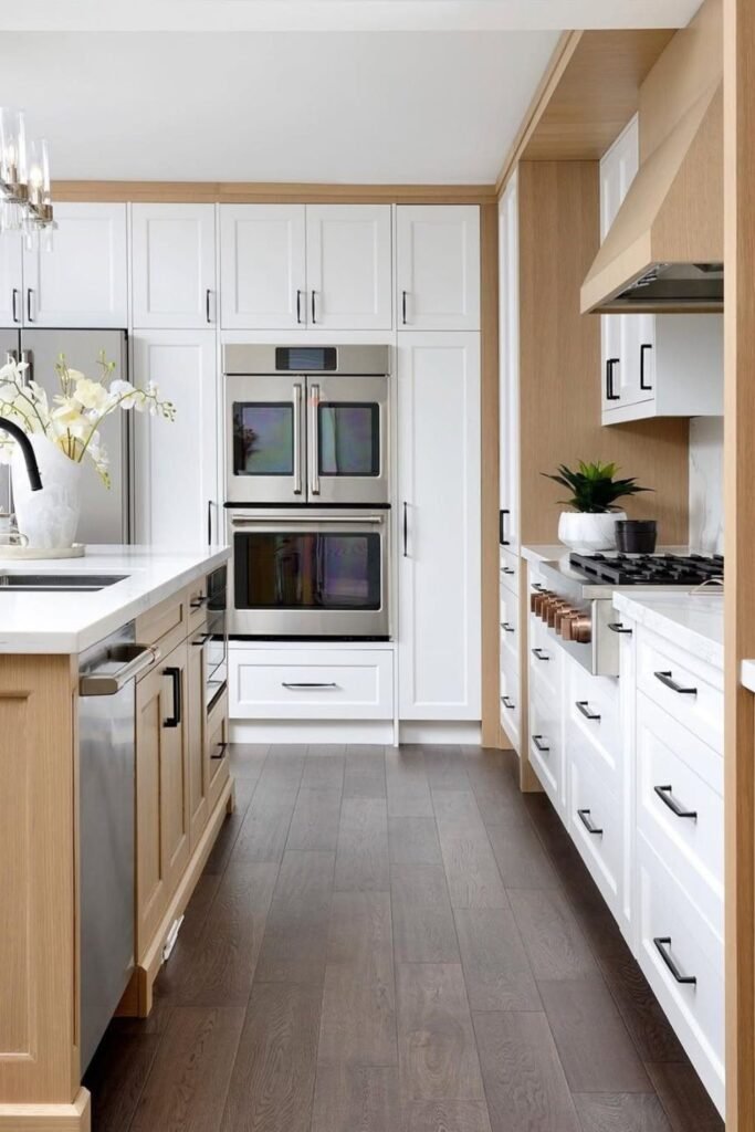
Light Wood Base
If you love a modern look but still want natural warmth, you get it instantly with soft wood lowers.
You stick to pale oak or birch and pair it with a simple white backsplash. You finish with slim black hardware to sharpen the whole setup.
Walnut Island Depth
A darker tone works in your favor when you choose a rich walnut island.
You go for a deep walnut stain and pair it with calming greige, finishing everything with brass hardware.
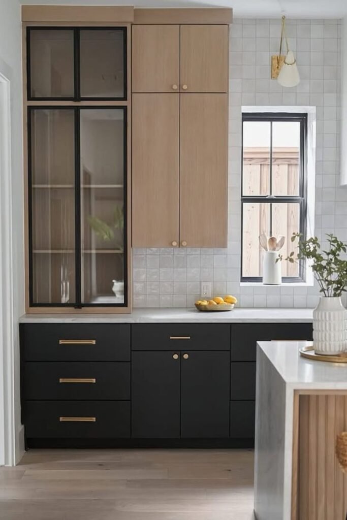
Black Accent Framing
You apply black on the island legs or select uppers, and you keep the rest warm white so the space stays open.
If your kitchen is large, this contrast looks even better. You bring in gold hardware to blend both tones and soften the edges.
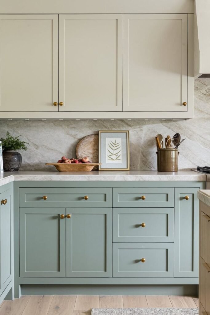
Soft Greige Lowers
Let the white uppers stay light and allow the greige to ground the lower half.
You pick a warm-toned greige and pair it with brushed brass hardware. You get a soft two-tone look that feels balanced, not bold.
Taupe Base Calm
A subtle taupe shade gives your kitchen stability, especially when you already have warm wood floors.
You choose a warm taupe paint, pair it with simple uppers, and use brass hardware to pull everything together.
Navy Island Anchor
When you want one bold color to anchor your kitchen, you let deep navy take over the island while your warm oak cabinets balance everything out.
You can keep the perimeter light or mid-tone wood so the navy feels intentional, not overwhelming.
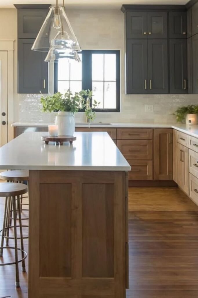
Charcoal Upper Contrast
If you’re aiming for depth without darkening the whole space, you use charcoal on the uppers and let warm wood sit below.
You can take advantage of natural light so the darker top cabinets feel lifted instead of heavy.
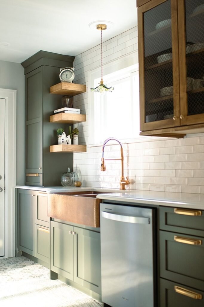
Olive Green Base
You can bring in muted olive lowers and let your warm wood uppers keep the space from feeling too heavy.
You can strike that perfect balance in a narrow kitchen where dark uppers wouldn’t work.
White Upper Lightness
Because you want brightness without losing depth, you rely on white uppers while your warm wood bases add grounding.
You can finish with brass hardware so both finishes blend rather than look like separate zones.
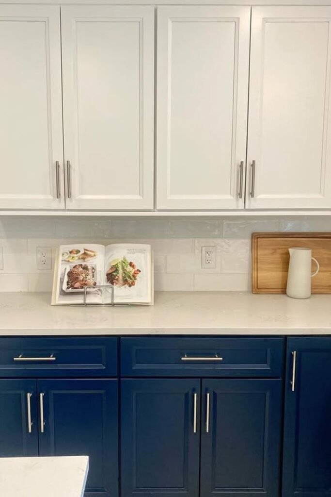
Navy Base Pop
For you, if crisp contrast is the goal, deep navy lowers give you color without overwhelming the room.
It adds brushed nickel or chrome hardware to match the cooler undertones and keep the palette fresh.
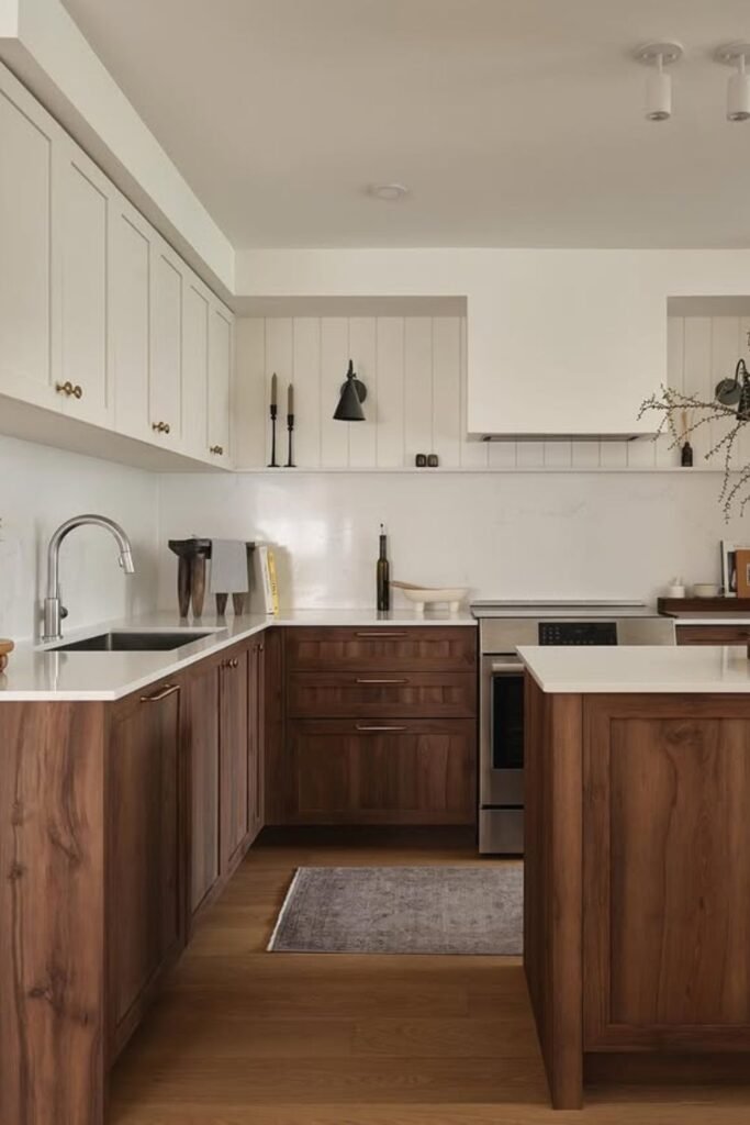
Walnut Base Warmth
The moment you choose walnut lowers, you instantly warm up your kitchen while keeping your uppers light and clean.
You can keep the uppers soft white or cream and let walnut carry all the richness on the lower half.
Balanced Light Wood Framing
When you surround your white cabinets with warm oak framing, you create a look that feels clean, open, and still inviting.
You can make a narrow kitchen feel wider because the white lifts the space while the wood adds dimension without clutter.
Black Base With Light Wood Lift
You can place the black on the bottom so the room feels anchored, then use light wood up top to keep things airy.
When you finish it off with brass hardware and a subtle Zelig backsplash, you tie both tones together so nothing feels disconnected.
Soft Sage With Warm Cream
Whenever you choose quiet sage for the lowers and warm cream for the uppers, you give your kitchen a calm, collected personality.
You can keep the room bright with cream, and you let the muted green give just the right amount of color, especially in smaller spaces.
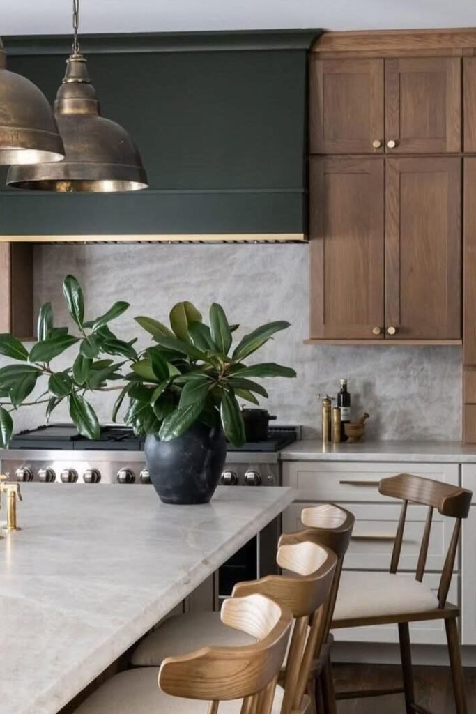
Earthy Wood With Deep Green
The moment you add a deep green hood, you ground your kitchen with richness while your earthy wood cabinets keep everything warm instead of heavy.
You get an elevated look without going full dark, which works especially well in homes that want color with sophistication.
FAQs
Can two-tone cabinets make a small kitchen look bigger?
You will get the best effect if you place the lighter color on top and keep the darker shade on the bottom.
You will notice this instantly draws the eye upward and makes your room feel more open.
If you use glossy or softly reflective finishes on your upper cabinets, you can bounce light around and add even more height to your space.
What colors work best together for a two-tone kitchen?
You will find the safest combos are the ones that pair a light neutral with a medium or deep tone like white and navy, cream and sage, or wood and black.
You can trust these mixes to stay timeless and balanced.
If you want something bolder, you should start with a muted base and bring the brighter shade into just one area, like your island or lowers, so you keep control over the whole look.
You may like to read!