
This article may contain affiliate links: read full affiliate disclosure.
Every time you search for 1910 kitchen colors, you run into the same frustrating loop.
You see one image with bright white walls, then you scroll and you find dark wood everywhere, and then you land on a kitchen that looks very modern but still tells you it’s authentic.
Before you know it, you’re confused and second-guessing what you should actually trust. When that happens, you might feel like you’re missing something important.
In this article, you are going to see which colors were really used in kitchens around 1910.
By the time you finish reading, you can leave the guesswork behind and feel confident about your choices.
Let’s jump in!
What Were The Colors Of Kitchens In 1910?
If you expect one single color palette, this is exactly where you usually get stuck.
When you look at kitchens from 1910, you have to remember that you’re not dealing with trends the way you do today.
Back then, you chose colors for one simple reason: they worked. If a color helped you keep the space looking cleaner, brighter, and easier to live with, you kept it.
If a shade made you notice dirt faster or made you feel like the room was too dark, you quietly let it go.
Once you start thinking the way they did, the color choices of a 1910 kitchen stop feeling confusing to you and suddenly begin to make complete sense.
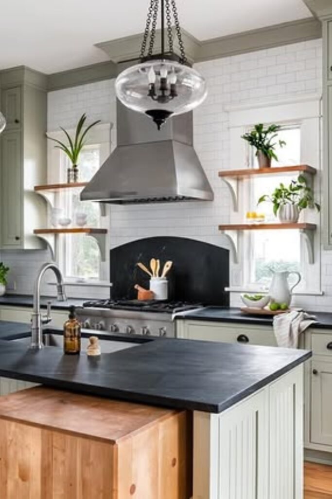
Dark Tile Backdrop
When you look at dark green tile in a 1910 kitchen, you’re not looking at decoration, you’re looking at a solution.
You used dark tile because you needed something that could handle splashes, stains, and daily mess without showing everything.
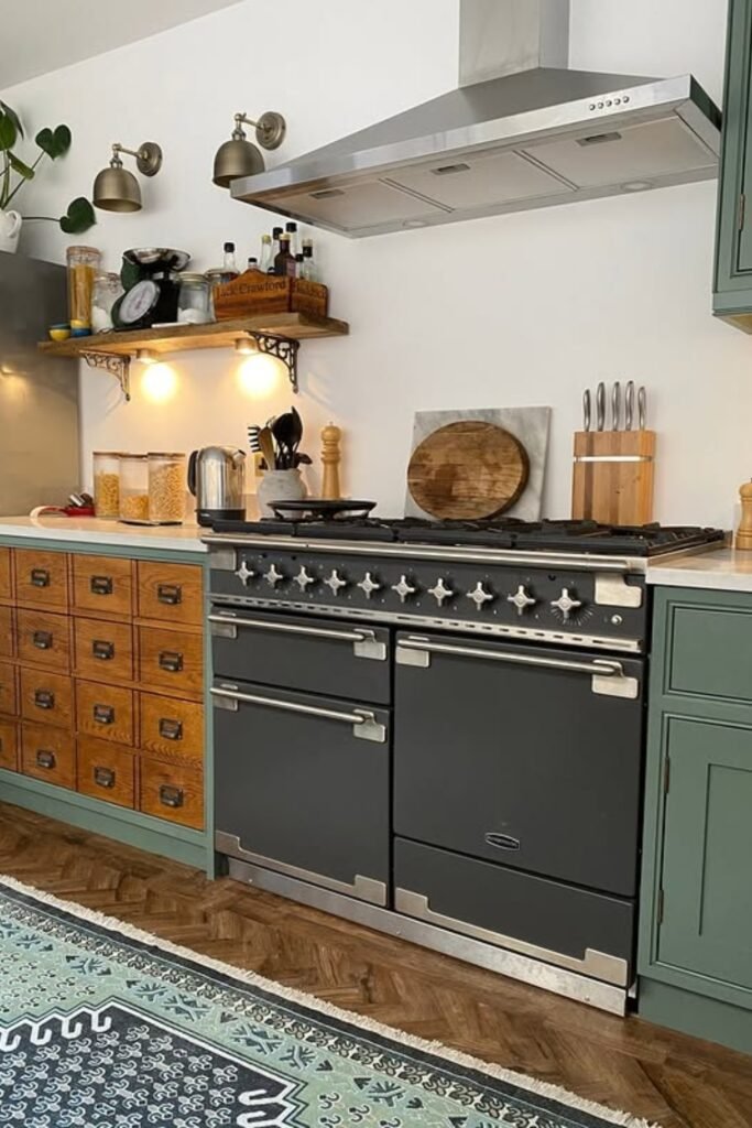
Furniture-Style Storage
If you want to recreate this feeling, you can mix one freestanding or furniture-inspired piece with your main cabinets.
This works especially well for you in medium-sized kitchens where you want warmth without going fully traditional.
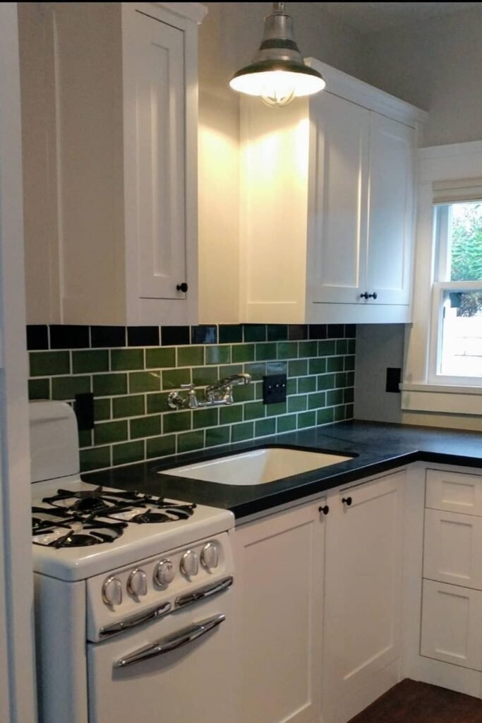
White And Green
When you use white cabinets, you quickly realize you need something to ground them and that’s where green tile comes in.
Early kitchens relied on this combination because it balanced the idea of cleanliness with everyday practicality.
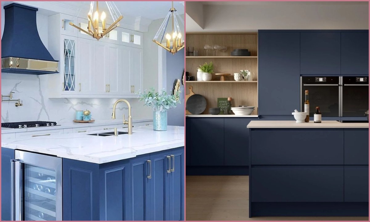
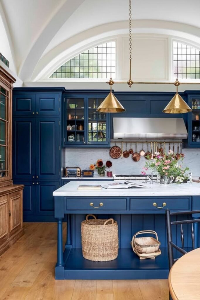
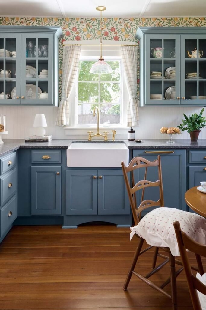
Deep Blue Anchors
When you see deep blue in early kitchens, you’re not seeing a style choice, you’re seeing control.
If you want this to work today, you can place blue on lower cabinets or an island and keep your walls and counters lighter so the room doesn’t feel closed in.
Warm Wood Walls
When kitchens had to survive daily wear, wood-paneled walls made sense to you. They handled heat, knocks, and constant use far better than plaster ever could.
If you want this look now, you should choose narrow beadboard or flat wood panels in a warm mid-tone instead of a dark stain.
White Above Wood
You used this balance to make kitchens feel clean without feeling cold or sterile.
To recreate it, you can use a warm white on upper cabinets or walls, then bring in natural wood below.
This approach works beautifully for you in long or narrow kitchens where you want light without losing character.

Formal Worktable Focus
When you look back at early kitchens, you’ll notice the worktable mattered more than a fixed island.
If you want to recreate that idea, you can use a solid wood island or table with visible grain and simple detailing.

Soft Blue Balance
If you want color without pulling focus, soft blue is where you land. Early kitchens relied on calm blues to keep things orderly and cool, especially in busy homes.
To recreate this, you should choose a muted blue with warmth rather than a sharp modern tone. This works well for you in kitchens that open into dining spaces.
Light Wood Contrast
When you want a kitchen to feel open but not cold, light wood helps you get there.
Early kitchens used natural wood to soften white surfaces and make long work areas feel more human.
If you want to use this idea, you can pair pale wood on an island or seating with simple white cabinetry around it.

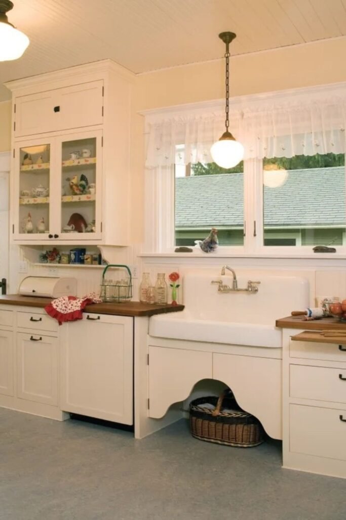
Clean Cream Utility
If you want to recreate this, you should lean toward a warm cream on walls and cabinets instead of pure white.
Early kitchens used off-white tones to stay bright without looking stark, while still showing dirt quickly enough to stay sanitary.
Pastel Accent Caution
Early kitchens avoided playful pastels because they showed stains too easily and didn’t hold up to daily use.
You can keep it limited to a small detail or appliance, and ground everything else in whites, woods, or muted greens so you don’t lose the historical feel.

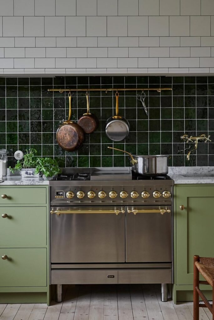
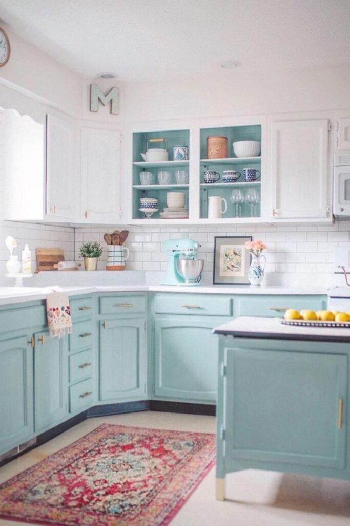
Pale Green Practicality
You used it to avoid starkness while still hiding everyday wear. To use this idea today, you should choose a soft green with warmth rather than a gray undertone.
You can pair it with white tile and visible cookware so the space feels useful, not styled. This works especially well for you if cooking happens daily.
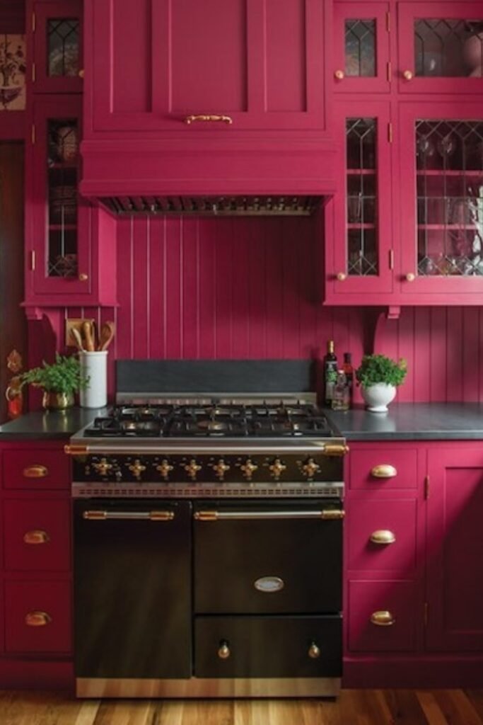
Bold Color Warning
When you look at deep reds like this, you can’t deny they make a strong statement, but you should know they weren’t common in 1910 kitchens.
If you’re drawn to this look, you can still use it, just sparingly. You might place it on one feature area or a furniture-style piece.
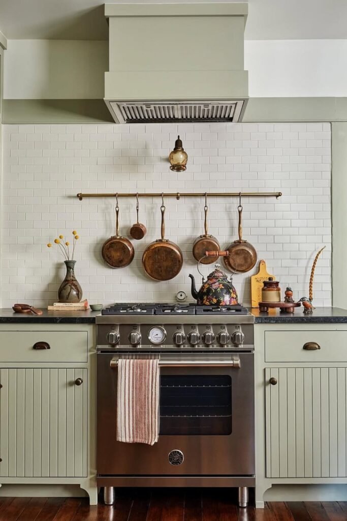
Soft Sage Layers
Early kitchens leaned on shades like this because they softened light without asking for attention.
If you want to recreate it, you can use sage on your cabinetry and keep your counters and tile simple so the color can do the work for you.
Mint Tone Limits
If you like mint, you should pull it back by choosing a grayer version and pairing it with warm whites, wood accents, and simple hardware.
This works best for you in light-filled kitchens where the color stays calm instead of turning playful.
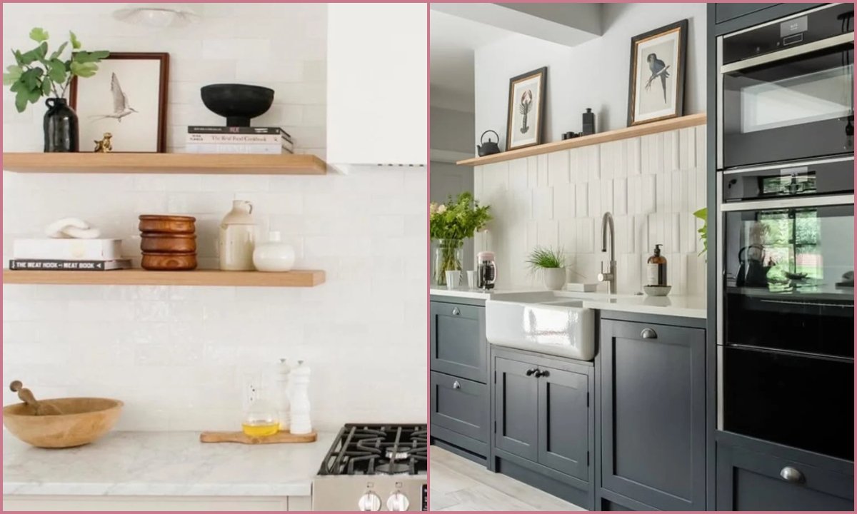
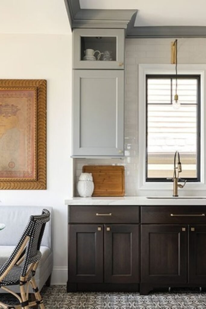
Dark Base Contrast
They helped you hide scuffs, splashes, and constant use, while lighter uppers kept the room from feeling closed in.
If you want to recreate this today, you should keep the dark tone grounded, espresso or deep brown will work better for you than black.
FAQs
Did kitchens in 1910 really use white cabinets?
Yes, you did see white in kitchens back then, just not the bright white you’re used to seeing today.
In 1910, you leaned toward warm whites and creamy off-whites because they helped you spot dirt quickly, which made keeping the space clean easier.
Pure, glossy white finishes didn’t exist yet, and even if they had, they would have felt too harsh to live with.
If you want this look now, you can choose a softer white and stick with a matte or satin finish so it feels right to you, not stark.
Were colorful kitchens common in 1910 homes?
You leaned toward greens, muted blues, and natural wood tones because they handled daily wear better and helped your kitchen stay practical.
When you tried stronger or playful colors, you quickly saw stains and aging show up, which is why you usually avoided them in working spaces.
Once you look at it this way, you can see how every color choice was really about making life easier for you.
You may like to read!
- 20 Mixed Metals Kitchen
- 21 Walnut Kitchen Cabinets
- 16 Beige Kitchen Cabinets
- 19 Greige Kitchen Cabinet
Ahtsham
Hi, my name is Ahtsham. I am a passionate writer and researcher. During my content writing journey, I worked with three different home decor content publishing websites. This topic caught my attention, prompting me to do in-depth research on interior decor. That’s why I started Styli Casa to share my insights and tips with my audience and inspire homeowners to make their home more special.