
21 Pink & Green Bathroom Ideas
Pink and green can feel soft, fresh, bold, or even a little vintage depending on the shades you bring together.
The right mix can make a bathroom feel more layered and full of character without needing too many extra details.
In this article, you’ll find pink and green bathroom ideas that show different ways to use both colors with confidence.
Let’s jump in!
Do Green & Pink Go Together?
Yes, green and pink work well together because green helps balance the warmth and softness of pink without making the room feel flat.
If you want a calm bathroom, pair blush pink with sage or muted green instead of using two bright shades at the same time.
For a stronger look, use pale pink with forest, olive, or emerald green so one color grounds the other.
You can also keep one color dominant and use the second on the vanity, tile, walls, or smaller details to control the overall balance.
Before choosing paint or tile, compare both shades in your bathroom lighting because undertones can change how they look next to each other.
Arched Contrast
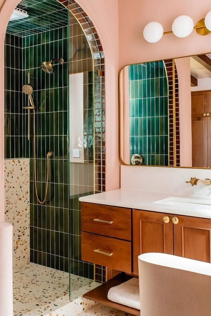
Let deep green shower tile do the heavy lifting when soft pink walls need stronger contrast without making the bathroom feel overly sweet.
An arched opening makes this pairing feel more architectural, while warm wood and brass stop the darker green from becoming too cold.
Use terrazzo or another light patterned floor underneath so both colors stay connected without adding another large block of solid color.
Coral Balance
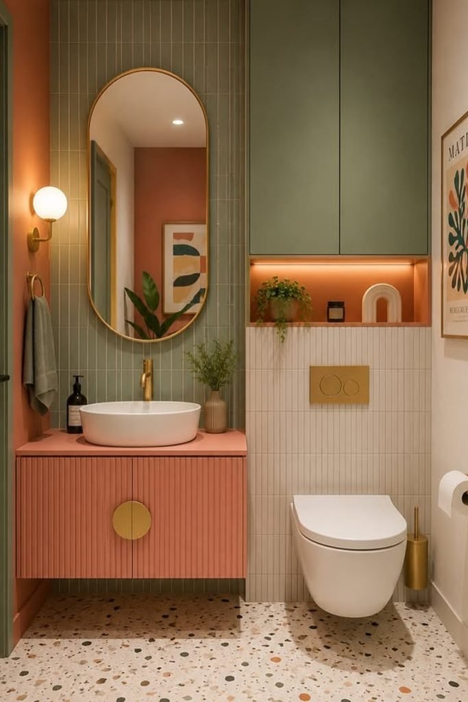
A coral pink vanity works well in a compact bathroom when muted green cabinetry and tile carry more visual weight around it.
Keep the sink, toilet, and lower wall finish light so the stronger colors feel planned rather than squeezed into a small footprint.
Warm brass details and a soft peach niche can repeat the pink side quietly, giving the whole scheme better balance and rhythm.
Playful Vanity
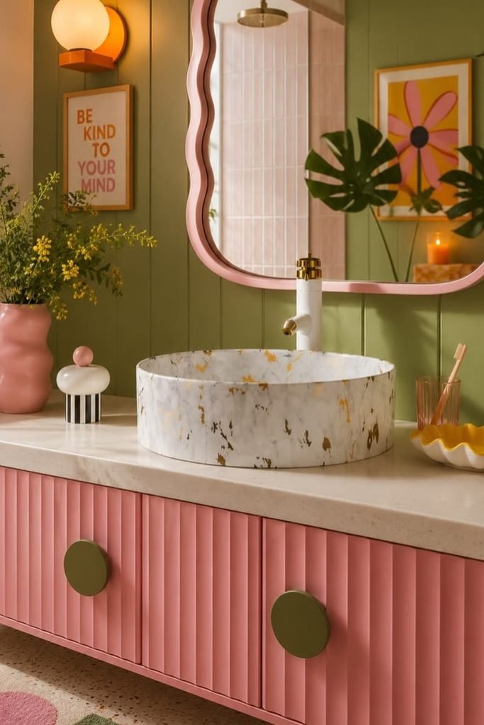
If you want pink to feel playful without taking over, put it on the vanity and let olive green cover the larger walls.
A wavy mirror, bold art, and small accessories can push the room toward a fun retro look without changing permanent bathroom surfaces.
Choose a pale stone counter and basin to break up the stronger colors, especially when both the vanity and walls already feel saturated.
Muted Shower
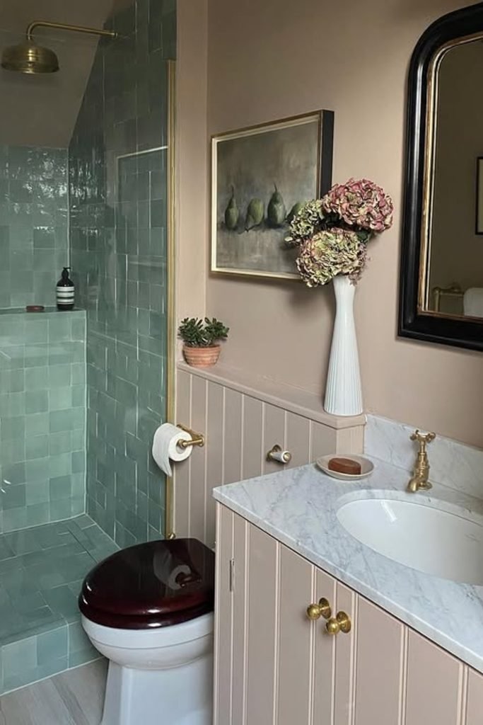
Soft green shower tile can calm a warm pink-beige bathroom, especially when you want color without turning the space into a statement room.
Carry the pink through painted walls and cabinetry instead of more tile, which keeps the palette softer and easier to live with.
Brass taps and a dark-framed mirror add enough definition here, so the muted green does not disappear beside the warmer neutral pink.
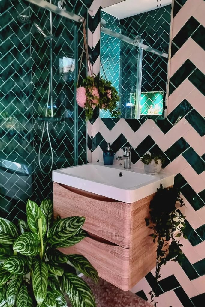
Chevron Walls
Turn pink and green into the main pattern when a small bathroom needs energy instead of another safe neutral wall treatment.
Keep the shower mostly green while repeating pink outside it, so the zigzag pattern feels connected rather than visually scattered.
A pale vanity and leafy plants soften the sharp geometry, which helps this bold idea work better in compact bathrooms.
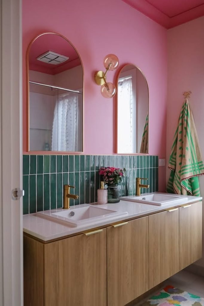
Tiled Divide
Use a narrow band of green tile when you want pink walls to stay dominant but still need a clear color contrast.
Stopping the tile at mirror height keeps the room lighter, while the long wood vanity adds warmth between both strong colors.
This layout suits shared bathrooms especially well because you get practical splash protection without covering every wall in hard surfaces.
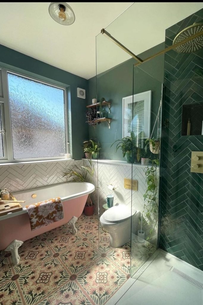
Pink Soak
Let a pink freestanding tub become the soft focal point when deep green walls and shower tile already carry plenty of weight.
Patterned flooring can bridge both colors here, especially if it repeats muted pink and green instead of introducing unrelated shades.
Keep the remaining fixtures white or brass so the room feels layered and collected without competing with the bath and shower.
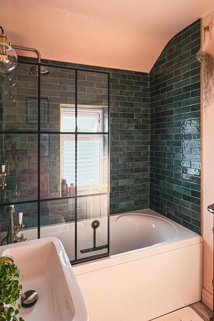
Dark Surround
Wrap the bath area in dark green tile when soft peachy pink walls need a stronger edge without losing their warmth.
Taking the tile high around the tub creates a defined wet zone, while the pink ceiling keeps the upper room connected.
Choose a black framed screen only if you want extra definition; softer metal finishes will make the same palette feel gentler.
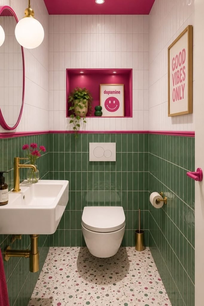
Bright Contrast
Use deep green tile on the lower walls when bright pink accents need a calmer base that still feels lively and intentional.
Keeping the upper walls white gives the stronger colors room to breathe, especially in a narrow powder room with limited natural light.
Repeat the pink through trim, towels, or a recessed niche so the ceiling color looks connected instead of randomly added.
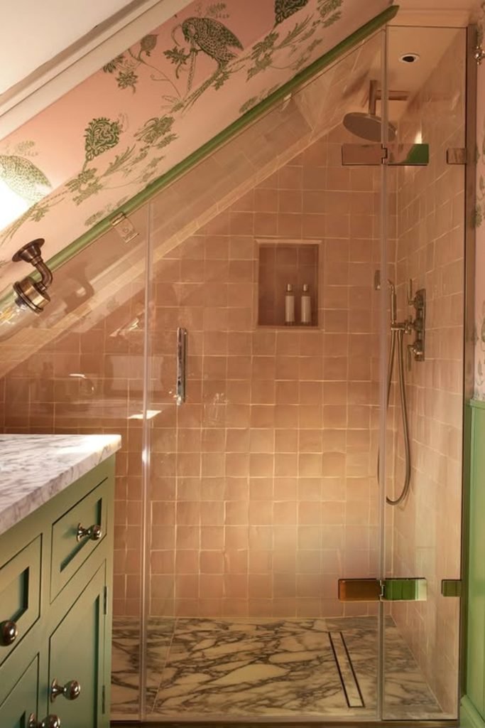
Sloped Charm
An awkward sloped ceiling can become the best feature when you carry patterned pink wallpaper across it instead of trying to hide it.
Pair that softness with a muted green vanity and trim, which gives the room structure without making the tight layout feel heavy.
Keep the shower tile pale and simple so the wallpaper and cabinetry stay readable, especially where angled walls already create visual movement.
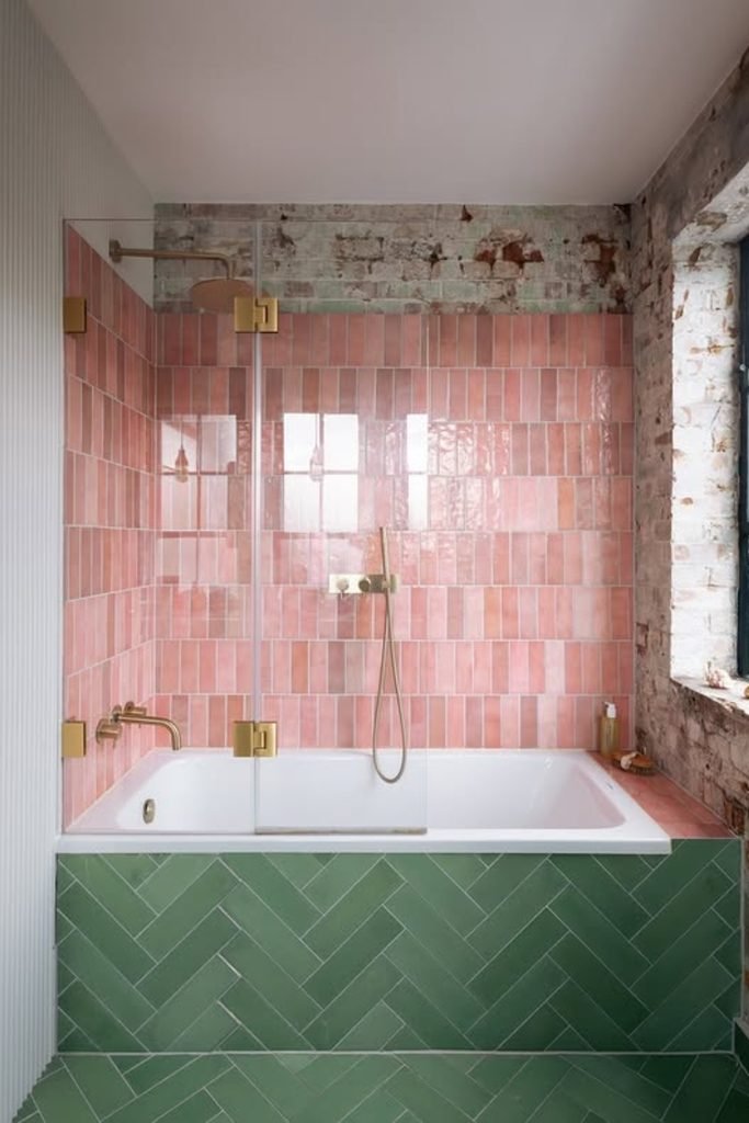
Split Tile
Separate the two colors by zone when you want both pink and green to feel bold without fighting across the same surface.
Run pink tile around the bath, then switch to green herringbone below so each color gets a clear job and boundary.
Exposed brick and plain white fixtures keep this stronger palette grounded, making the idea especially useful in industrial or converted spaces.
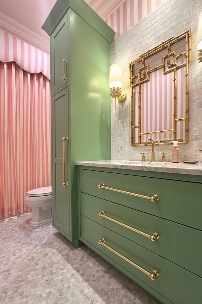
Striped Softness
If solid pink walls feel too flat, use narrow stripes instead and let green cabinetry provide the heavier block of color.
Repeating the stripe on curtains or fabric panels creates continuity, while the vanity and tall storage keep the bathroom practical.
Choose warm brass hardware and a quiet stone floor so the pattern stays playful without turning the whole room overly decorative.
Ceiling Garden
Let the ceiling carry the pattern when deep green walls and a pink tub already give the bathroom plenty of color.
A botanical print above eye level adds movement without crowding the walls, which keeps this traditional setup from feeling too heavy.
Use white subway tile through the middle to separate both stronger colors and give the patterned floor some breathing room.
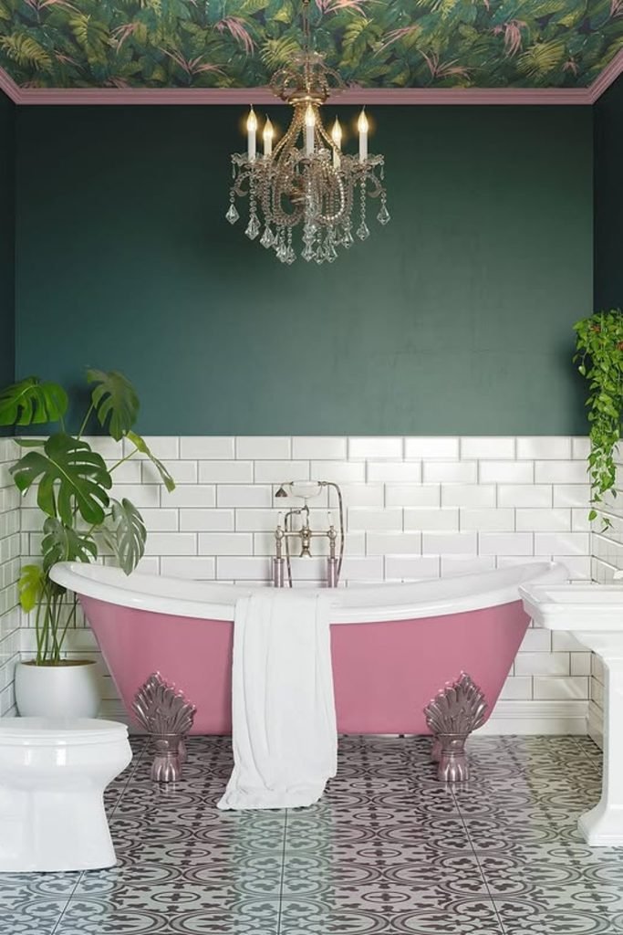
Gallery Green
Dark green tile can handle a lot of pink above it, especially when you want a bathroom that feels bold but grounded.
Keep the green around the wet zones and lower walls, then let soft pink take over the brighter upper surfaces.
Black trim, monochrome flooring, and leafy plants sharpen the scheme, so the room feels collected rather than overly coordinated throughout.
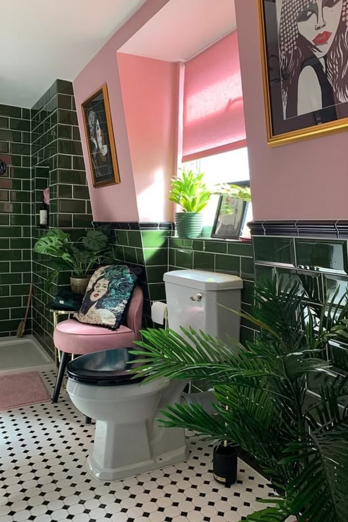
Soft Layers
Muted green works beautifully when pink appears only in towels and small textiles, giving you color without changing permanent bathroom finishes.
Choose warm wood, woven lighting, and creamy stone beside the green so the room feels relaxed instead of overly pastel.
This approach suits larger bathrooms especially well because natural materials fill the space while the pink stays soft and occasional.
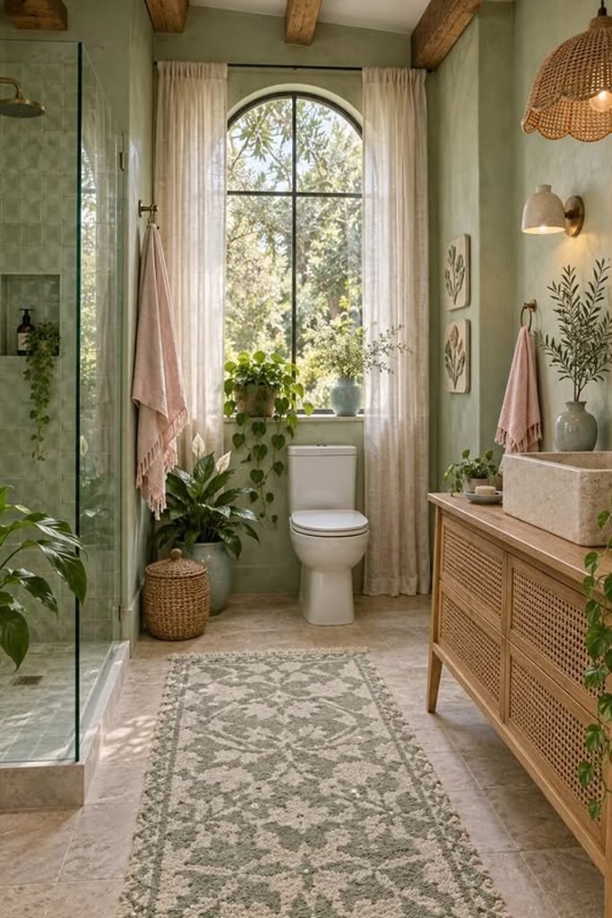
Glass Divider
Use a glass-block shower divider when you want green to feel architectural without closing off a compact bathroom with another solid wall.
Repeat the same muted green on the shower tile, then bring pink forward through the vanity and large botanical mural.
Warm lighting under the shelf softens both colors and helps the textured glass catch light instead of looking cold or bulky.
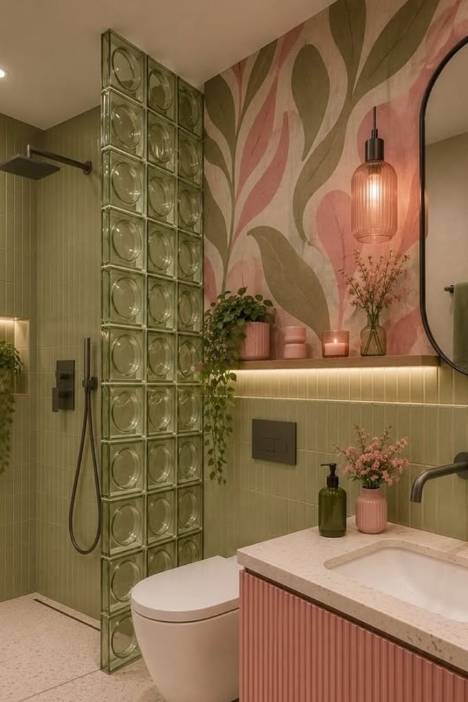
Layered Color
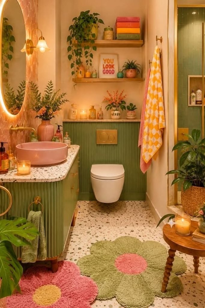
Mix a pink basin with olive cabinetry when you want both colors visible without covering every wall in another strong finish.
Keep the shower green too, then use terrazzo flooring to connect the palette while giving the smaller room some breathing space.
Flower-shaped rugs and warm wood can add personality here, but repeat existing pinks and greens so extra accents still feel intentional.
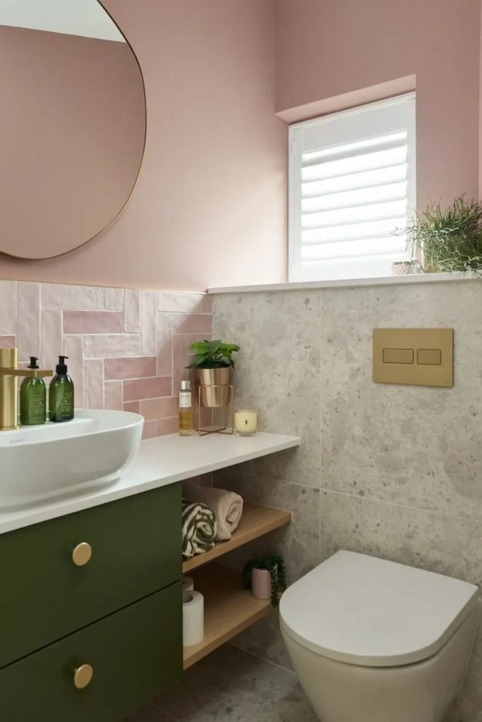
Quiet Contrast
Choose an olive vanity against pale pink walls when you want a calm bathroom that still has clear color contrast.
Keep the backsplash softly pink instead of matching the cabinet, which stops the two colors from feeling too separated visually.
Light stone around the toilet and counter gives this scheme enough neutral space, making it especially useful for smaller bathrooms.
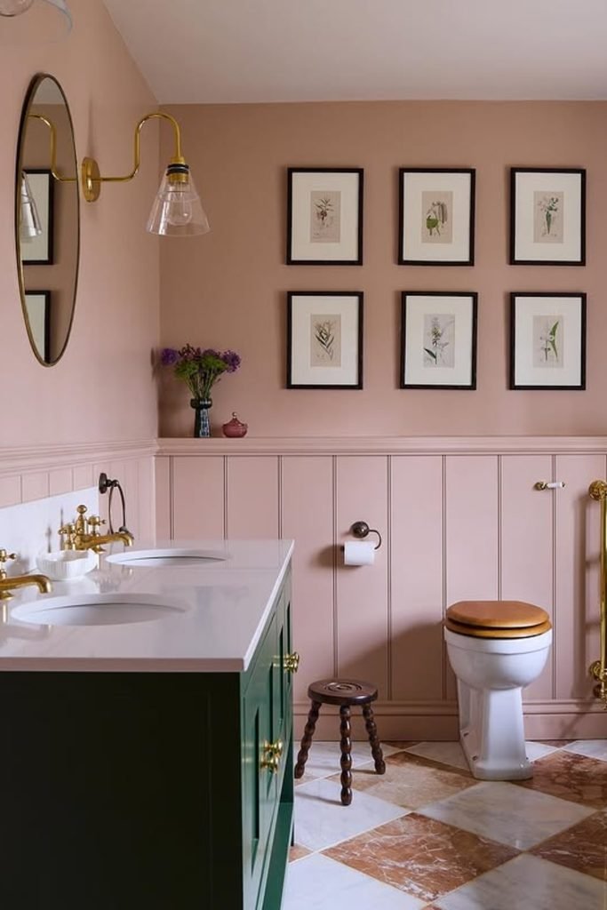
Classic Pairing
Use dusty pink across the walls and paneling when a deep green vanity needs a softer background instead of stark white.
A stone checkerboard floor works well here because its warm browns bridge both colors without introducing another bright shade into the room.
Finish with brass taps and simple botanical art so the bathroom keeps its traditional character without looking overly formal or heavy.
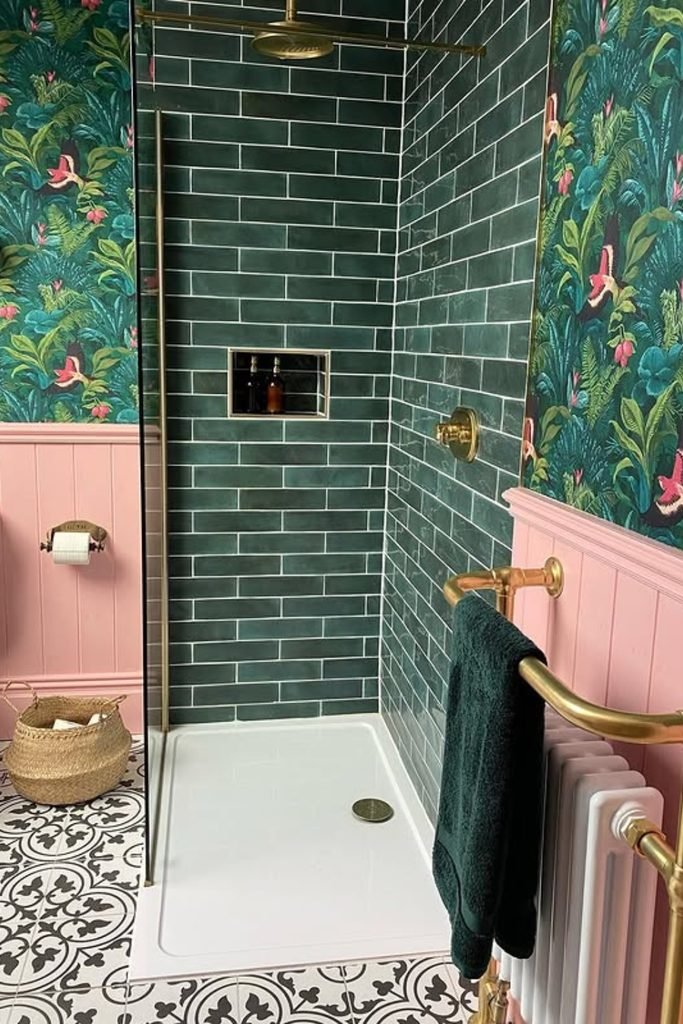
Tropical Walls
Let botanical wallpaper carry both pink and green when you want a colorful bathroom without painting every surface in separate blocks.
Match the shower tile to the wallpaper’s deeper green, then repeat pink below with paneling for a cleaner visual break.
Brass fittings work especially well with this richer palette, while patterned flooring can add interest if its colors stay mostly neutral.
Tiled Balance
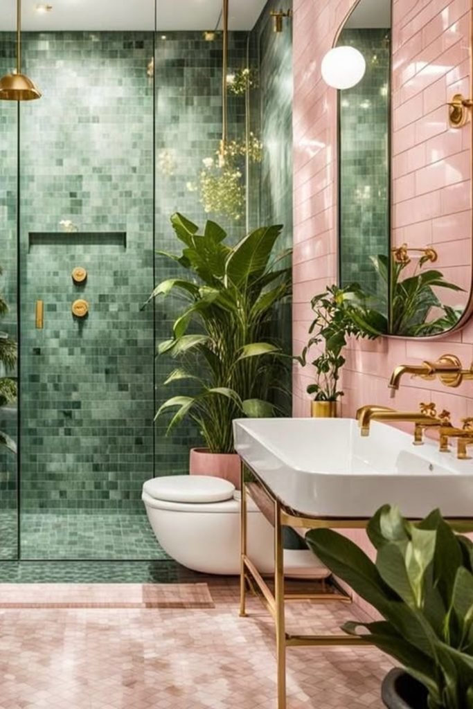
Use soft pink wall tile beside a green mosaic shower when you want both colors to feel strong without competing.
Keeping each color in its own zone gives the bathroom structure, while brass fixtures add warmth between the two finishes.
Add leafy plants only where they repeat the shower tones, so the room feels lush without turning every corner into decor.
FAQs
Which Pink Works Best With Green?
Blush and dusty pink are easiest to pair with sage or olive because their softer undertones keep the bathroom calm and balanced.
If you prefer stronger contrast, pale pink works well with forest or emerald green, especially when white or stone breaks up both colors.
Always compare paint and tile samples inside your bathroom first, since natural light can change how warm or cool each shade looks.
How Can You Keep Pink And Green From Looking Too Busy?
Let one color lead and use the second on a smaller surface like the vanity, backsplash, shower, or painted upper wall.
If both colors are already strong, bring in white, cream, wood, or stone so the room gets enough visual breathing space.
Repeating the same pink and green tones through small details also helps everything feel connected instead of looking like separate design choices.

One Comment