Color seems very simple, until it is your own home on the line. That is where most people freeze.
It is not about taste and trends. It is about the fear of getting it wrong.
What if the living room looks great, but the hallway feels disconnected? What if the color you love in the store looks awful on your wall?
These are not small worries. They are what hold people back from finishing their homes for months and sometimes years.
But the truth is you do not need to be a designer to get this right. You just need to follow a simple method that takes the guesswork out.
That’s exactly what you will find in this article, a clear step-by-step guide to choose a home color palette that will work room to room, and long term.
Let’s dive into it!
Why Does It Feel So Hard to Choose the Right Color?
Most people struggle with color because no one teaches you how to do it.
You walk into a paint store, and suddenly there are thousands of colors.
Online, every home looks perfect but none of it tells you where to start in your own space.
Here’s where it usually goes wrong;
You pick colors one room at a time, you choose one because it is trendy, another because you saw it on Pinterest, and maybe something bold because it looks good in someone else’s kitchen.
But when you step back, your house feels disconnected, nothing flows.
Another big mistake is you ignore your home’s existing fixed elements like your floors, your countertops, and even your lighting.
These things already create a color story, whether you realize it or not.
If you choose colors without respecting what is already there, your palette will always feel off.
4-Step Method to Build Your Home Color Palette
If you want your home to look like it was pulled together by a professional, you need to stop guessing and start to follow a clear process.
These four steps will help you to build a color palette that will flow through your home and will feel balanced.
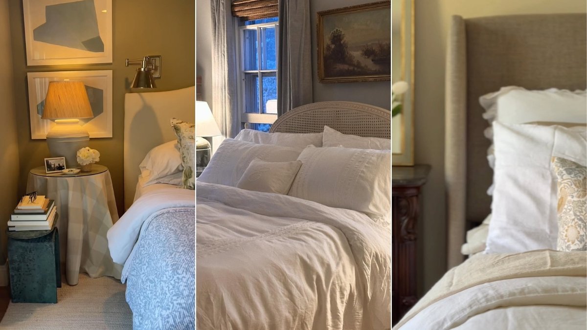
Step 1: Start with Main Space
Your living room and kitchen usually sets the tone for the whole house, this is where people spend the most time, and it often connects visually to other rooms.
You have to pick the main color here first. It does not have to be bold.

It just needs to reflect the mood you want; calm, cozy, airy, modern, and maybe warm.
For example:
- If you choose soft beige walls here, you are steering your home toward a warm, neutral palette.
- If you go with charcoal gray and navy, then you are setting a moody and modern tone.
You have to look at your big, fixed elements here like floor, cabinets, countertops, and large furniture.
Your color must work with what is already in place.
Step 2: Choose Your Base Neutral
Base neutral is the color that will help you to tie your room together.
It might show up on walls, trims, and ceilings.
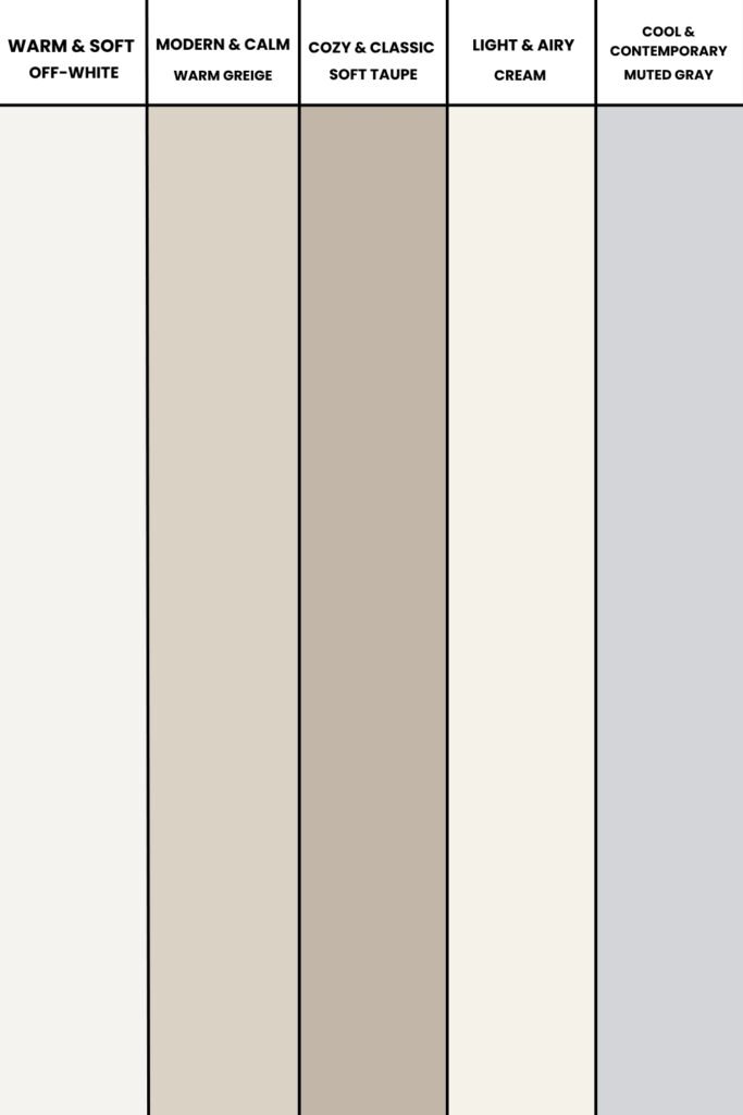
It usually something timeless and subtle;
- Off white
- Warm greige
- Soft taupe
- Cream
- Muted gray
The base neutral will become the glue that will connect your room visually, even if you change colors in each space.
You can paint large samples and view them in different lights like morning, afternoon, and evening.
Because neutrals can shift with lighting.
Step 3: Layer in Supporting Colors
Supporting colors will add depth and variation to your home.
These might be soft colors and also bold shades that can pull from your main space.
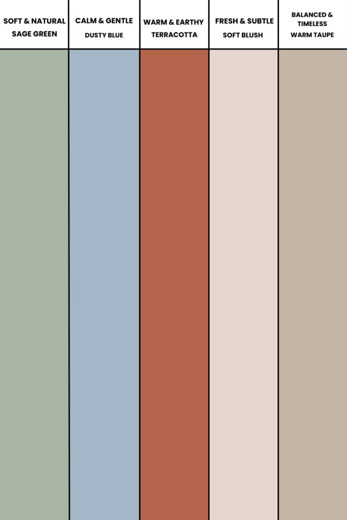
You can consider these for bedrooms, hallways, dining rooms, spaces that still need to feel connected but not identical.
For example:
- Soft sage with warm beige
- Dusty blue with warm white
- Terracotta with taupe
You can pick these from fabrics, rugs, and artwork you already own.
This will make styling easier later because colors already exist in your decor.
Step 4: Add One/Two Accent Shades
Accent colors are used to bring personality in space.
These colors do not dominate, but they show up in smaller details, like cushions, throws, vases, art, and even kitchen accessories.

These pop will help you to break up all the neutrals and make your home feel lived-in and styled.
For example:
- Deep green with neutrals
- Rust orange with creams
- Black for contrast in light home
You have to repeat these accents in small, thoughtful ways throughout your home.
It will help to tie rooms together without overdoing it.
Common Mistakes You Can Do When You Choose a Home Color Palette
It is easy to see why color mistakes happen.
You are trying to make your home feel beautiful, but without a clear plan, small decisions pile up and suddenly your home feels disconnected.
These are the biggest mistakes I think you are making and how you can fix them:
1. Pick Color Room-By-Room
As we discussed earlier the four step method you have to look in the overall home not one room at a time.
I know it might feel natural to pick something bold for the living room, something soft for bedroom and something trendy for your kitchen, but believe me when you walk through the space, none of it will flow.
So, you always have to make a clear plan for your color palette from the start.
You have to choose a base neutral that will be repeated in your main spaces and then you have to build your supporting colors from there.
2. Ignore the Existing Colors
We also discuss that you should first see what colors your space already has, things like floor, countertops, cabinets, and tiles.
When you will pick wall color and furniture without considering these existing elements, your palette will start clashing.
So, you should always avoid this, first look at your fixed elements and identify whether they lean warm and cool.
Your new color should work with those tones, not against them.
3. Forget About Lighting
It is easy to fall in love with a color on a tiny swatch and in a Pinterest photo and assume it will look the same way in my home.
But in reality it would not. Light changes everything.
Morning light, afternoon light, artificial light, they all shift the way color appears on your wall.
This usually happens because most people do not take time to test colors properly in their real environment.
The solution for this problem is very simple but it is important too.
As we learn in a four step method you should always paint large samples directly on your walls and then observe them throughout the day.
4. Use Too Many Colors
Colors should always work with each other.
Many homes look chaotic because homeowners use too many unrelated colors.
This might happen because you might be influenced by trends, Pinterest boards and impulse decisions.
So, the smart way to build a color palette is to choose one neutral that will flow through the main space and then add two and maybe three supporting shades that all should compliment the neutral.
Your accent colors should be limited and must be repeated thoughtfully throughout the home to create cohesion.
5. Play Too Safe
I know you are concerned about the end results and that’s why you may stick with beige, gray and white everywhere.
But sometimes if you play it too safe can lead to a home that will feel flat and lifeless.
To fix this problem you need to bring contrast in the picture.
And it does not mean you have to go bold on every wall.
It can be as simple as deeper shades on trim, dark furniture choices, and strong accents in your decor.
Example Color Palettes for Popular Styles
Sometimes it is hard to decide where to start.
You do not want to copy someone else’s home, but you also do not want to start pain simply without a clue.
The best and easy way is to look at examples that fit the style you love.
1. Modern Minimal with Warm Neutrals
If you want a home that can feel clean, modern and timeless then you can build your palette on warm neutrals.
You can choose soft white, warm taupe, greige walls, and natural textures like oak and linen.
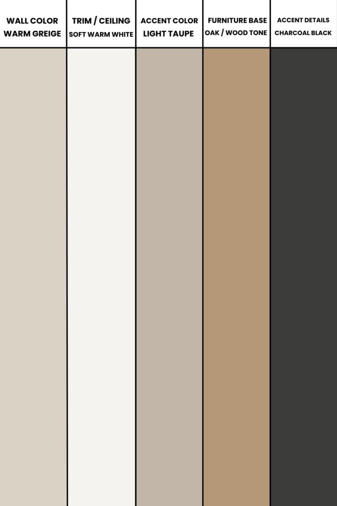
These colors work because they create calm and simplicity, without feeling cold.
You often see this style with black and charcoal accents (in lighting, handles, and frames) to ground the softness and give it a modern edge.
2. Earthy, Cozy with Natural Tones
This palette is perfect if you love a home that feels warm, inviting and rooted in nature.
You can consider terracotta, clay, olive green, warm beige, soft brown, and creamy white.
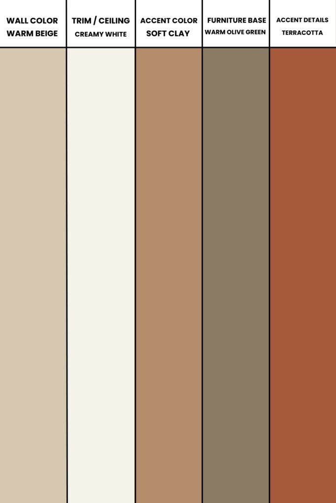
These colors feel connected to the earth, so they make a home feel comfortable and lived in.
You will also see these tones paired with wood, stone, and textured fabrics like wool and jute.
3. Bold and Eclectic with Deep Contrast
So, if you love a home that feels vibrant and full of personality you have to lean into contrast.

This might look like navy blue walls with warm camel leather, emerald green paired with soft pinks, and even black with mustard and rust.
The key here is confidence, this style works because you commit to strong choices and then balance them with soft neutrals in trims, ceilings, and large furniture pieces.
4. Soft and Airy with Cool Neutrals
For a home that feels light, bright, and peaceful you have to consider cool-toned neutrals.
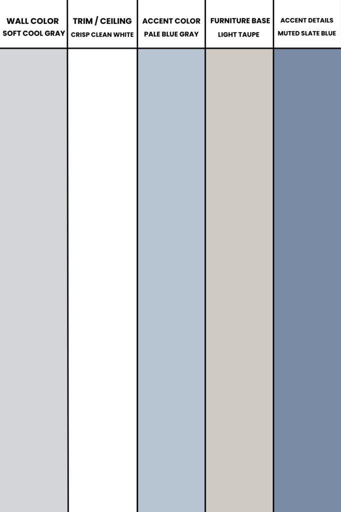
For example you can choose soft gray, light taupe, pale blue, and crisp white. This style often leans into simplicity.
It avoids looking sterile because it mixes textures like soft fabrics, brushed metals and gentle patterns.
Conclusion
At the end once you will understand the common mistakes like pick color without plan, ignore existing colors, and not consider lighting you will be able to make a perfect palette.
You have to build your palette with intention, not guesswork.
Stick with neutrals that flow, layer in supporting colors with care and use accents to add personality.