22 Chic Kitchen Backsplash Design Ideas for 2026
This article may contain affiliate links: read full affiliate disclosure.
Have you ever walked into someone’s new kitchen and think hmm.. something feels off?
The cabinet looks great, the counter looks expensive, but the backsplash?
It may clash with the overall space, and it is the one detail that can ruin the whole vibe of any kitchen.
Now you are upgrading your own kitchen, and that mistake is stuck in your head.
You do not want to waste your money on a backsplash that looks good in the box but turns awkward on the wall.
So, don’t worry because in this article you will get answers, what color to use, whether to go light and maybe dark and also the best designs for inspiration.
Let’s jump into it!
What is the Best Color for Kitchen Backsplash?
The best color for kitchen backsplash is the one that can either balance your kitchen and create contrast there is nothing in middle works.
If your kitchen already has bold cabinets, strong countertop, and patterned floor, then you should go with soft, neutral backsplash that will keep your space from feeling overwhelmed.
But if your kitchen feels plain and flat, that is when you should choose a deep and more colorful backsplash to pull everything together.
Neutral tones like warm white, creamy beige, and soft gray can work in almost any kitchen because they can calm the overall look.
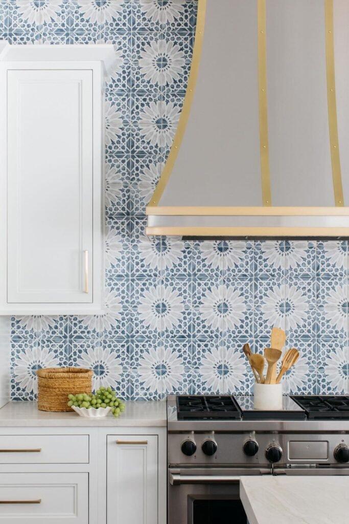
But it does not mean to go boring. You can consider textured tile and subtle gloss to still add depth with neutral tones.
On the other hand, if your entire kitchen feels cold and blank, then a bold backsplash like navy, forest green, and matte black can create contrast.
You do not have to go wild with patterns.
You just have to change the tone and it will shift the whole feel of your kitchen.
So, if you do not want to mess it up, you should look at your kitchen from a distance and ask yourself one thing – does the backsplash bring balance, or does it compete?
Then take your sample tile and place it next to the cabinets and countertops under natural light.
If it blends too much and feels like an afterthought then skip it.
But if it stands out in a way that supports everything else in the kitchen, then you have found the right one.
Should Your Backsplash Be Lighter or Darker Than a Countertop?
If your countertop is dark, then you should use light backsplash, but if it is light then you should consider a dark backsplash to add contrast and texture.
That is the simple way to create a visual balance without overthinking the design.
When both the countertop and backsplash sit in the same tone, your kitchen will start to look flat.
But when one will offset the other, then your kitchen will feel more layered and pull together.
Let’s say you have black and maybe deep gray counter, so if you add another dark surface on the wall it will make the kitchen feel heavy.
A light backsplash, even a soft warm white and ivory, can open up the space and will give your kitchen breathing room.
On the other hand if your counter is white, beige and pale stone, then you can anchor the space with a dark backsplash.
It will keep the upper half of your kitchen from fading into the background and will give your design a strong foundation.
22 Kitchen Backsplash Designs You Can Try in 2025
There are lots of options out there, and I find the best one for you with different kitchen styles.
So, you can checkout and save any design you like on your Pinterest account for future inspiration.
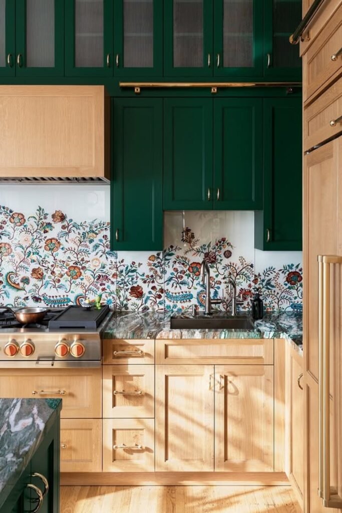
Use a Bold Floral Tile
If your kitchen feels too safe, then floral tiles like this one can bring character without clash with the overall space.
You can try this if you have light oak cabinets and strong cabinet colors like deep green and maybe navy.
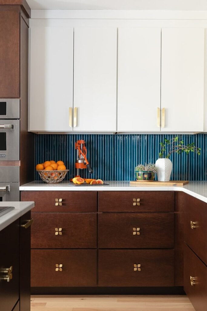
Contrast with Vertical Tile
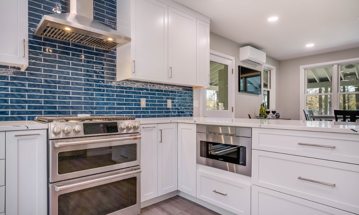
Dark vertical tile works best when you have a light upper cabinet and rich, warm tone lower cabinets.
It will create a sharp contrast that will make both your upper and lower cabinets pop.
You can consider narrow, glossy ceramic tiles in a deep blue limited height.
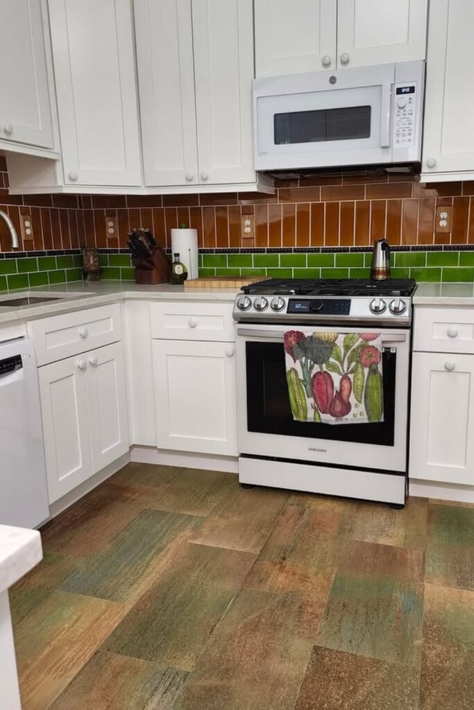
Use Two-Tone Tile
Spilt-color backsplash will work well when your kitchen needs a bit of energy without a full remodel.
If you try the same brown and green combination it will give a retro diner vibe, but you should have white cabinets and modern appliances to keep it grounded.
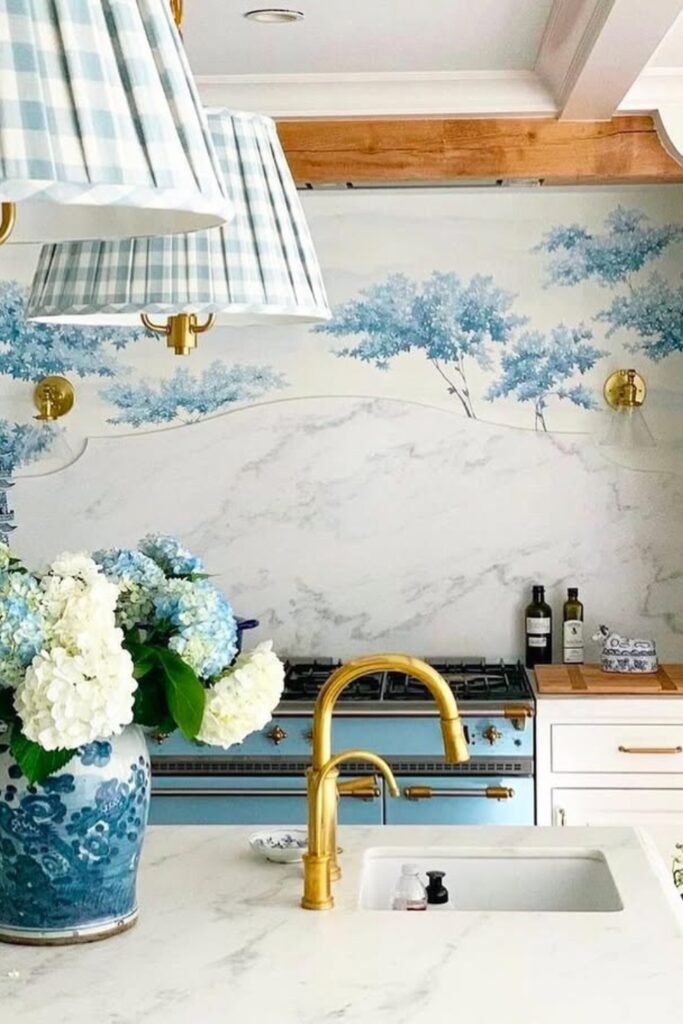
Try a Scenic Panel
A printed backsplash panel works very well when your kitchen leans soft, elegant and traditional.
You can use a printed glass and porcelain slab with a watercolor-style scene.
Then frame it with trim and maybe with a wood canopy hood to make it look intentional.
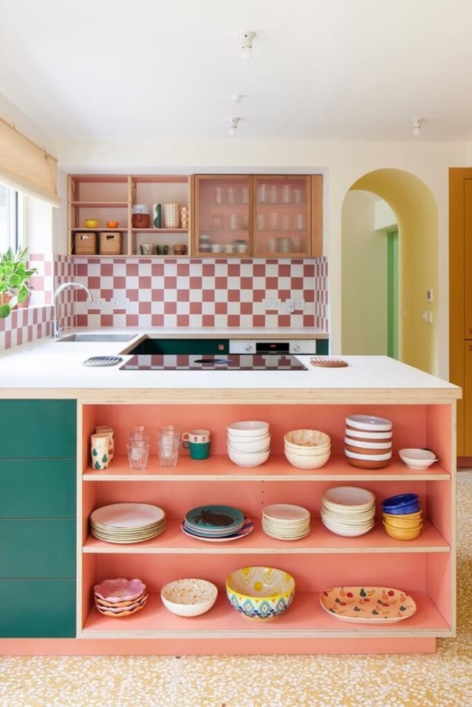
Go Bold with Checkboard Tile
Red and pink checkerboard tile does not play it safe, and that is the whole point here in this design.
This will bring a playful, retro energy that will work when you lean into it with colorful cabinets, open shelving, and patterned floor.
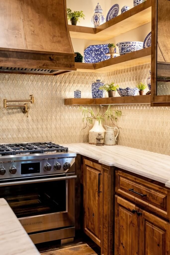
Texture with Neutral Pattern
Forget plain subway tile because this diamond-patterned backsplash can bring detail that will fit right into rustic and traditional kitchen.
It works here because the warm glaze picks up the tone of the wood cabinets, and subtle shine adds contrast under soft lighting.
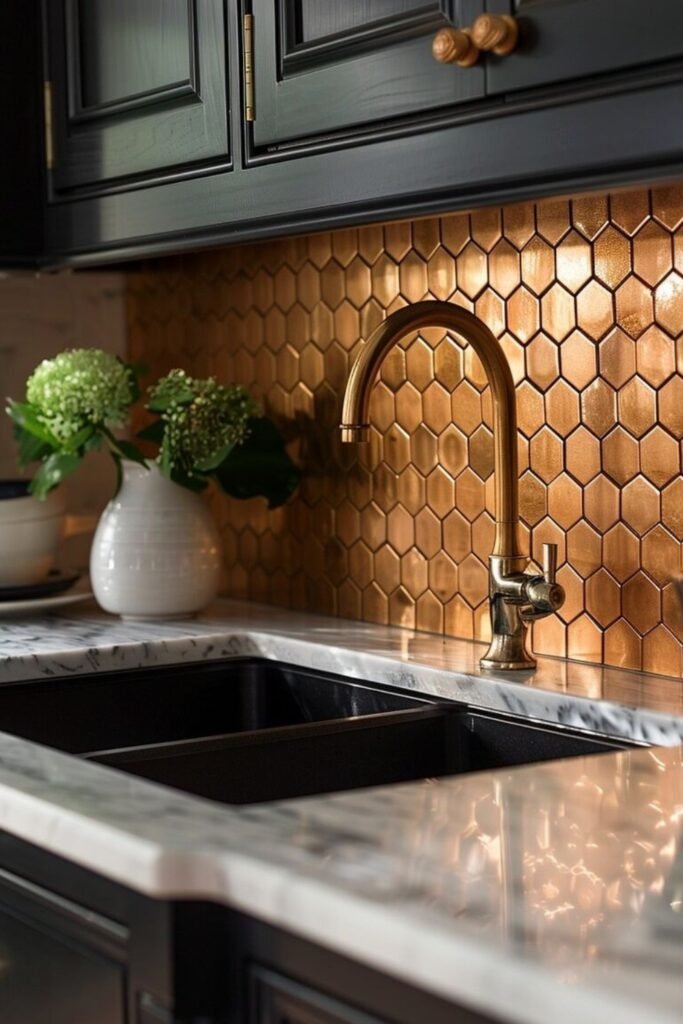
Use Copper Tile
Copper catches light in a way no ceramic ever can.
If you use this honeycomb tile backsplash it will pull warmth into your kitchen.
If your kitchen has dark cabinets and marble counters then you can give it a try.
It is a bold move, but one that can add luxury without relying on color.
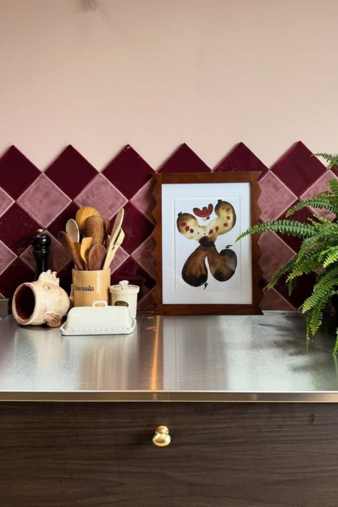
Stack Tiles on the Diagonal
If you turn square tiles on a diagonal it will change everything.
This deep berry and blush backsplash feels custom, even though it uses simple tile shapes.
It can work well with open wall space above because the diamond layout will lead the eyes upward.
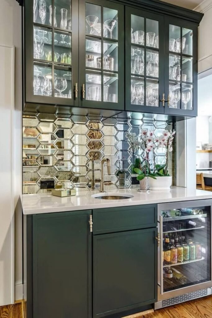
Reflect Light with Mirror Tile
Mirror backsplash can do more than just add shine, they can bounce light and visually double your space.
If you have a narrow kitchen then you can try the mirror backsplash to make your space feel more open.
You can use beveled and antique finish mirror tiles and install them with light seams to keep the surface clean.
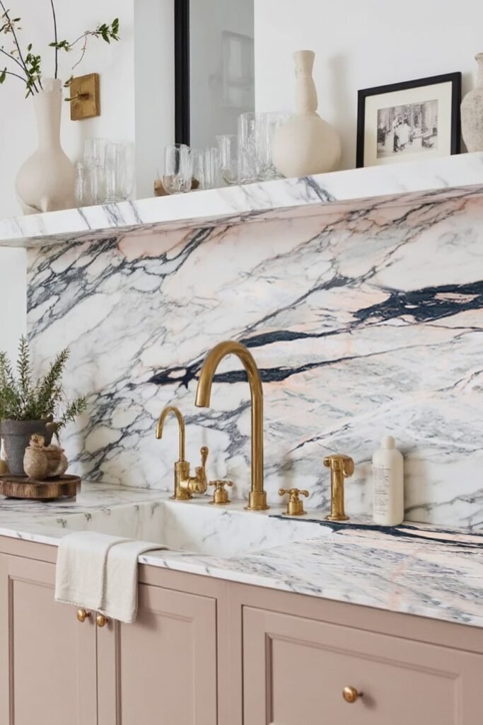
Extend Your Stone to the Wall
Whenever you will run the same stone from counter to backsplash it will give the kitchen a seamless, high-end feel especially when the slab has strong natural veining.
This look works best when the faucet and fixtures stand out, like these warm brass taps against the cool marble.
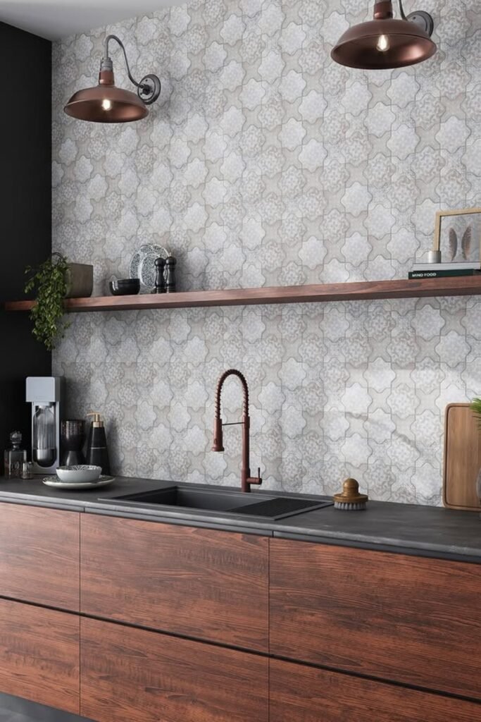
Use Patterned Tile
Flat cabinets and sharp black accents can sometimes feel cold, but a soft-pattern backsplash like this one will add texture without breaking the sleek look.
This can work best in kitchens with open walls and a long countertop run where the tile has room to repeat.
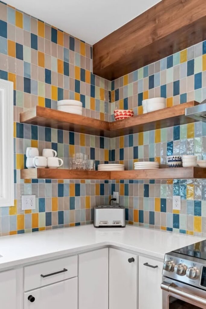
Mix Vertical Color Blocks
Color-block tile does not need to feel loud if you use a tight, vertical layout like this.
The mix of mustard, navy, powder blue, and taupe keep the rhythm interesting without overwhelming the space.
You have to choose 4-5 tile shades in similar gloss levels and rotate them vertically in a random order.
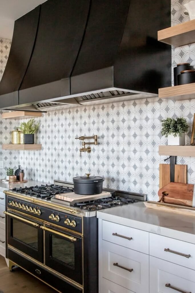
Graphic in a Monochrome Space
Pattern tiles like this can keep things visually interesting without pulling in extra color.
You can go for cement and ceramic tiles with subtle pattern depth and let them run full height behind the stove.
This kind of backsplash is perfect if you want movement but still want to stick with black, white and gray tones.
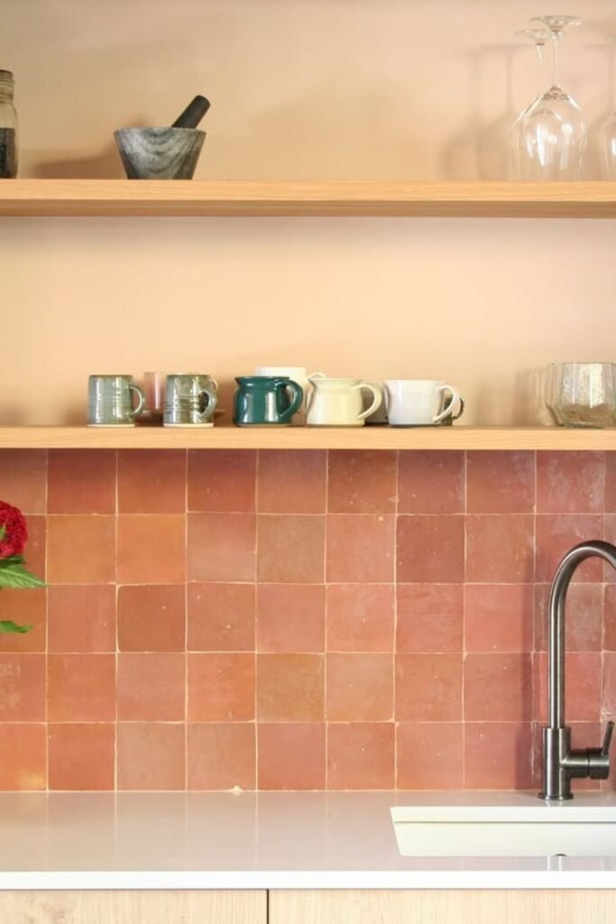
Warm Up with Terracotta Tile
Terracotta can bring warmth to your kitchen, especially when the rest of your space lean into light and minimal.
You can consider handmade and zellige terracotta tiles and embrace slight color variation between the pieces.
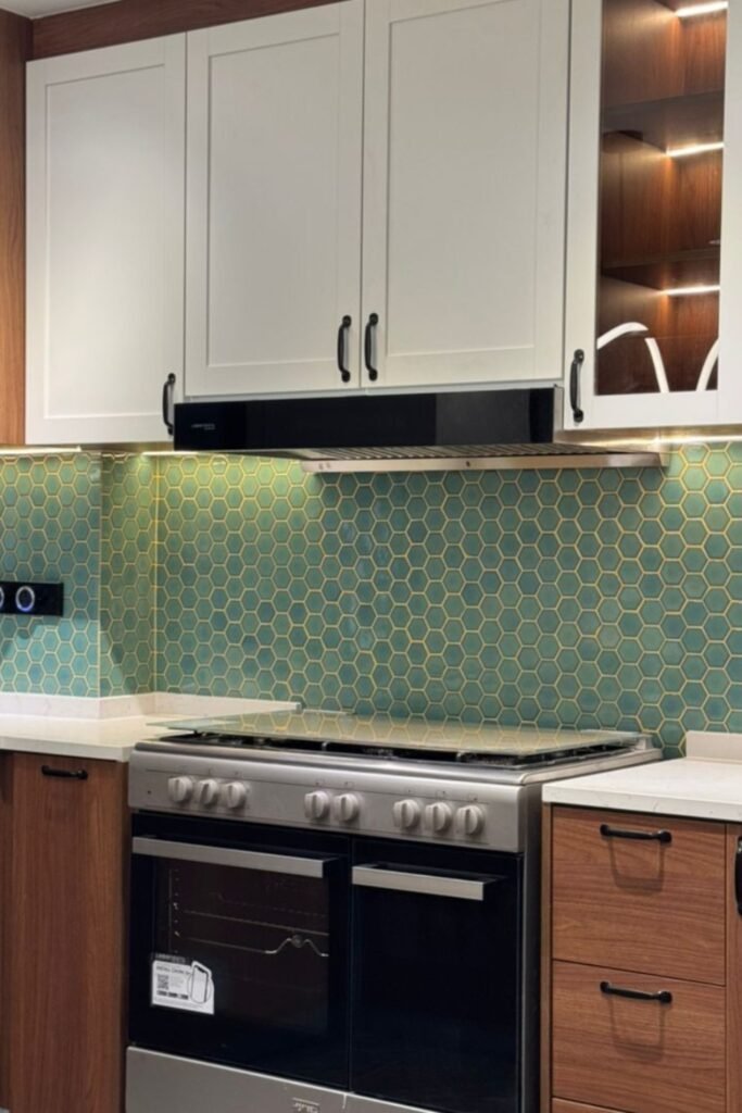
Consider Teal Tiles
When the rest of your kitchen sticks to simple finishes, then this backsplash can become the unexpected twist.
You have to choose small matte hex tiles and match them with warm metallic and sand color grout.
Then you have to keep your cabinets plain and let the backsplash do work, around the stove zone.
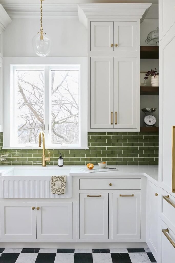
Deep Green with All White Kitchen
White kitchens can start to feel too bright if there is nothing to anchor them.
This olive green backsplash is perfect to add depth in your all white kitchen.
You can use a white and light gray grout to keep the tile sharp, and repeat the green in small accents like herbs, ceramics and even flooring.
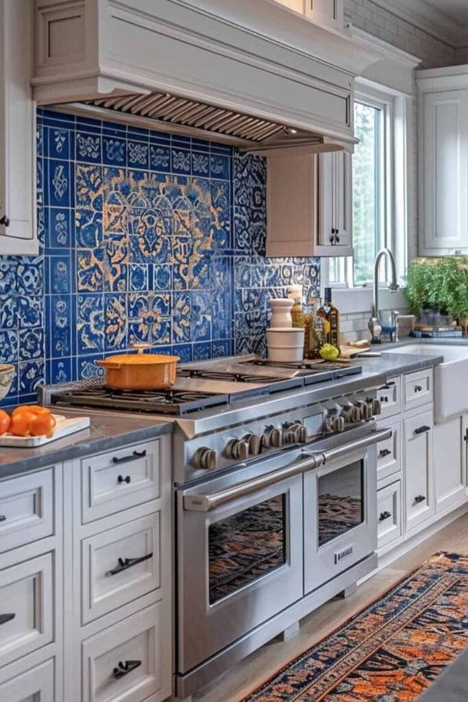
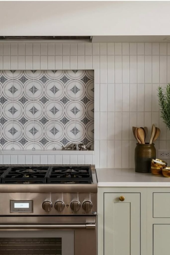
Frame the Stove with Pattern
There is no rule that says your whole backsplash has to match.
This setup proves that a framed pattern behind the stove can stand out as a centerpiece.
If you want to try this, then treat the focal area like art work.
Use decorative tiles for just the center section and surround it with matching solids.
Highlight One Spot with Mixed Tile
When you use two types of tiles in one backsplash it does not just add variety it adds focus.
Here the patterned tile frames the cooking zone like a piece of art, and surrounding vertical tiles keep the rest of the wall clean and subtle.
You have to create a recessed and bordered section behind the stove with decorative tile, then tile the rest with vertical stack rectangles in a tone that blend into the wall.
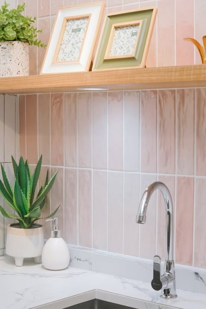
Subtle with Soft Pink Vertical Tile
Not every backsplash needs to shout to stand out.
These soft pink tiles bring a calm, pretty backdrop that warm up a small kitchen without clutter.
If you want to try this, then go with elongated ceramic tiles in a gloss and satin finish, and choose a barely-there grout to keep the tone gentle.
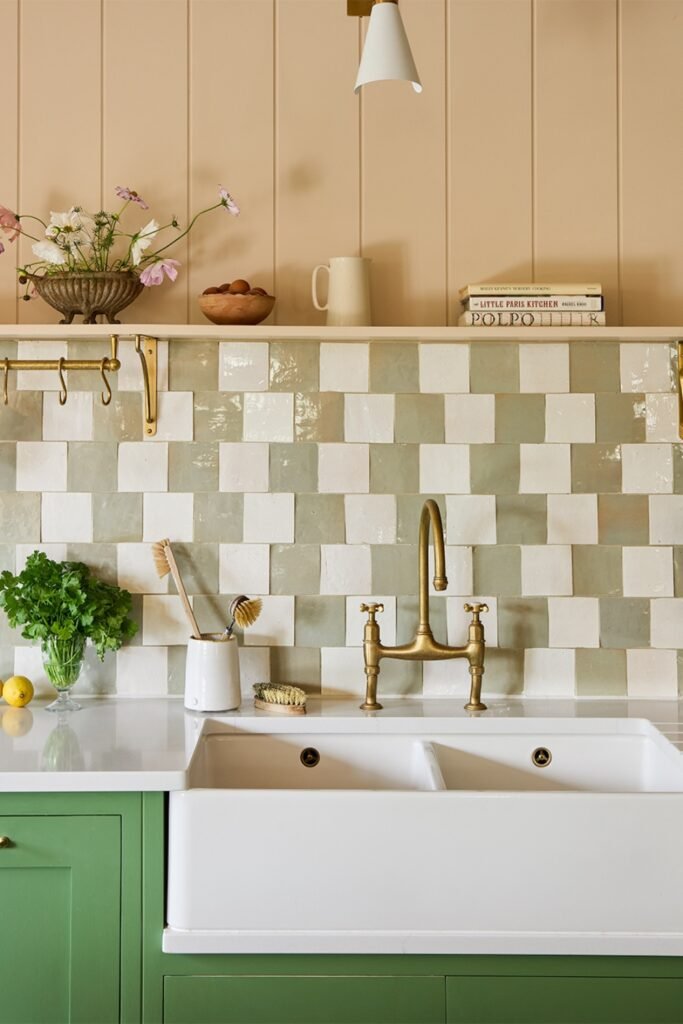
Mix Tones for Handcrafted Look
This is not about perfect symmetry, it is about charm.
The soft green and off-white tiles create a patchwork that feels calm and personal.
If you want this kind of warmth, then skip machine-perfect tiles, and go for handmade zellige in light, earthy shades.
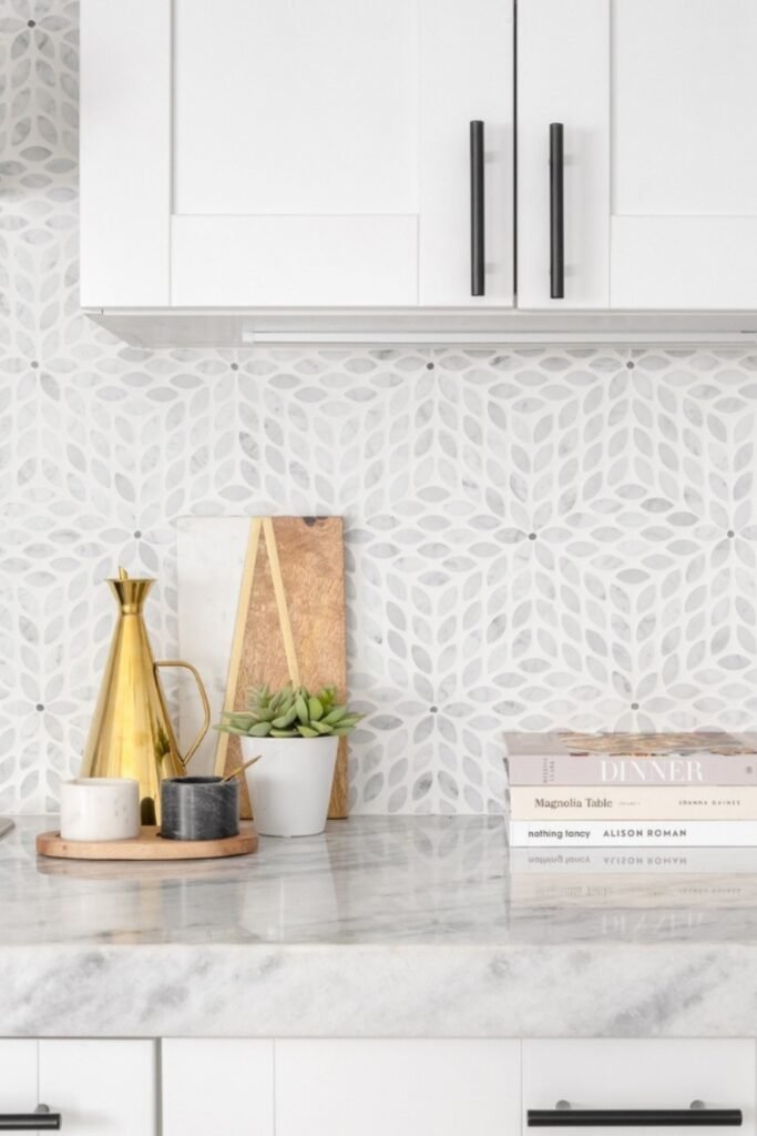
Keep It Light with Soft Pattern
You do not always need color to make a backsplash interesting.
This soft floral tile is made from white and gray marble and they bring in texture through shapes.
You can look for mosaic tile sheets with a repeating pattern and a soft honed finish.
If you have all white kitchen then this can work well there.
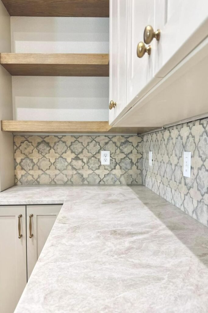
Let Pattern Add Soft Contrast
This backsplash brings in a pattern without using bold color, which makes it a good fit for kitchens that already lean neutral.
It will work best under open shelving, where the repeat shape can give a structure without stealing focus.
You can consider stone and ceramic tiles with a Moroccan and trellis-style pattern in muted shades.
